Final Project
-
Hi everyone
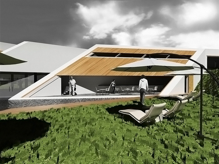
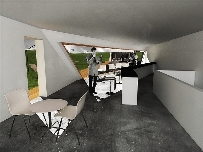
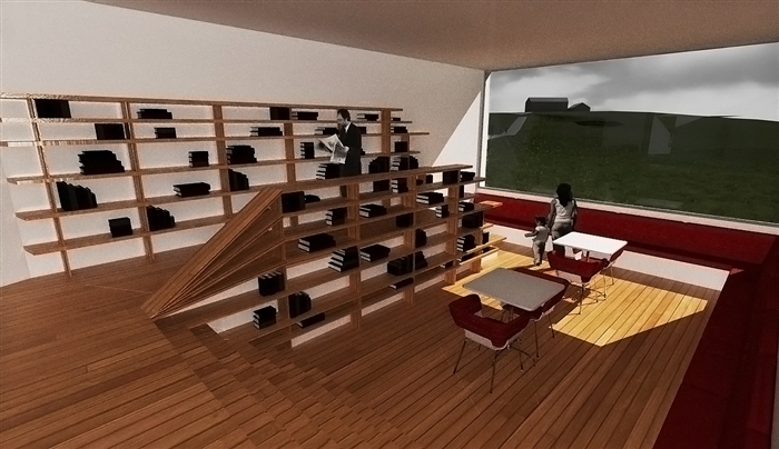
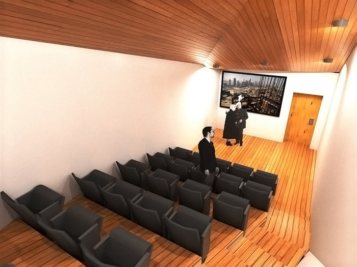
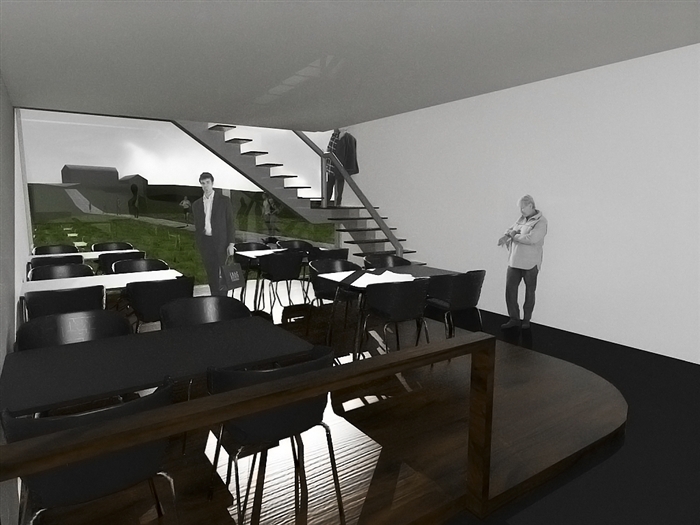
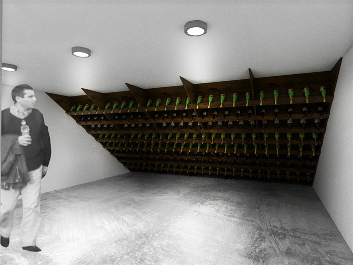
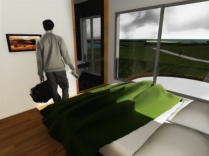
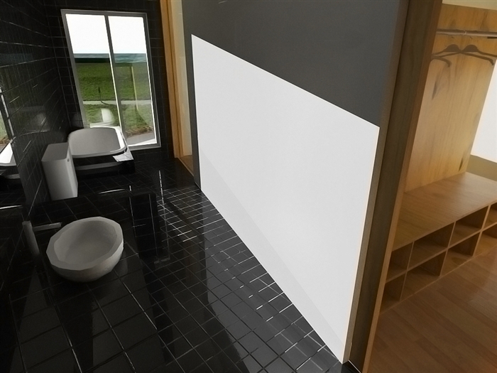
This house is one of my final projects for my final year in architecture (the other was the bridge that disaperar with when the forum had a failure dome days ago). This house was supost to be like a mini hotel (don't know how to call it in english...sorry but if anyone knows how to translate "Pensão" or "Pousada" from protuguese it would be very helpfull) in a old farm located near the river that now would work for agro-turism (tourist see how the agriculture works). I located the house near the water deposit that already existed and star molding the general form to the water deposit and to that part of the landscape where it is (the terrain here have a small inclination).
Like in the bridge project, i wasn't aiming for a realistic look but rather for a more dramatic one, and i'm also posting two top sections, so you can understand the interior better, an the side sections that is a mix between a cad drawing a sketchup view (tell me what you thinks of them).
As allways any coments, critics and advices would be apreciated.
Thanks for watchingDavid
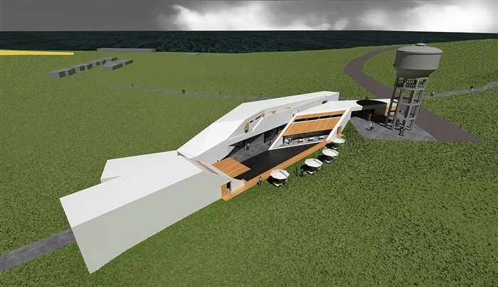
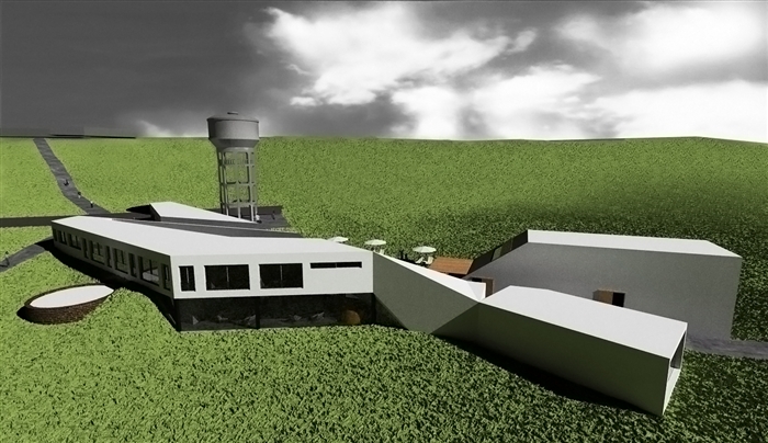
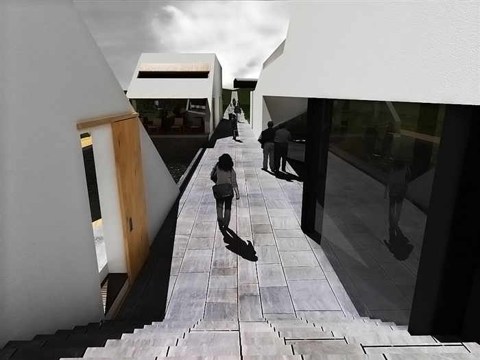
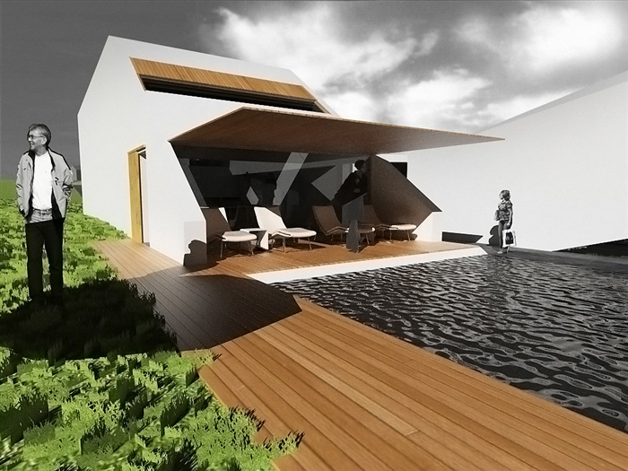

-
Hi Giovani
Thanks for the coment.
But i think this project isn't still enough "sharp" for Zaha Hadid...
David
-
very "sharp"!
interesting project and good images!
Zaha hadid would probably like it... hehe!
-
I like the actual building but the grass is really over powering and not realistic. Some of the images have a distorted look to them that takes away from the composition. I am not sure if it is just me but there is a gloomy feel to the images...kind of odd. Maybe it is the black and white sky.
Scott
-
Hi scottpara
Thanks for the coment. I agree with you about the grass, i had to much problems with that grass mainly because d grass colour was diferent from the ground face colour, producing some odd results. Other problem i had was about the number off grass instances in keykethea because my PC couldn't handle the entire terrain with grass and this produced strange results in views that showed a lot of landscape. But i'm always learning and this was great to learn some new tricks in rendering and post producing in photoshop.
The distorted look i think it's a mix between some of the non-rectangular angles that the building does and the field of view i use. I normally use a field of view of 60 degrees because i think that's what the human eye does (don't remember where i read this so feel free to correct me if i'm worng). And with this field of view the perspective is normally more spectacupal than the ussually 35. What's the normal that everybody uses?
And forgive my ignorance but what does "gloomy feel" means? (again sorry for my rusty english...)
David
-
50-52 degrees is the typical setting used for the focal length of the human eye. Anything past that can give distorted visuals. sometimes it can look good but I find for small interiors it can distort things past reality.
Here is the definition as I found it hard to explain myself

gloomy
adjective
- Depressingly dark; "the gloomy forest"; "the glooming interior of an old inn"; "'gloomful' is archaic" [syn: glooming]
- filled with melancholy and despondency ; "gloomy at the thought of what he had to face"; "gloomy predictions"; "a gloomy silence"; "took a grim view of the economy"; "the darkening mood"; "lonely and blue in a strange city"; "depressed by the loss of his job"; "a dispirited and resigned expression on her face"; "downcast after his defeat"; "feeling discouraged and downhearted"
- causing dejection; "a blue day"; "the dark days of the war"; "a week of rainy depressing weather"; "a disconsolate winter landscape"; "the first dismal dispiriting days of November"; "a dark gloomy day"; "grim rainy weather"
Scott
-
actually, both things
@unknownuser said:Some of the images have a distorted look to them that takes away from the composition. I am not sure if it is just me but there is a gloomy feel to the images...kind of odd. Maybe it is the black and white sky.
are what i liked most... hahahaThe human eye apparently can "focus" atention to a 60 degree angle view.. but can actually almost get to 180 degree field of view... as if you extent both arms to side and then closing them in, when you can actually notice them getting in to your field of view.. even if out of focus...
The 50 degree as standard for the human eye in perspectives seams to me really close to reality... -
I wanted the images to have a more dramatic look\mood and that's why i put the people and the sky in black and white to contrast with all the bright green around, didn't realizes that that could give a depressive tone to the picture...now i'm depressed...lol
Thanks for the 50 degres in field of view tip. Always learning
David
Hello! It looks like you're interested in this conversation, but you don't have an account yet.
Getting fed up of having to scroll through the same posts each visit? When you register for an account, you'll always come back to exactly where you were before, and choose to be notified of new replies (either via email, or push notification). You'll also be able to save bookmarks and upvote posts to show your appreciation to other community members.
With your input, this post could be even better 💗
Register LoginAdvertisement


