Warehouse WIP
-
First of all thank you Pete (solo) for the help.
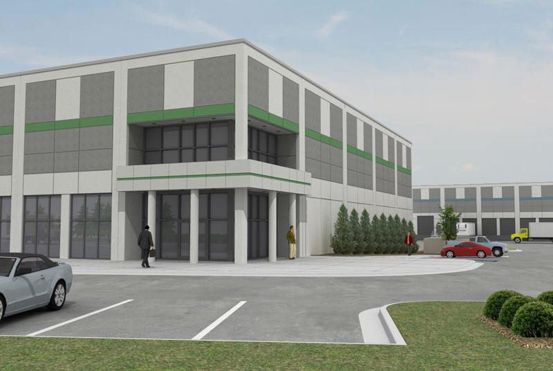
Here is a test shot of a project I am currently cutting my 'paid for'
rendering teeth on. SketchUp and Podium.The odd thing about this building is the canopy is not a balcony.
The other 7 buildings on this site have the same entrance design with
a balcony as there is a mezzanine level. This one does not so it
looks a bit odd but in context it fits right in.Larger image Here

-
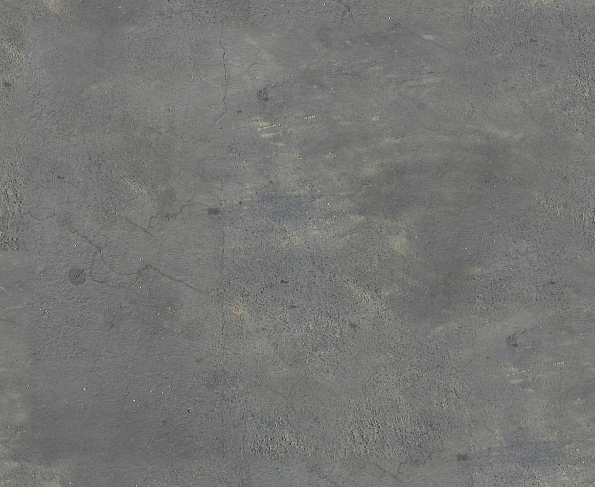
Looks great, Eric. How did you achieve that look on the asphalt paving?
-
Thanks Daniel. It is a texture someone shared with me. I will ask if it is free to share...
-
Its GREAT but it looks more like an office
-
Here it is, compliments of Solo's Place.

-
looking great so far...nice detail with the reflections in the windows
 foreground car looks good, others seem a little flat, maybe just because they're farther away... paving texture is great, def gonna steal that
only thing that kind of bugs me are those foreground bushes...too photoreal or something? or just too saturated? they definitely stick out.
-
Thanks Eric/Pete for the texture.
-
Nice lookin buildings
-
I like it too. It appears to communicate the design very well.
Thanks for the asphalt texture. What technique did you use for the sky? It looks yummy.
Regards, Ross
-
Thanks all.
Jason, the bushes are from the Podium plant library. I think once I get the tree photoshopped in the final image (there is one just to the right in the plans) they will be less noticeable. However I will keep my eye on that thanks. The cars in the back, I did not add any reflection to them. Maybe a bit of PS touch up there too.
Ross, the sky is from a landscape photo I had "lying around" my hard drive that I just placed in behind the scene.
I did a night render from another one of the building's entrances a while back here. maybe you remember it?
These buildings are huge. 8 of them, 7 measuring 900 feet long with the majority of openings being roll up truck doors. This is the only one with an "at grade" entrance.
-
Again, thanks to all who have helped out.
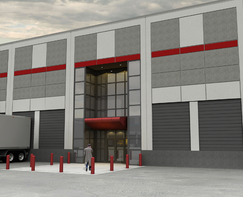
Here is an update. The original image I posted is not in the set the owner wants so I am on to the others. Here is a shot of one of the middle entrances. Bit of a boring setup but it is what it is.

-
Actually I like it. It is a bit gloomy but it helps the lights show. Maybe some more definition to the wall materials. There is a bit of tiling in the darker grey material though.
Good work.
Scott
-
@unknownuser said:
Again, thanks to all who have helped out.
Here is an update. The original image I posted is not in the set the owner wants so I am on to the others. Here is a shot of one of the middle entrances. Bit of a boring setup but it is what it is.
Pedestrians walking through the loading bays to get to the entrance? Not working for a very safety-oriented company then?
-
The personal vehicle parking is facing the building.
Thanks Scott. I believe before I deliver this image I will fix that tiling.
-
Eric,
I like the overhang but it seems like water would run right down it to the face of the door. Is that right?
Scott
-
Ha Ha Ha, good eye. First off I am not the designer on this job, just the cadd monkey.
We just changed that canopy yesterday. It used to have a built up roof with roof drains going through the building and the owner wanted to cut cost so out it went. There will be a drip edge along one of the panel joint lines towards the leading edge but I am sure some water will make it closer to the door. Actually I think it might change later to some prefab unit but for the renderings this will stay.
-
Nice work Eric.

-
Again, nice work

-
Eric, nice renderings, even if you did forget the dock bumpers on the second image.
-
Thanks Daniel. I did not forget the bumpers because the owner is not furnishing them. They will be tenant fit-ups if required. Dock levelers might be added but for the rendering they are not to be shown. Good eye.
I am cooking another view right now... so far it is my favorite.
Hello! It looks like you're interested in this conversation, but you don't have an account yet.
Getting fed up of having to scroll through the same posts each visit? When you register for an account, you'll always come back to exactly where you were before, and choose to be notified of new replies (either via email, or push notification). You'll also be able to save bookmarks and upvote posts to show your appreciation to other community members.
With your input, this post could be even better 💗
Register LoginAdvertisement


