sketchucation logo sketchucation
    • 登入
    Oops, your profile's looking a bit empty! To help us tailor your experience, please fill in key details like your SketchUp version, skill level, operating system, and more. Update and save your info on your profile page today!
    ⚠️ Important | Libfredo 15.6b introduces important bugfixes for Fredo's Extensions Update

    Stuff Topic (Once "My Projects and W.I.P.s")

    已排程 已置頂 已鎖定 已移動 Corner Bar
    567 貼文 31 Posters 29.0k 瀏覽 31 Watching
    正在載入更多貼文
    • 從舊到新
    • 從新到舊
    • 最多點贊
    回覆
    • 在新貼文中回覆
    登入後回覆
    此主題已被刪除。只有擁有主題管理權限的使用者可以查看。
    • pbacotP 離線
      pbacot
      最後由 編輯

      Hate to say, but that lady doesn't even have toes!

      MacOSX MojaveSketchUp Pro v19 Twilight v2 Thea v3 PowerCADD

      1 條回覆 最後回覆 回覆 引用 0
      • StinkieS 離線
        Stinkie
        最後由 編輯

        @pbacot said:

        Hate to say, but that lady doesn't even have toes!

        Oi! She's got four of 'em! No need to diss her because she's different!

        Kevin: Get the bloody chip off your shoulder, and at least try to understand what we're trying to tell you.

        1 條回覆 最後回覆 回覆 引用 0
        • K 離線
          KDSDESIGN
          最後由 編輯

          this is not te hot woman topic!!!!!!!!!!!!!!!!!!!!!!!!!!!!!!!!!!!!!!!!!!!!!!!!!!!!!!!!!!
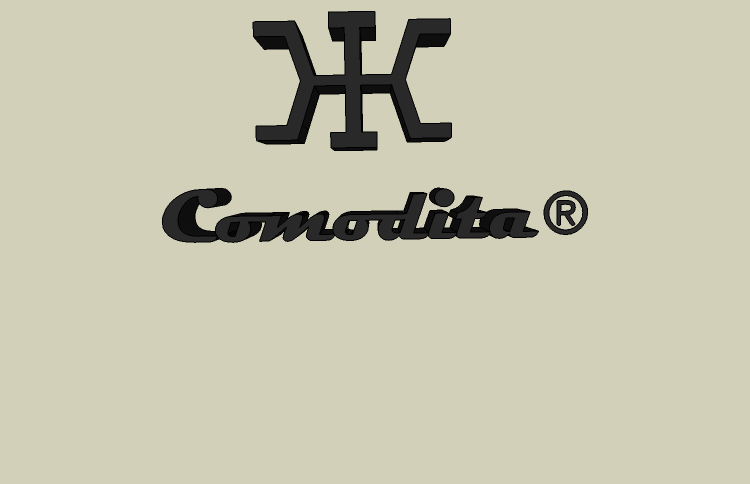
          okay to many !s but still

          btw is this a good logo

                             ****Ж****
          

          its some thing ZHE

          Regards,
          █Kevin█

          (about 20% done)

          1 條回覆 最後回覆 回覆 引用 0
          • K 離線
            KDSDESIGN
            最後由 編輯

            uhhh comments on the logo.

            btw, i am going to PM a mod if this keeps up. just please, keep on topic.

            Regards,
            █Kevin█

            (about 20% done)

            1 條回覆 最後回覆 回覆 引用 0
            • S 離線
              Stu
              最後由 編輯

              Waooooooo!!..psychedelic nail polish!!!...like... I havent seen that since the sixties, man 😎

              http://www.landesign.com.au

              1 條回覆 最後回覆 回覆 引用 0
              • Alan FraserA 離線
                Alan Fraser
                最後由 編輯

                Thanks Stinkie. This is gonna be a more detailed mod. I'm gonna give her fingerprints too. See, I've started.
                More soon. I'll post again when I've added another whorl.


                fingerprint.jpg

                3D Figures
                Were you required to walk 500 miles? Were you advised to walk 500 more?
                You could be entitled to compensation. Call the Pro Claimers now!

                1 條回覆 最後回覆 回覆 引用 0
                • K 離線
                  KDSDESIGN
                  最後由 編輯

                  ok coool polish. make a topic about it and dont post it here!

                  Regards,
                  █Kevin█

                  (about 20% done)

                  1 條回覆 最後回覆 回覆 引用 0
                  • S 離線
                    Stu
                    最後由 編輯

                    @alan fraser said:

                    Thanks Stinkie. This is gonna be a more detailed mod. I'm gonna give her fingerprints too. See, I've started.
                    More soon. I'll post again when I've added another whorl.

                    Ahhhhh...fingerprints!!..so, if she turns up in the 3D Warehouse you can prove to Google that she is yours!!!....devilishly clever!!...have you thought about iris scans as well?

                    [But Alan....could you wait until you finish the whole fingerprint before you post anymore?]

                    http://www.landesign.com.au

                    1 條回覆 最後回覆 回覆 引用 0
                    • pbacotP 離線
                      pbacot
                      最後由 編輯

                      Kevin,

                      I do like the Logo. Sort of a Samurai look. I think it is good for "K" for Kevin. I also suspect it has been used somewhere before, but how could one find that out?

                      I have the word "design" in my business name too. I think I will take it out after this.

                      But I really like the nail polish.

                      Too much. That fingerprint's been viewed 23 times already.

                      Remus, what faith was that?

                      Peter

                      P.S. Here are some extra "n"s Anyone may use them. Please do. nnnnnnnnnnnnnnnnnnnnnnnnnnnnnnnnnnnnnnnnnnn

                      MacOSX MojaveSketchUp Pro v19 Twilight v2 Thea v3 PowerCADD

                      1 條回覆 最後回覆 回覆 引用 0
                      • Alan FraserA 離線
                        Alan Fraser
                        最後由 編輯

                        The logo is the Cyrillic character for the Russian soft Z sound...like in Zhivago.

                        3D Figures
                        Were you required to walk 500 miles? Were you advised to walk 500 more?
                        You could be entitled to compensation. Call the Pro Claimers now!

                        1 條回覆 最後回覆 回覆 引用 0
                        • P 離線
                          pav_3j
                          最後由 編輯

                          finger print is nice!
                          excellent progress on that by the way alan.

                          come on though, lets stay on topic.

                          KD are you seriously asking us to comment on something you didn't even design yourself?
                          you're right it's a zhe, part of the cyrillic alphabet which represents the voiced postalveolar fricative, similar to the s in the English word treasure or the g in the English word mirage.

                          Pav

                          courtesy of wikipedia. (except the Pav bit, i added that myself)

                          Just won the 'Who is Least Competitive Championships' where trying to win will make you lose. Trying to lose makes you win which makes you lose. Not trying at all makes you lose which makes you win which makes you lose.

                          1 條回覆 最後回覆 回覆 引用 0
                          • K 離線
                            KDSDESIGN
                            最後由 編輯

                            i mean the choise. It is Cyrillic ZHE (whatever that means)

                            Regards,
                            █Kevin█

                            (about 20% done)

                            1 條回覆 最後回覆 回覆 引用 0
                            • K 離線
                              KDSDESIGN
                              最後由 編輯

                              btw why dont you just put the Pav part in the signature?

                              Regards,
                              █Kevin█

                              (about 20% done)

                              1 條回覆 最後回覆 回覆 引用 0
                              • P 離線
                                pav_3j
                                最後由 編輯

                                because the grey line scares me.
                                plus i a rhhhhhealy good at writing my name.

                                ha ha

                                Pav

                                Just won the 'Who is Least Competitive Championships' where trying to win will make you lose. Trying to lose makes you win which makes you lose. Not trying at all makes you lose which makes you win which makes you lose.

                                1 條回覆 最後回覆 回覆 引用 0
                                • K 離線
                                  KDSDESIGN
                                  最後由 編輯

                                  so am i:
                                  KDSDESIGN KDSDESIGN KDSDESIGN KDSDESIGN KDSDESIGN KDSDESIGN KDSDESIGN KDSDESIGN KDSDESIGN KDSDESIGN KDSDESIGN KDSDESIGN KDSDESIGN KDSDESIGN KDSDESIGN KDSDESIGN KDSDESIGN KDSDESIGN KDSDESIGN KDSDESIGN KDSDESIGN KDSDESIGN KDSDESIGN KDSDESIGN KDSDESIGN KDSDESIGN KDSDESIGN KDSDESIGN KDSDESIGN KDSDESIGN KDSDESIGN KDSDESIGN KDSDESIGN KDSDESIGN KDSDESIGN KDSDESIGN KDSDESIGN KDSDESIGN KDSDESIGN KDSDESIGN KDSDESIGN KDSDESIGN
                                  lol
                                  sorry if that was spam
                                  full logo:
                                  Comodita.png

                                  Regards,
                                  █Kevin█

                                  (about 20% done)

                                  1 條回覆 最後回覆 回覆 引用 0
                                  • S 離線
                                    Stu
                                    最後由 編輯

                                    Geee, I dont know.....is it maybe about time to start reaching for the padlock... and just let this thread sink slowly to the bottom?

                                    http://www.landesign.com.au

                                    1 條回覆 最後回覆 回覆 引用 0
                                    • K 離線
                                      KDSDESIGN
                                      最後由 編輯

                                      funny stu 😆 🤣 😆 🤣 😆 🤣 😆 🤣 😆 (sarcasim)

                                      Regards,
                                      █Kevin█

                                      (about 20% done)

                                      1 條回覆 最後回覆 回覆 引用 0
                                      • P 離線
                                        pav_3j
                                        最後由 編輯

                                        it might be an idea though KD, maybe killing this thread is best for everyone.
                                        it's gone way too far now, you can always start a better thread, with proper WIPs, and proper updates.
                                        may be the best way to get yourself some respect round here.

                                        Pav

                                        Just won the 'Who is Least Competitive Championships' where trying to win will make you lose. Trying to lose makes you win which makes you lose. Not trying at all makes you lose which makes you win which makes you lose.

                                        1 條回覆 最後回覆 回覆 引用 0
                                        • Chris FullmerC 離線
                                          Chris Fullmer
                                          最後由 編輯

                                          A serious critique on the logo, since it more or less deserves one.

                                          That is also used by many other firms because it looks like a K K with the first one backwards. So type in "KK Logo" in google and go to images and you'll see quite a few variations on it. Its a bit overdone already. Plus, there are two K's in it. Your name only has one. Think of a logo that incorporates your initials. So try KDS in some cool font. That would be more appropriate.

                                          The Comodita. That also does not start with K. So it doesn't make sense to have that KK logo and comodita. Its like have two company names. Here's how your introduction works:

                                          Kevin: Hi, I'm Kevin Smith. I own "sze" comodita,
                                          Possible Client: Sze?
                                          Kevin: Yes, Sze. Its Cyrillic and it looks like two K's, and my name is Kevin so I used it, even though its pronounced differently and it looks like 2 K's and my name only has one. ANYHOW, I own SZE design, or comodita for short.
                                          Client: I thought your firm was called Sze, how is comodita related?
                                          Kevin: Oh its not, but I wanted to have a German name, because Germans can design super great.
                                          Client: Comodita is Italian.
                                          Kevin: Not when I say it in my German Accent....

                                          See, its just a trainwreck of a conversation, implying that it all doesn't quite fit together. KK and comodita are separate firm names. So just stick with one. And neither of them relate to you as a designer. So don't use either. Hope that all makes sense,

                                          Chris

                                          Lately you've been tan, suspicious for the winter.
                                          All my Plugins I've written

                                          1 條回覆 最後回覆 回覆 引用 0
                                          • P 離線
                                            pav_3j
                                            最後由 編輯

                                            Funniest post ever, and surprisingly correct to.

                                            that is a design/corporate lesson I feel we can all learn from.

                                            Pav

                                            Just won the 'Who is Least Competitive Championships' where trying to win will make you lose. Trying to lose makes you win which makes you lose. Not trying at all makes you lose which makes you win which makes you lose.

                                            1 條回覆 最後回覆 回覆 引用 0
                                            • 1
                                            • 2
                                            • 12
                                            • 13
                                            • 14
                                            • 15
                                            • 16
                                            • 28
                                            • 29
                                            • 14 / 29
                                            • 第一個貼文
                                              最後的貼文
                                            Buy SketchPlus
                                            Buy SUbD
                                            Buy WrapR
                                            Buy eBook
                                            Buy Modelur
                                            Buy Vertex Tools
                                            Buy SketchCuisine
                                            Buy FormFonts

                                            Advertisement