Stuff Topic (Once "My Projects and W.I.P.s")
-
@chris fullmer said:
I've worked hard to get ober 600 posts, that are largely responses to people needing help, or sincere questions. Once in a while I'll post here in the Corner bar on completely non-SU-related topics just for fun. But its taken me well over a year to get my post count to where it is and full of real posts.
Kevin now has 200 in just under 3 weeks. 154 in the corner bar, and 92 in this thread alone.
I wish you'd leave our recipe sharing thread alone now and go post your work, edge by edge, somewhere else.

Chris
now do you want me to start spaming? go back to about page 10-11 or something like that. now that
was just post count raising.
seriosly there are more posts in this topic than i have made total. care to explain?
no.. no.. no. it was in the gallery but because of posts like this it goes into the corner bar. care to explain that?
also, did you rate that model bad? there is a use for that. i hope it isnt you >_> -
KD, sometimes you make no sense at all.
Chill out a bit mate.
Pav
-
I was trying to think of something witty to say, but words fail me.
This thread has lessened my faith in humanity.
-
Here's my latest project. Some more people for around the pool, like this one.

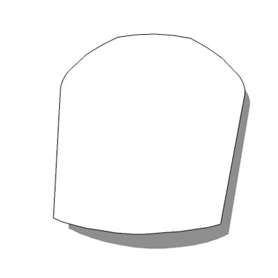
This is what I;ve done so far...it's a toenail. Comments and crits welcome.

-
It could have been filed with a bit more care...and there is no way of knowing if this is for a left or right toe.....and white nail polish?...that sucks!
But keep posting..I want to see the whole ten toenails before I can give you my objective opinion.
-
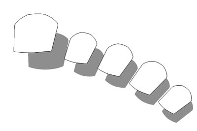
It's a right, of course....here's a whole foot-full.
And don't be so mean. I haven't had time to paint it yet. I'm studying hard for my proctology exams and they're really hard...and the budgie just flew smack into my monitor and there's blood and feathers all over the place.

-
Hate to say, but that lady doesn't even have toes!
-
@pbacot said:
Hate to say, but that lady doesn't even have toes!
Oi! She's got four of 'em! No need to diss her because she's different!
Kevin: Get the bloody chip off your shoulder, and at least try to understand what we're trying to tell you.
-
this is not te hot woman topic!!!!!!!!!!!!!!!!!!!!!!!!!!!!!!!!!!!!!!!!!!!!!!!!!!!!!!!!!!
okay to many !s but stillbtw is this a good logo
****Ж****its some thing ZHE
-
uhhh comments on the logo.
btw, i am going to PM a mod if this keeps up. just please, keep on topic.
-
Waooooooo!!..psychedelic nail polish!!!...like... I havent seen that since the sixties, man

-
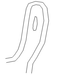
Thanks Stinkie. This is gonna be a more detailed mod. I'm gonna give her fingerprints too. See, I've started.
More soon. I'll post again when I've added another whorl.

-
ok coool polish. make a topic about it and dont post it here!
-
@alan fraser said:
Thanks Stinkie. This is gonna be a more detailed mod. I'm gonna give her fingerprints too. See, I've started.
More soon. I'll post again when I've added another whorl.Ahhhhh...fingerprints!!..so, if she turns up in the 3D Warehouse you can prove to Google that she is yours!!!....devilishly clever!!...have you thought about iris scans as well?
[But Alan....could you wait until you finish the whole fingerprint before you post anymore?]
-
Kevin,
I do like the Logo. Sort of a Samurai look. I think it is good for "K" for Kevin. I also suspect it has been used somewhere before, but how could one find that out?
I have the word "design" in my business name too. I think I will take it out after this.
But I really like the nail polish.
Too much. That fingerprint's been viewed 23 times already.
Remus, what faith was that?
Peter
P.S. Here are some extra "n"s Anyone may use them. Please do. nnnnnnnnnnnnnnnnnnnnnnnnnnnnnnnnnnnnnnnnnnn
-
The logo is the Cyrillic character for the Russian soft Z sound...like in Zhivago.
-
finger print is nice!
excellent progress on that by the way alan.come on though, lets stay on topic.
KD are you seriously asking us to comment on something you didn't even design yourself?
you're right it's a zhe, part of the cyrillic alphabet which represents the voiced postalveolar fricative, similar to the s in the English word treasure or the g in the English word mirage.Pav
courtesy of wikipedia. (except the Pav bit, i added that myself)
-
i mean the choise. It is Cyrillic ZHE (whatever that means)
-
btw why dont you just put the Pav part in the signature?
-
because the grey line scares me.
plus i a rhhhhhealy good at writing my name.ha ha
Pav
Hello! It looks like you're interested in this conversation, but you don't have an account yet.
Getting fed up of having to scroll through the same posts each visit? When you register for an account, you'll always come back to exactly where you were before, and choose to be notified of new replies (either via email, or push notification). You'll also be able to save bookmarks and upvote posts to show your appreciation to other community members.
With your input, this post could be even better 💗
Register LoginAdvertisement


