sketchucation logo sketchucation
    • 登入
    Oops, your profile's looking a bit empty! To help us tailor your experience, please fill in key details like your SketchUp version, skill level, operating system, and more. Update and save your info on your profile page today!
    🔌 Smart Spline | Fluid way to handle splines for furniture design and complex structures. Download

    Hello! Love the board... care to critique a project?

    已排程 已置頂 已鎖定 已移動 Gallery
    26 貼文 12 Posters 2.1k 瀏覽 12 Watching
    正在載入更多貼文
    • 從舊到新
    • 從新到舊
    • 最多點贊
    回覆
    • 在新貼文中回覆
    登入後回覆
    此主題已被刪除。只有擁有主題管理權限的使用者可以查看。
    • S 離線
      spunky
      最後由 編輯

      I Am glad to be here... I have really just started in rendering... and wonder if you would mind critiquing a recent project. Please critique away!


      critique.jpg

      1 條回覆 最後回覆 回覆 引用 0
      • Chris FullmerC 離線
        Chris Fullmer
        最後由 編輯

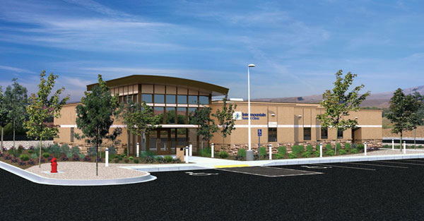
        Thats really quite nice. I am even going to have ask if it is all sketchup w/a photo background? Or is some of the building a photo? Either way, the rendering is quite great. I would suggest this get moved to the gallery forum I think. Thats a more normal place to post work to critique on and show off. Really though, quite nice. Do you have a higher resolution image? It would be nice to see it in more detail.

        Chris

        Lately you've been tan, suspicious for the winter.
        All my Plugins I've written

        1 條回覆 最後回覆 回覆 引用 0
        • boofredlayB 離線
          boofredlay
          最後由 編輯

          This is really good for what I can see. Please post a larger image if you can so we can see more detail. The only negative I can see thus far is the hydrant... does it have to be there, or in the rendering at all?

          I am going to move this to the Gallery.

          http://www.coroflot.com/boofredlay

          1 條回覆 最後回覆 回覆 引用 0
          • S 離線
            spunky
            最後由 編輯

            Here is a bigger picture... it is sketchup with podium and then a whole bunch of photoshop.


            flatclinic.jpg

            1 條回覆 最後回覆 回覆 引用 0
            • B 離線
              bubbalove
              最後由 編輯

              I agree with Boo about the fire extinguisher... if it has to be there just change it to a different color so it doesn't take your eye away from the building! I like the image as a whole but I think that since your building has shadows your shrubs and trees need them too! Nice stuff... looking forward to more!

              "Success consists of going from failure to failure without loss of enthusiasm." - Churchill

              1 條回覆 最後回覆 回覆 引用 0
              • M 離線
                mirjman
                最後由 編輯

                hey nice work! awesome environment feel... the only thing that strikes me is that there is a lot of black asphalt in the view. Some things you might try are just lightening it up color wise so it isn't such a contrast, tilting the view up so it doesn't take up so much of the frame, or just breaking it up with some landscaping/cars/or people even if that is not the actual design.

                great detailed look to it though, very convincing

                1 條回覆 最後回覆 回覆 引用 0
                • O 離線
                  outersketcher
                  最後由 編輯

                  It looks GREAT to me. You've managed to divest the building of the "Sketchup look" quite nicely. Care to explain a little bit how you performed the render?

                  David

                  "I mostly enjoy not being dead.." -Grandpa

                  1 條回覆 最後回覆 回覆 引用 0
                  • S 離線
                    spunky
                    最後由 編輯

                    Thank you! I Am just starting a rendering firm... (is it a firm if it is just one person?) and wondered how far along I was... MOst of this is done in photoshop, the sketchup is the easiest part, the photoshop, that is the hard part... anyone use Podium and really like it?

                    1 條回覆 最後回覆 回覆 引用 0
                    • R 離線
                      ridix
                      最後由 編輯

                      Nice render. Two comments. Trees on the foreground really need to cast some kind of a shadow; looks pasted. And the curves seem little too high; its almost look like a wall. May be the edges are made too sharp. Is that a Mission Peak on the background?

                      1 條回覆 最後回覆 回覆 引用 0
                      • Chris FullmerC 離線
                        Chris Fullmer
                        最後由 編輯

                        The fire hydrant:
                        Use this to help make a better design. Don't remove the hydrant from the render just so it doesn't detract from the building. If it really detracts, then it should be re-designed to go somehwere else on the grounds. Or perhaps redesigning it to be toned down a little. Bit if it has to stay there and it has to be red, do not remove it from the rendering. That would be lieing.

                        Intermountain health clinic? Isn't that on the wasatch front?

                        Chris

                        Lately you've been tan, suspicious for the winter.
                        All my Plugins I've written

                        1 條回覆 最後回覆 回覆 引用 0
                        • S 離線
                          spunky
                          最後由 編輯

                          It is actually here in Sunny (and hot as hades) St. George...

                          1 條回覆 最後回覆 回覆 引用 0
                          • Chris FullmerC 離線
                            Chris Fullmer
                            最後由 編輯

                            Ahh, the background mountains weren't as red as I would expect for St. George. My parents live in Ivins. Quite nice out there, but it is a bit warm this time of the year (most times of the year really). Anyhow, really nice work spunky.

                            Chris

                            Lately you've been tan, suspicious for the winter.
                            All my Plugins I've written

                            1 條回覆 最後回覆 回覆 引用 0
                            • G 離線
                              galbavy1
                              最後由 編輯

                              select the hydrant with the lasso in photoshop and image-adjustment-hue/saturation---desaturate it about 50%, that should help. Saturated colors often don't stand out that much in real life due to material properties like texture and the reflection of the immediate area on it.... I get away with setting the opacity back a bit to avoid putting shadows on photoshopped trees. The transparency "tricks" the mind to not pay as much attention to the plant material- thats the goal if you want to empahasize the architecture, not the landscape... looks really good though!

                              1 條回覆 最後回覆 回覆 引用 0
                              • Chris FullmerC 離線
                                Chris Fullmer
                                最後由 編輯

                                I think its valid to lighten the red hydrant up if it is brighter than it would be in real life. Great tip.

                                But why woud someone want to highlite the architecture and not the landscape?

                                Chris - Landscape Architect (student)

                                Lately you've been tan, suspicious for the winter.
                                All my Plugins I've written

                                1 條回覆 最後回覆 回覆 引用 0
                                • G 離線
                                  galbavy1
                                  最後由 編輯

                                  @chris fullmer said:

                                  I think its valid to lighten the red hydrant up if it is brighter than it would be in real life. Great tip.

                                  But why woud someone want to highlite the architecture and not the landscape?

                                  Chris - Landscape Architect (student)

                                  hey man, LA power all the way! (Im a UF grad and now work at a firm in Tampa) All Im saying is you can strengthen what it is that your trying to present but reducing everything else. When I do renderings for architects I try to make sure that the landscape doesn't detract from the building.... vise versa when I present a landscape plan. Of course in real life they should be designed equally together so they look great together. Have you had a chance to visit Peters' office right above you there? I got to see some of conceptual models for the trade center before they went public!

                                  1 條回覆 最後回覆 回覆 引用 0
                                  • Chris FullmerC 離線
                                    Chris Fullmer
                                    最後由 編輯

                                    All right, as long as you're not the architect type who doesn't understand why we should even include plants in renderings 😄 Theres a lot of them around me where I am I think. I see lots of work that never includes a single photosynthesizing object.

                                    Chris

                                    Lately you've been tan, suspicious for the winter.
                                    All my Plugins I've written

                                    1 條回覆 最後回覆 回覆 引用 0
                                    • E 離線
                                      evilelvis
                                      最後由 編輯

                                      That looks great!

                                      Nice shadow work mate 👍

                                      http://www.coroflot.com/MDVee

                                      1 條回覆 最後回覆 回覆 引用 0
                                      • brodieB 離線
                                        brodie
                                        最後由 編輯

                                        I don't think anyone's mentioned this so I will. You might relook at how the foreground trees meet the ground. It looks like they run right into the sidewalk area. Might look less pasted to have something at the base. A little mulch, some grass, rocks, something like that.

                                        -Brodie

                                        steelblue http://www.steelbluellc.com

                                        1 條回覆 最後回覆 回覆 引用 0
                                        • S 離線
                                          spunky
                                          最後由 編輯

                                          This has been great... I miss being in college and having peer reviews... (I was a photography major). Just after you leave that warm cocoon of creativity... you are just, without perspective on your own work, and you run the risk of thinking all your stuff is just great. So I love this! Thank you all!

                                          1 條回覆 最後回覆 回覆 引用 0
                                          • S 離線
                                            spunky
                                            最後由 編輯

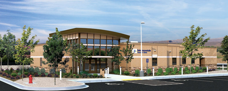
                                            And here are the results of all your help!!!!!

                                            THANK YOU!!!


                                            clinicfinal.jpg

                                            1 條回覆 最後回覆 回覆 引用 0
                                            • 1
                                            • 2
                                            • 1 / 2
                                            • 第一個貼文
                                              最後的貼文
                                            Buy SketchPlus
                                            Buy SUbD
                                            Buy WrapR
                                            Buy eBook
                                            Buy Modelur
                                            Buy Vertex Tools
                                            Buy SketchCuisine
                                            Buy FormFonts

                                            Advertisement