Hello! Love the board... care to critique a project?
-
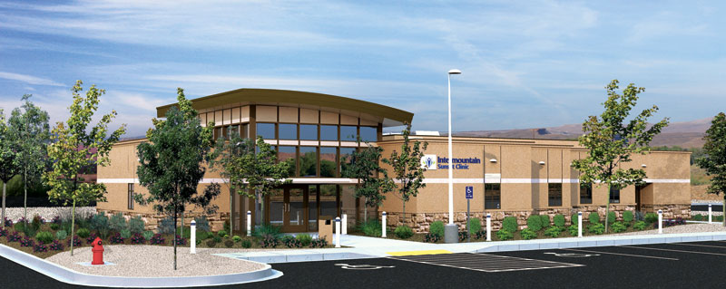
Nice render. Two comments. Trees on the foreground really need to cast some kind of a shadow; looks pasted. And the curves seem little too high; its almost look like a wall. May be the edges are made too sharp. Is that a Mission Peak on the background?
-
The fire hydrant:
Use this to help make a better design. Don't remove the hydrant from the render just so it doesn't detract from the building. If it really detracts, then it should be re-designed to go somehwere else on the grounds. Or perhaps redesigning it to be toned down a little. Bit if it has to stay there and it has to be red, do not remove it from the rendering. That would be lieing.Intermountain health clinic? Isn't that on the wasatch front?
Chris
-
It is actually here in Sunny (and hot as hades) St. George...
-
Ahh, the background mountains weren't as red as I would expect for St. George. My parents live in Ivins. Quite nice out there, but it is a bit warm this time of the year (most times of the year really). Anyhow, really nice work spunky.
Chris
-
select the hydrant with the lasso in photoshop and image-adjustment-hue/saturation---desaturate it about 50%, that should help. Saturated colors often don't stand out that much in real life due to material properties like texture and the reflection of the immediate area on it.... I get away with setting the opacity back a bit to avoid putting shadows on photoshopped trees. The transparency "tricks" the mind to not pay as much attention to the plant material- thats the goal if you want to empahasize the architecture, not the landscape... looks really good though!
-
I think its valid to lighten the red hydrant up if it is brighter than it would be in real life. Great tip.
But why woud someone want to highlite the architecture and not the landscape?
Chris - Landscape Architect (student)
-
@chris fullmer said:
I think its valid to lighten the red hydrant up if it is brighter than it would be in real life. Great tip.
But why woud someone want to highlite the architecture and not the landscape?
Chris - Landscape Architect (student)
hey man, LA power all the way! (Im a UF grad and now work at a firm in Tampa) All Im saying is you can strengthen what it is that your trying to present but reducing everything else. When I do renderings for architects I try to make sure that the landscape doesn't detract from the building.... vise versa when I present a landscape plan. Of course in real life they should be designed equally together so they look great together. Have you had a chance to visit Peters' office right above you there? I got to see some of conceptual models for the trade center before they went public!
-
All right, as long as you're not the architect type who doesn't understand why we should even include plants in renderings
 Theres a lot of them around me where I am I think. I see lots of work that never includes a single photosynthesizing object.
Chris
-
That looks great!
Nice shadow work mate

-
I don't think anyone's mentioned this so I will. You might relook at how the foreground trees meet the ground. It looks like they run right into the sidewalk area. Might look less pasted to have something at the base. A little mulch, some grass, rocks, something like that.
-Brodie
-
This has been great... I miss being in college and having peer reviews... (I was a photography major). Just after you leave that warm cocoon of creativity... you are just, without perspective on your own work, and you run the risk of thinking all your stuff is just great. So I love this! Thank you all!
-
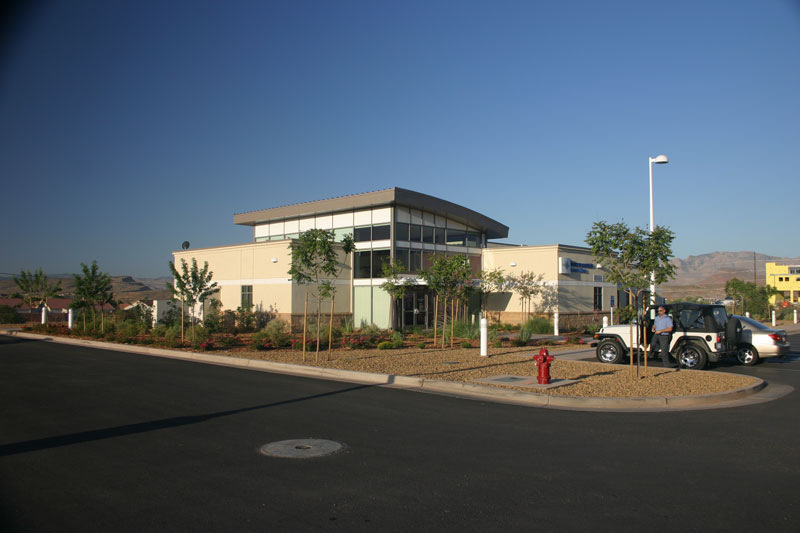
And here are the results of all your help!!!!!
THANK YOU!!!
-
Looks great, but Eric is correct - trees wouldn't grow right out of the pavement like that.
-
I think I misread that from a distance. The second perspective makes it more clear that what I thought was pavement is actually a large rockbed in between the viewer and the building (right?). Nevertheless, it still seems an odd condition for trees to be growing from.
I feel like I'm playing one of those picture games in the dentist's office where it says there are 6 differences between these two photos...
Can you tell us exactly what you've changed from the first render to the last? I noticed that you've zoomed in which was a good call. And I think the whole thing seems a bit brighter too which is an improvement. What else is in there that I'm missing?
-Brodie
-
I know... I thought so too. Here is a picture of the actual clinic. I love St. George, but there landscaping is sparse and at times rather boring. I put shadows on all plants and trees, sharpened and blurred a bit here and there and then lightened it up a bit.
-
Yup, welcome to the southern Utah desert. Trees do in fact grow right out of rock beds there. And that is a bright red firehydrant in real life too
Chris
-
@spunky said:
I know... I thought so too. Here is a picture of the actual clinic. I love St. George, but there landscaping is sparse and at times rather boring. I put shadows on all plants and trees, sharpened and blurred a bit here and there and then lightened it up a bit.
Hrm...not bad but the sky could use some clouds, take out the manhole cover right in the foreground, and that guy getting out of the jeep is totally unrealisic. Not bad materials though aside from the asphalt.
 oh wait, it's real.
-Brodie
-
Hey looks great, i don't care about the fire hydrant but i do think the tar mac is to black make it more gray or dusty.
Hello! It looks like you're interested in this conversation, but you don't have an account yet.
Getting fed up of having to scroll through the same posts each visit? When you register for an account, you'll always come back to exactly where you were before, and choose to be notified of new replies (either via email, or push notification). You'll also be able to save bookmarks and upvote posts to show your appreciation to other community members.
With your input, this post could be even better 💗
Register Login


Advertisement