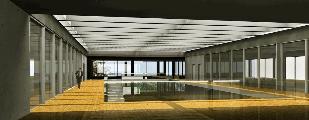
Brasilia Bldg (Podium renders)
-
beautiful design.. your interior renders seem underpopulated though, some people/objects would make them a lot more dynamic
-
thank you all for the encouragement and the comments. they shall help my next renders to be better.
-
Good calm architecture and renders very suitable for presenting it. What slightly disturbs me is that the atrium clearly (to judge by the shadows) has a very large glass roof which is its most prominent feature, yet looking up, it is nowhere to be seen.
Anssi
-
anssi,
thanks for your comments. one way of looking at it is to think that my choice of POV was bad. on the other hand, as kahn did several times, hiding the source of light can give a space a sense of mistery.
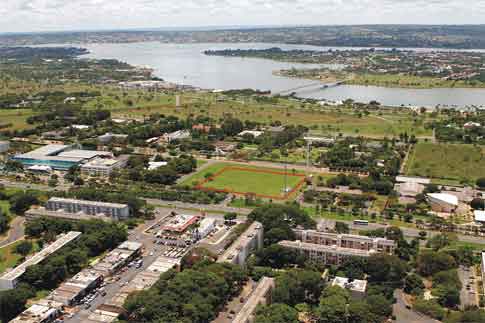
but anyway, just so that you are not left gessing what it looks like, here it goes.

-
dear edson,
this is truly outstanding.. both the render and the design.. the minimalistic approach is well suited here.. i am more inclined to know the building itself in its context to the site and the function it serves.. however this might not be the appropriate forum to discuss it ...
once again.. congrats on the beautiful rendering of what i believe is a phenomenal building!

-
Edson,
Thanks for the explanation, and for another great image.
Anssi
-
jenu,
many thanks for your words.
this is a project for an administrative building in our capital, brasilia. the site is a big plot not far from a lake. it is a kind of rarified urbanism in which the buildings are far apart from each other. in my website there are plans and sections as well: http://www.mahfuz.arq.br-->portfolio-->institutional-->sebrae

-
nice building Edson
the trouble i found when i said maybe the interior shot of the building was lacking of a bit more comprehension of the building, was, once i´ve looked at your portofolio, because on that picture it does not appears the sky, as fortunately your building do.

-
Really fine work there Edson.

Your progress in using render software really shows.
The architecture itself is attractive and reminds me a bit of the contemporary Spanish architecture.
Large scale public 'exterior rooms' etc..
I guess the climate of Argentina is similar of that of Spain, thus the parallels in approach ?...Thanks for sharing this.
-
@kwistenbiebel said:
Really fine work there Edson.

Your progress in using render software really shows.
The architecture itself is attractive and reminds me a bit of the contemporary Spanish architecture.
Large scale public 'exterior rooms' etc..
I guess the climate of Argentina is similar of that of Spain, thus the parallels in approach ?...Thanks for sharing this.
biebel,
thanks for you comments, especially because your work has been an inspiration to me and i have been using a lot the lessons from your 2006 photoshop tut.
your right about connecting my architecture with what has been done in spain for the last 20 or 30 years. i have been looking carefully to spanish architecture for years and am glad it shows.
as for the climate, ours is similar to what they have in the north of spain: hot summers, cold winters, etc. however, do not move me to argentina, although i love to go to buenos aires now and them. my city is geographically and culturally almost there but still in the south of brasil.
regards.
Advertisement


