Roofing
-
I was just wondering how to make the rood on a house/building look proper. So that the shingles or whatever line up at corners etc.
If you get what I mean please reply, thanks.
-
Have You seen this thread:
http://www.sketchucation.com/forums/scf/viewtopic.php?f=81&t=10549 -
Verrou,
The question is: Do you want to have a high or low poly model. If it's high, you cna't do better than the reference Mateo gives. If you want low poly, you have to do a bit of work on the details of the texture you use. Have a look at the roof textures on this site http://www.cgtextures.com/.
I think that roof realism in lower poly models comes not just from the detail at the eves but on ridges, hips and valleys and around chimneys etc. In you photo editor you can put together textures that show these details and fit the model you're building. Also look for roof textures that tile well for big areas.
good luck,
Tom -
Hmm ok. Is it really that complicated?

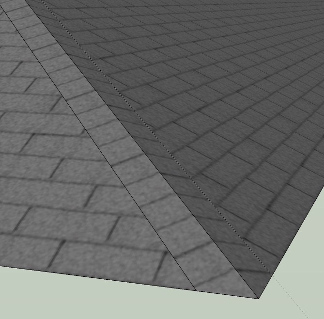
On the left is how I want it, but some edges/corners are unaligned.
-
Use the "texture" right click to "position" the shingles of one roof face, aligned with the eave.
Alt-bucket that texture and paint all the roof faces.
Correct the "errors" by repeating the above on dormers and such (which don't have the same original eave).Have fun!
-
Verrou,
That looks like an unusual roof, if that is shingle. Maybe that's what you want, but along the lines of realism in this thread, there would often be a hip shingle detail. I haven't done it myself. Anyone have pointers?
-
For quick, easy "realism" with asphalt shingles, make sure you start with a full shingle at the eave edge (since that is how the roofers will begin) and align the textures as Tom indicated above. For the hip, simply strike parallel lines about 3 or 4 inches off the hip, then rotate and position the texture as shown in the attached image, again aligning the textures on each side of the hip. Repeat at the ridges.

-
I like Daniel's fix. Seems the fastest and looks pretty good too.
-
Thanks, Chris. I think I would add another step - to hide the lines. Looking at the ugly condo buildings across from my office, I knoticed the hip shingles are barely discernable. It's nice to have that extra bit of detail, but I don't think it is something you'd wan to draw attention too like you would with two lines showing at each hip/ridge.
-
Daniel, I've never heard a word about skipping this step with asphalt shingles (nice job BTW)...but have actually gotten a complement or two for doing it to wood shingles: really helps!
-
@daniel said:
I think I would add another step - to hide the lines.
Interesting... I was thinking of some way to pump them up. Maybe I need to rethink how I visualize this! Thanks for the tip, I will take a second look.
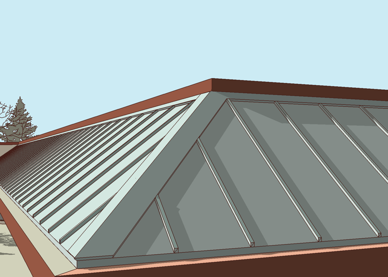
I did a metal hip a while ago and I had a hell of a time modeling that. If I can post the image, you will see I never healed the hip of the metal piece. (edit: looking at the picture I guess you can't tell and really it wouldn't show in a render--but it takes time to do something poorly--bugs me)I probably used push-pull and that leaves two ridges to fix. I have tried making this shape at the bottom of the hip to Follow-me with, but drawing that has been impossible for me so far (to draw the chevron shape perpendicular to the hip).
Maybe I should have used push pull to depress the main portion of the roof instead of pulling the flashing (the borders) out.

Hello! It looks like you're interested in this conversation, but you don't have an account yet.
Getting fed up of having to scroll through the same posts each visit? When you register for an account, you'll always come back to exactly where you were before, and choose to be notified of new replies (either via email, or push notification). You'll also be able to save bookmarks and upvote posts to show your appreciation to other community members.
With your input, this post could be even better 💗
Register LoginAdvertisement


