Gallery Hall (Vray Render)
-
Great work...!!

And the textures are very well done...
I like the soft appearance in the render... How did you achieve it..??
-
Thanks Frederik for the comment. In this scene I used three different types of lighting. Omni directional light from outside, vray emissive light from the ceiling) with value 1, and an inside rectangle light with the value set to 2. That's it.
Cheers,
Khalid
-
Nice rendering. Would that soffit light be clad with stone (how would you support it?)? If so, wouldn't you see the thickness of the stone on the underside?
-
Tray emhasising those paintins with some light, other than that nice work.
-
I would imagine it is only face stone attached much like wall tile.
Scott
-
It's a wall tile and the X and Y set to 1 meter.
-
@daniel said:
Nice rendering. Would that soffit light be clad with stone (how would you support it?)? If so, wouldn't you see the thickness of the stone on the underside?
Dear Daniel, honestly I didn't get your point.
-
Don't cover the paintings with the lighting fixtures. Better use spotlights fixed to the ceiling.
Anssi
-
@khshahen said:
@daniel said:
Nice rendering. Would that soffit light be clad with stone (how would you support it?)? If so, wouldn't you see the thickness of the stone on the underside?
Dear Daniel, honestly I didn't get your point.
He's referring to the linear light or lightwell just above the paintings.. it looks like the face of that is clad with stone like the wall. if so, you will need a lintel of some type.
if this is just for kicks then no harm, just the architects will notice such things. -
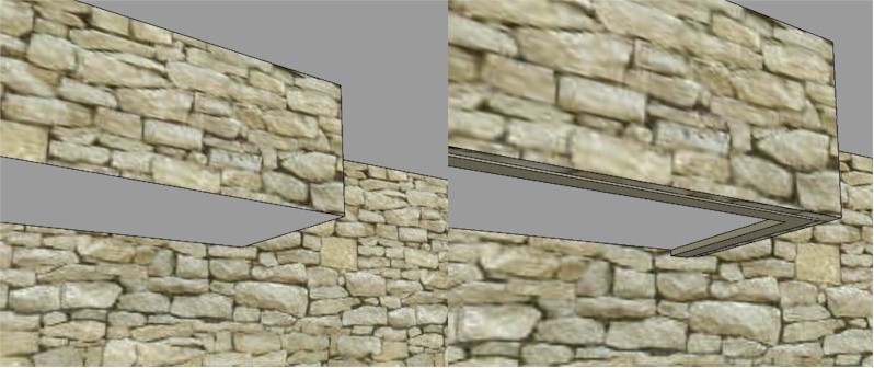
Sorry, I'm being excruciatingly picky - has to do with my job this week. It appears to me that you applied the stone material to the font face only of your soffit light (as illustrated on the left, below), but didn't return it on the bottom to show the thickness of that stone (as shown on the right, along with a supporting frame). It's the sorta thing that only an architect would probably notice.

-
@daniel said:
Sorry, I'm being excruciatingly picky - has to do with my job this week. It appears to me that you applied the stone material to the font face only of your soffit light (as illustrated on the left, below), but didn't return it on the bottom to show the thickness of that stone (as shown on the right, along with a supporting frame). It's the sorta thing that only an architect would probably notice.
[attachment=0:1utuuevu]<!-- ia0 -->stonesoffit.jpg<!-- ia0 -->[/attachment:1utuuevu]regardless, it's a nice rendering.
-
@daniel said:
@daniel said:
Sorry, I'm being excruciatingly picky - has to do with my job this week. It appears to me that you applied the stone material to the font face only of your soffit light (as illustrated on the left, below), but didn't return it on the bottom to show the thickness of that stone (as shown on the right, along with a supporting frame). It's the sorta thing that only an architect would probably notice.
[attachment=0:247hl1ac]<!-- ia0 -->stonesoffit.jpg<!-- ia0 -->[/attachment:247hl1ac]regardless, it's a nice rendering.
not at all Daniel, you're most welcome. Now I got your point. The most difficult part in any realistic rendering is the light distribution and the texture mapping technique. This model took me more than 2 hrs to achieve such an output. Currently, i'm experimenting fluid and realistic water surface which is really hard to achieve in sketchup+vray. The minutes it's done I'll post it here and your comments will be a plus.
Cheers
Khalid
Hello! It looks like you're interested in this conversation, but you don't have an account yet.
Getting fed up of having to scroll through the same posts each visit? When you register for an account, you'll always come back to exactly where you were before, and choose to be notified of new replies (either via email, or push notification). You'll also be able to save bookmarks and upvote posts to show your appreciation to other community members.
With your input, this post could be even better 💗
Register LoginAdvertisement


