Variations On A Theme
-
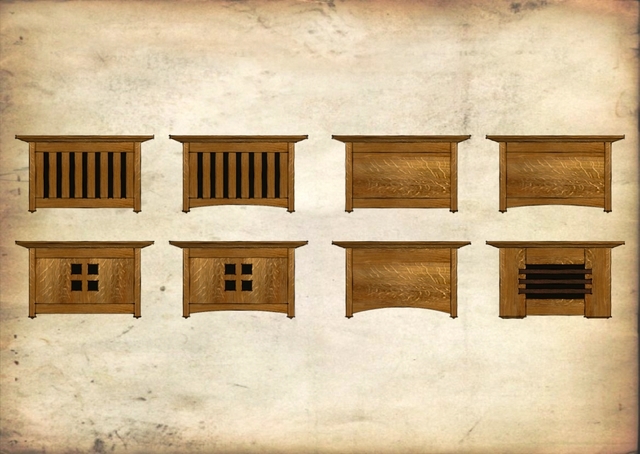
On Friday my brother called and asked me to design a sort of Arts and Crafts style doorbell cover to replace the ugly plastic one he had. I sketched out a few otptions. Thought I'd show them here.

Larger version here.He built the one second from the left, bottom row. I like the one in the lower right corner.
-
I like the second from the left, top row, though his and your favorites are sorta tied for second best.

-
Lower right corner is my favorite too. Nice Dave... maybe this will bring my machines out of hibernation soon and I will build my own.

-
Eric, we're gonna get you covered in sawdust yet.

-
I gotta tell ya, I'd also go for the second from left, bottom row.
Beautiful stuff, Dave.How did you make the picture? It's got such a beautiful "recently discovered DaVinci sketch" to it.
I hope you don't need Photoshop or anything like that. Can this be done purely in SU? -
@gidon yuval said:
I gotta tell ya, I'd also go for the second from left, bottom row.
Beautiful stuff, Dave.How did you make the picture? It's got such a beautiful "recently discovered DaVinci sketch" to it.
I hope you don't need Photoshop or anything like that. Can this be done purely in SU?Thank you Gidon. That was sort of the look I was after. In this case it is a combination of my Old Paper style which I posted in the Styles section and one of Ross' line styles from Form Fonts. the only post production was a bit of auto-contrast in Picasa to darken things up.
-
OMG, you did that on the back of an original copy of the constitution.
-
Dave, I like the way you display your projects. Beside the fact that they are always very nice, they also have very attractive styles.
-
Thank you Luca.
As Roger has discerned, I have access to some very rare paper for these images.

I was thinking that I need to find the photo of the one my brother actually made and post that.
-
I like them all but will cast my vote for bottom right with 2nd from left botton row as a close back up.
-
Thanks Ron,
This was originally posted about a year ago. I keep thinking I'll make ne but I haven't done it yet. I guess since I did these for my brother and he did build one, it was successful.
-
Oops, one of these times I'll have to look at the submitted dates to see when the thread started. Color me red!
-
No worries Ron.
Hello! It looks like you're interested in this conversation, but you don't have an account yet.
Getting fed up of having to scroll through the same posts each visit? When you register for an account, you'll always come back to exactly where you were before, and choose to be notified of new replies (either via email, or push notification). You'll also be able to save bookmarks and upvote posts to show your appreciation to other community members.
With your input, this post could be even better 💗
Register LoginAdvertisement


