Wine rack
-
I'm just finishing up a restaurant and the client asked me to come up with an idea for a different sort of wine rack. It's more for show than anything else as most of the wines are in special coolers. He wants something minimalistic. The whole restaurant is in Oak stained to a dark Wenge color with Burgundy colored MDF.
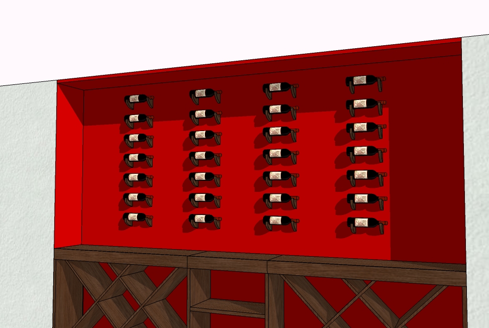
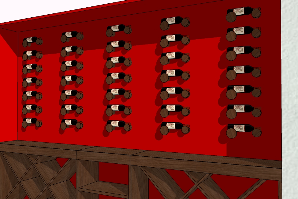
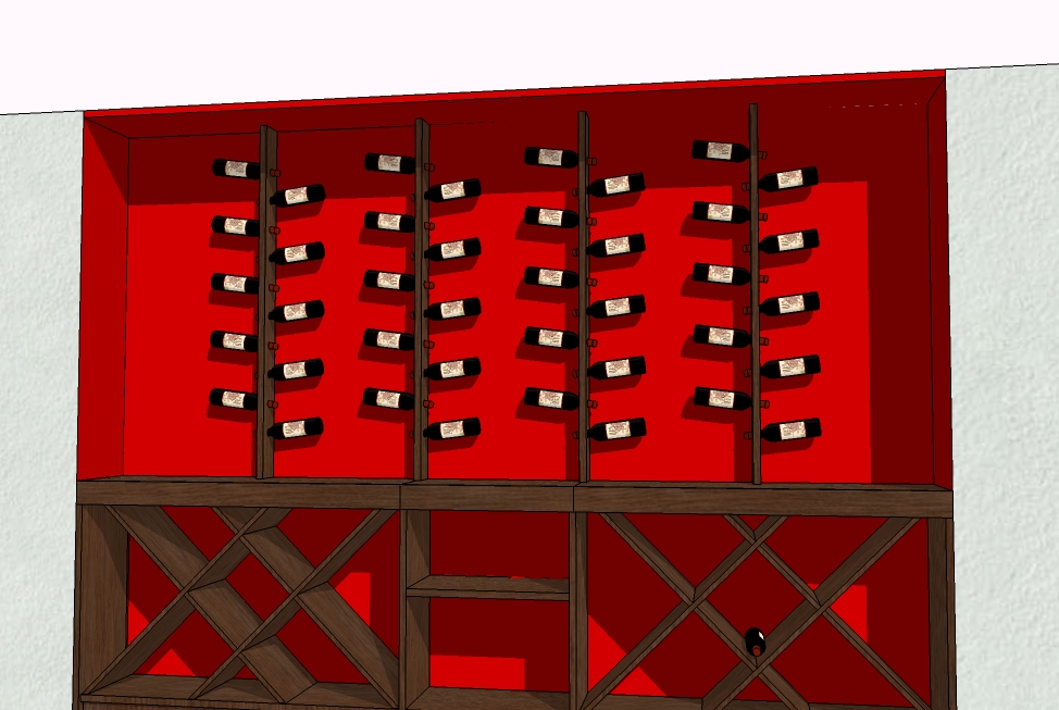
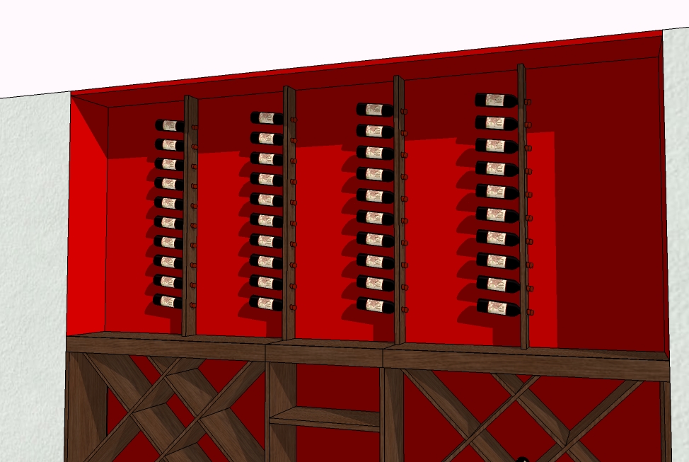
Here are a few ideas I came up with.
I'd love to hear what you guys think and see any other ideas you may have.
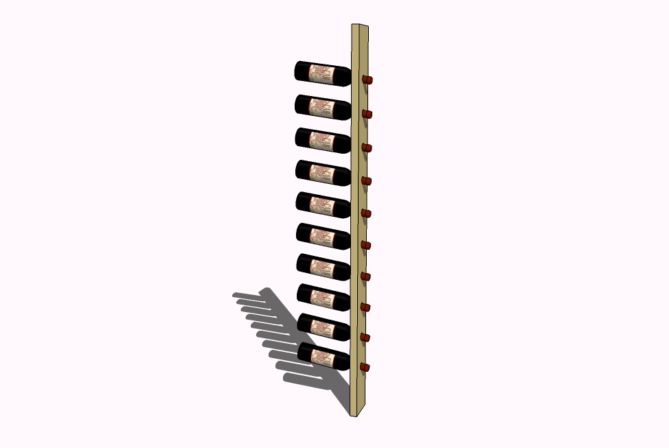
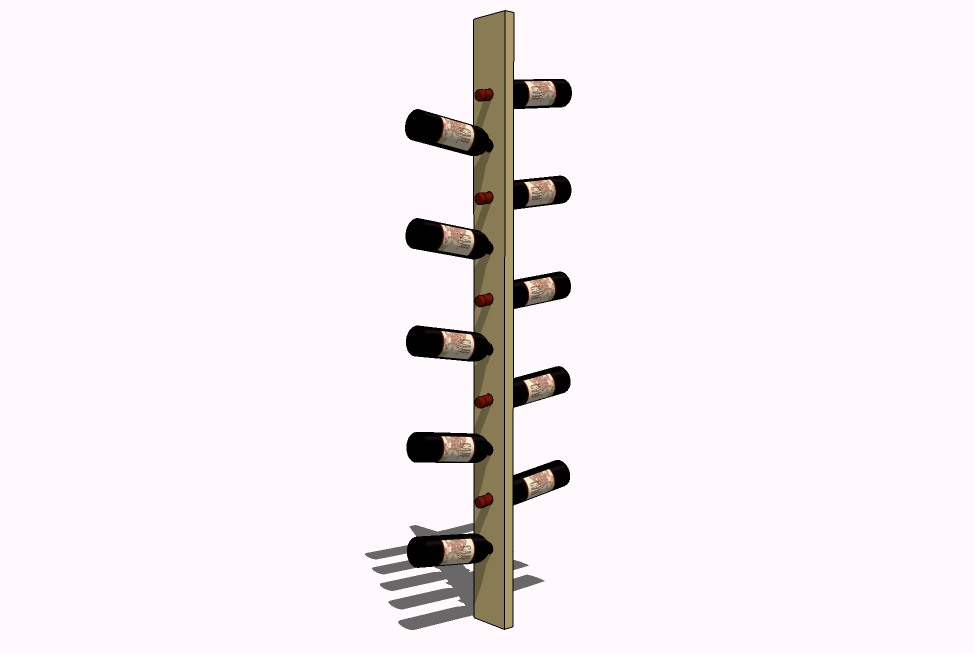
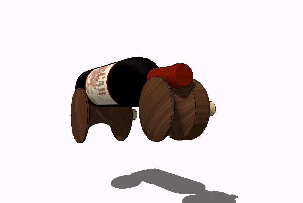
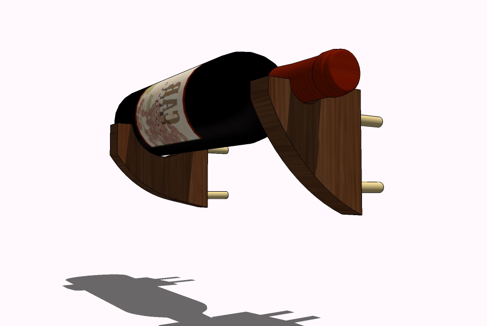
-
This is what the display wall would look like with the different supports.
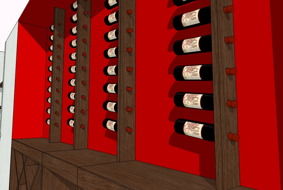
-
Hmmmm, i prefer the first and second ones, although i cant help but wonder how easily the wood will be damaged if someone accidentaly knocks a bottle.
-
Perhaps even more minimal (in terms of material at least) would be simple pegs positioned to support the bottles - two per bottle. Each peg simply angled so the bottle doesnt roll off. To add visual interest, the entire backboard could have a regular pattern of holes so that pegs could be put in anywhere to support a bottle. Also the pegs could be different random lengths to give more visual interest. I can picture the pegs just being lengths of dowel with their exposed end rounded over.
-
Remus, I also prefer the first and second options. I'm not too worried about damage seeing as no-one will be touching these bottles. They're just for show.
Ross, I'd love to be able to support the bottles on angled pegs but the Burgundy back-board is already in place and I don't like the idea of drilling at an angle with a hand drill at the site.
-
Very nice Gidon.
Maybe I should loan you my hand drill. It only drills angled holes.

-
Just looking at that burgundy wall I can't help but think a very different approach might be worth investigating. The idea is to forget displaying so many bottles on it and instead feature just two or three, each in their own simple, tasteful, framed shadow box. In the shadow boxes the bottles could be supported on little brackets or turned supports like the ones you've designed. The framed shadow boxes would serve to really feature a few special bottles. I can even imagine them being empty bottles commemorating the special occasions when they were opened. An engraved plaque below each could tell patrons the story of each bottle and the special occasion on which it was consumed. I think patrons are much more likely to appreciate such a display and the burgundy wall seems well-suited to it.
And there's another woodworking opportunity in the idea. Imagine if the restaurant's most expensive vintages included a similar shadow box that the patrons could take home along with their empty bottle to commemorate their special occasion in their own homes. It might help market the really expensive wines to patrons who'd typically order less special ones.
-
-
I personally like
 the first one. I believe two of them faced towards each other would look really good
-
Hi Gidon, It seems you have a quite a bit of depth to work with; how deep is the recess? I am thinking you should rotate the the bottles to face outward and angle them down. This was your client will be able to get more on the wall..... you know the more you see the more you drink. [or is that just me]
Also, maybe think about lightening up the wine rack frames; maybe with another product other than timber. It sound like there is enough timber throughout the restuarant to deal with.
attached the .skp file so we can have a play.....
-
My relationship with wine . . . is one of relaxation. The designs with the bottles cantilevered by their necks bother me. Too much tension.
I think Ross's idea above is excellent. I'm sure the rest of the store is filled with quantity, this could be the place to emphasize quality. And I can just imagine the kind of person who would drop big money on a bottle of wine and a display case to memorialize it. (Probably not my friend, but perhaps my customer.)
-
Thanks for the responses and ideas.
In the end the client opted for this: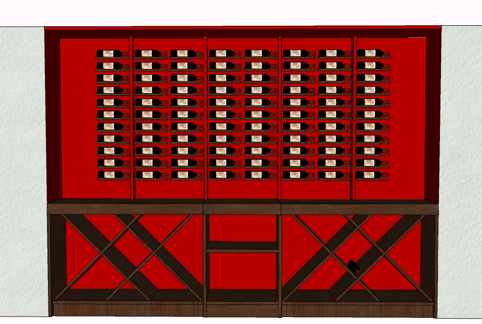
I tried to sell him on Ross's idea but he and the architect were adamant.
It seems that the purpose of these bottles is more visual than anything else. A kind of 3-D wall paper, if you will. -
dammed clients, always going for the boring options

Hello! It looks like you're interested in this conversation, but you don't have an account yet.
Getting fed up of having to scroll through the same posts each visit? When you register for an account, you'll always come back to exactly where you were before, and choose to be notified of new replies (either via email, or push notification). You'll also be able to save bookmarks and upvote posts to show your appreciation to other community members.
With your input, this post could be even better 💗
Register LoginAdvertisement


