Sun room rendered in Kerkythea
-
My first attempt at a comeback to the KT scene. Thanks to all the fantastic folks here and at the KT forum for assistance and encouragement.

Too much fun!!

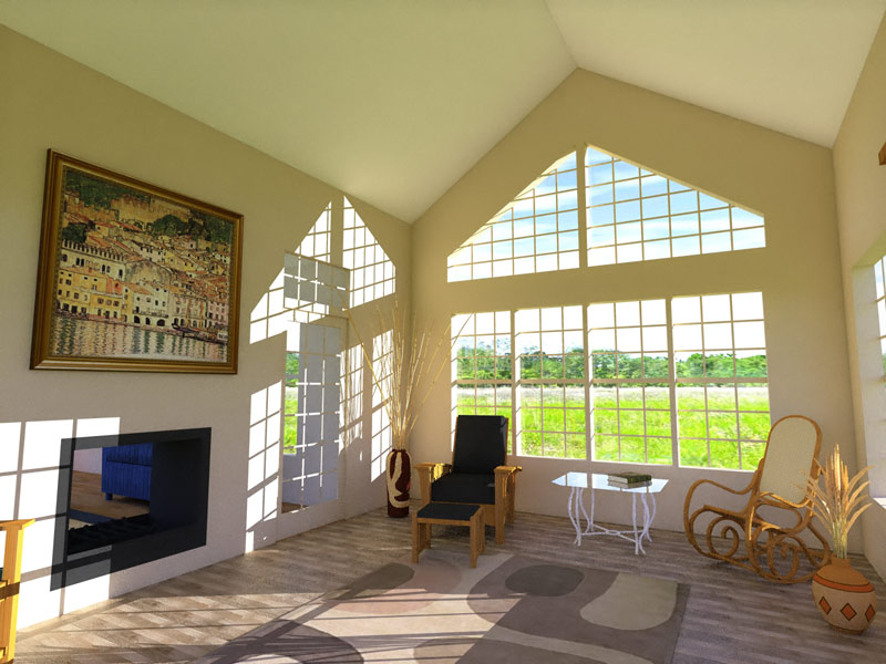
-
Wow Nick that is really beautiful. My only 2cents... to soften the light coming in from the windows and something seems out of scale in the background scene? Maybe the grass?
-
Nice lighting Nick:)
-
@tinanne said:
...My only 2cents... to soften the light coming in from the windows and something seems out of scale in the background scene? Maybe the grass?
That's what he was told over the KT Forums, too...

Definitely, that would enhance the whole thing. I like it, too!
-
Looks nice, calm, and relaxing.
-
I can feel the warmth from my computer. Nice!
-
That looks great, Nick.
-
Very good to Kerkythea render!
Very nice! -
Thanks everyone.

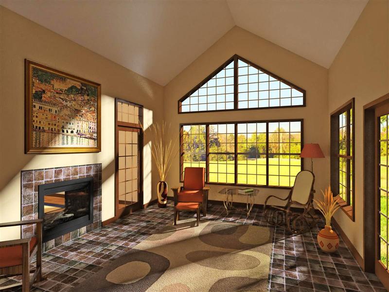
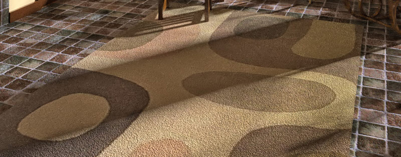
Here's another go at it. I took a shot at bump maps, etc. in KT. I was pleased with the result of the rug, but still working on the tile. Back to basics - I'm reading the Material Editor Guide - or just "to basics" I guess...

added details to model (trim, baseboard, fireplace, logs), changed bg, softened light... I'm learning

-
Nick, that is gorgeous! Sooo warm and inviting, I want to snuggle with my hubby in that room

-
Nick,
Nice advance, really!
The soft shadows and the bumps on the rug are now great.
Maybe you should set the bump on the tiles reverse (or inverse? - I'm not sitting at Kerky now). This way the whites would be "deeeper" rather than "higher" as are now. -
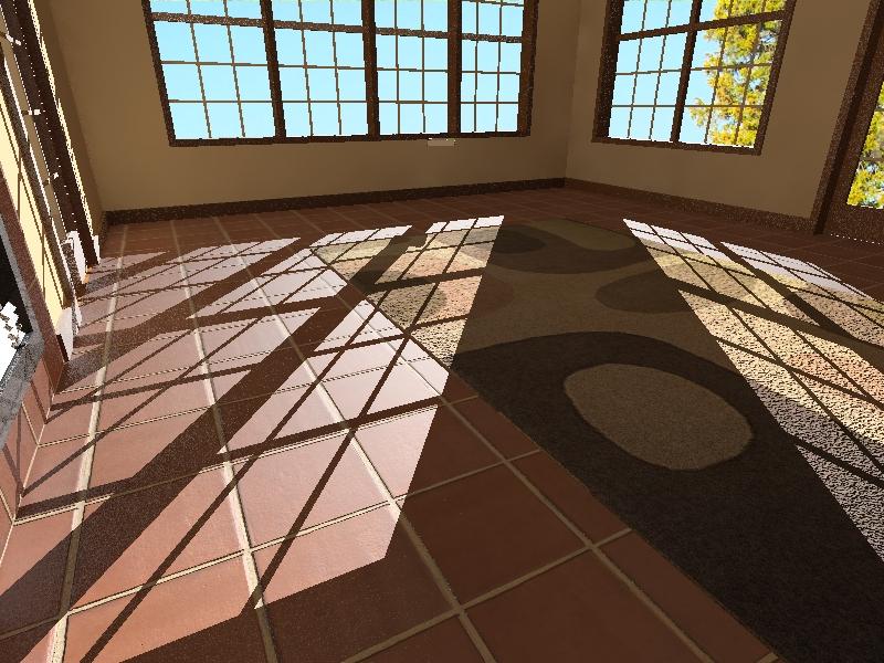
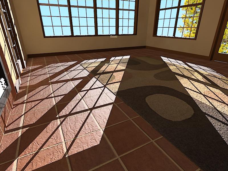
working on new tile. got a nice high res base from Solo - a converted Maxwell tex.
I thought I'd give this landsat image texture a whirl superimposed over the smooth tiles to add some "earthiness".
-
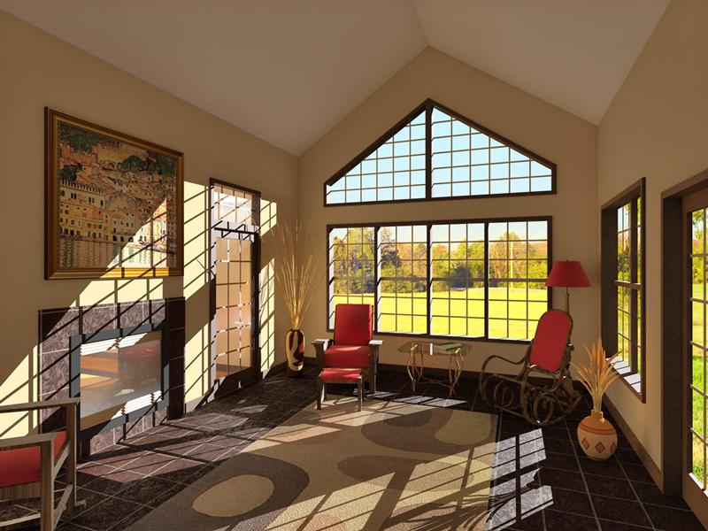
Here's what I cooked up over the weekend. Unfortunately, I forgot to enable the soft shadows before rendering... oops. Oh well, I can do better yet before I call it done. The reflectivity experiment with the fireplace glass doesn't look great and the tiles are much darker and flatter looking than I had hoped. Oh, and the adjustments I made to the tile mapping position got lost somewhere in the fray - I had lined it up to evenly frame the fireplace - I've lined that up once again.
With the color of the tiles it seems either something changed between my last test and this render, or Photon Map and MLT mode interpreted it differently.
I'm setting the glass back to straight-up TG and I'm not sure yet what I'll do to try getting the tile to look better. I guess some prelim test in MLT would be appropriate since my final render will be in that mode.
-
That looks great, Nick.
-
Thanks for the tips and encouraging words, everyone.

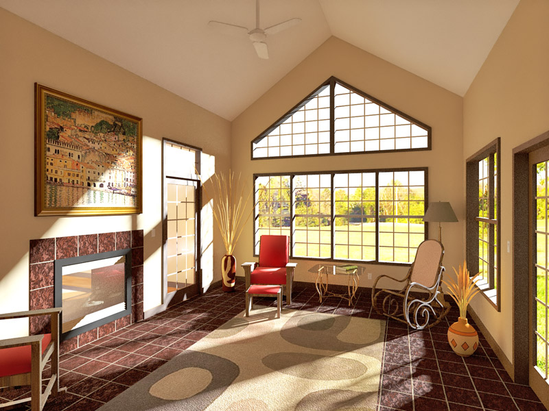
Here's the "final" version. Changed since last posting: some colors & textures, tweaked tile color/position/bump map, softened shadow, ceiling fan, light switches, outlets, tone mapping.
I experimented with HDR on this - output 5 Gamma tonemap exposure steps (1.00, 2.00, ...), merged them in PS, then Shadow/Highlight adjusted. I liked this version better than the product of my previous process (HSV or Linear tonemapping, PS Shadow/Highlight adjustment). It produced a more realistic image; though highlights are more overexposed than with just Shadow/Highlight adjustment, it appeared more like a real photograph for that very reason.
Hello! It looks like you're interested in this conversation, but you don't have an account yet.
Getting fed up of having to scroll through the same posts each visit? When you register for an account, you'll always come back to exactly where you were before, and choose to be notified of new replies (either via email, or push notification). You'll also be able to save bookmarks and upvote posts to show your appreciation to other community members.
With your input, this post could be even better 💗
Register LoginAdvertisement


