Quick sketches of new project...
-
...looks like I'm being offered up to the board to do some bond issue renderings :`)
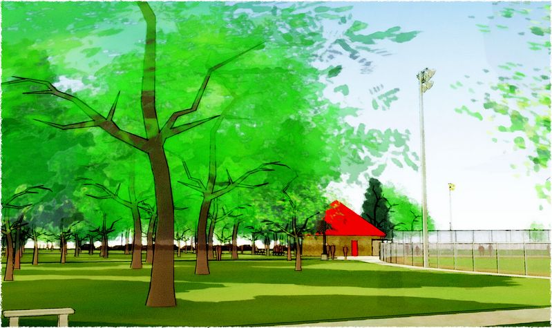
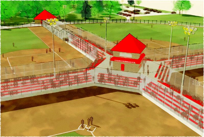
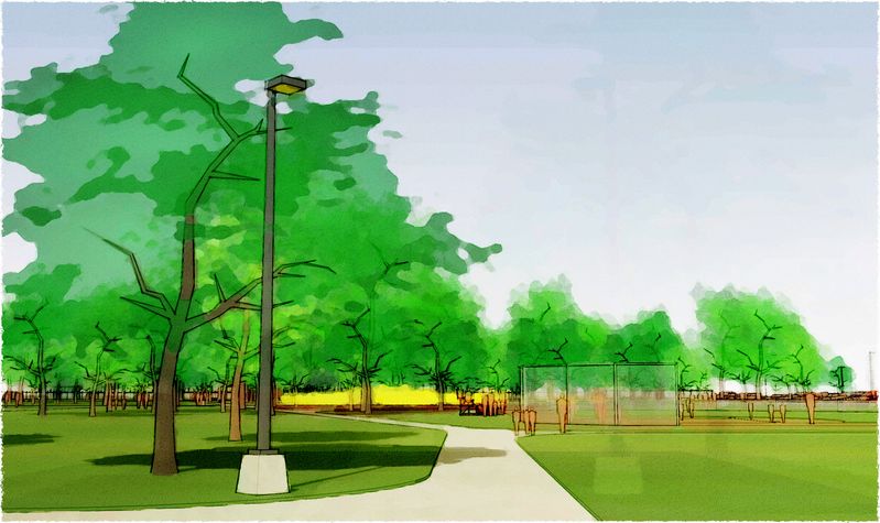
-
tom
Your effects are very nice, how do you make them
or is it secret?Thanks Marc
-
anglaret, bit of a stab in the dark here, but it looks like a variation on a watercolour technique. If you do a forum search for 'water colour' you should get a wealth of information on achieving the watercolour look, then to get something a bit more like toms, i iamgine you just tone it down a bit and bit a little less liberal with the effects, perhaps turn up the contrast/brightness a bit?
i'll jsut wait for tom to come and tell you soemthing completely different now...
-
always a treat to watch your posts!
very refreshing!! -
Wow Tom, the last three are amazing. Thanks for your description of your method. Your style is certainly unique, i.e. it is much brighter and colorful than the normal. "Viva la difference."
Best,
-
First of all, please let me apologize for not responding sooner. I've been cranking to finish this model, so waiting for the time to answer appropriately...and thus inappropriately didn't respond at all.
Marc, no secret...and remus, spot on. Thanks, all. I use many of the methods described here:
http://www.sketchucation.com/forums/scf/viewtopic.php?f=82&t=4616
and will use more of them: excellent thread!Attached is another image of the almost done model, and here's how I did it:
I export several images from SU, all with shadows on except for the edge only image:
materials/textures only (M), xray of that (X), hiddenline profiles only set to jaggeredge (PKJ), hiddenline edge only no jagger no shadows (L)...for this one I used Ross' pencil style and really like what it does, thank you Ross. I vary the export size depending on the size of the details I want to keep: 3000 wide for most work, 4000 for this one (this on coulda/shoulda been 5000 but my laptop runs out of memory too often at this size...hope the new 'chine doesn't :~)In PSP I first make the DWC layer:
I dup M and set that to screen with a pretty high transparency value (high-t...nearly or fully opaque) to lighten the SU colors. Over these two layers I add a low-t overlay layer (often just a mirror of M or X...but sometimes another image: like clouds) to brighten the SU colors and add "blotches" and "mistakes". Now I merge all, apply a "soften more", then a "gaussian blur" set to 8 (a lower number will save detail, higher gets real sketchy). Now the fun begins: "caravaggio" from xero settings at max artistic, "pyramid paint" from KPT, then "beyondedger4" from DC (all these are free except PP...which I don't use every time).
(I've found the above to be a pretty reliable 1-2-3 but it doesn't always work on its own...this image took a couple of trials darkening and lightening portions of the three layers before merging to get a nice overall DWC effect.)
Then the image:
Base layer is the DWC.
Over that are the layers to adjust the overall composition, texture, color, and detail...set to different layer blends and various transparencies. For these I'll use the M, X, and/or the DWC (each most often softened or blurred a bit, sometimes hit with other whacky filters), with areas erased or painted over with white (I also use "sidemerge" from DC quite often to give the image an evenly blended effect from front to back, side to side, or whatever). This DWC was a nice surprise and only has a high-t "softlight" X layer.
Above these are the edge layers, I set them to "burn" so they take on a hint of the colors below. PKJ is softened and blurred quite a bit and usually pretty high-t for darker shadows (so I usually have to paint out some of the lines with white). L is hit with "soften" once (or it won't take on color and looks all pixelated and SU'y). This image has one PKJ set to 65, and three (the bottom one softened again) L's set to 100 (because the sketchy edges are pretty greyed out...you'll only need one or two with straight SU edges).
On top is the "paper" texture. Instead of applying a texture from the effects menu, I use a "burn" layer of a black spots image I created from a paper texture (and sometimes I add a "dodge" layer of a white spots image too). This gives me a colored "paper" texture instead of greys. The "burn" is set to mid-t and the dodge is "low-t". This image has only the "burn" texture layer.
That's it for the tech, all are merged, border added (the only one I've found I like so far is "jaggedge" from DC). Now comes the pain of critical review and often lots of little tweaks and adjustments hoping to get one that lets you sleep.
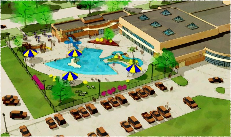
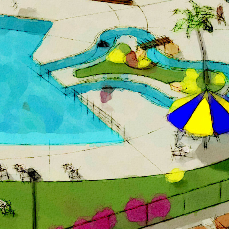
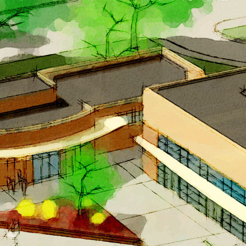
-
Peter, glad you like the bright...can't seem to help myself :`)
Here's a couple more looking for my voice...suggestions to make better, please all:
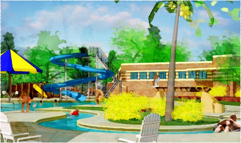
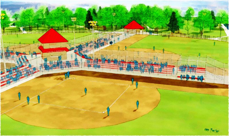
-
Simply stunning work, Tom! Your presentation certainly gives a "warm fuzzy" to me. I would think the style would really help sell the concept.
Thanks again for sharing,
John S.
Hello! It looks like you're interested in this conversation, but you don't have an account yet.
Getting fed up of having to scroll through the same posts each visit? When you register for an account, you'll always come back to exactly where you were before, and choose to be notified of new replies (either via email, or push notification). You'll also be able to save bookmarks and upvote posts to show your appreciation to other community members.
With your input, this post could be even better 💗
Register LoginAdvertisement


