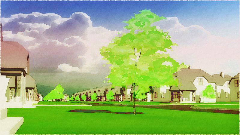
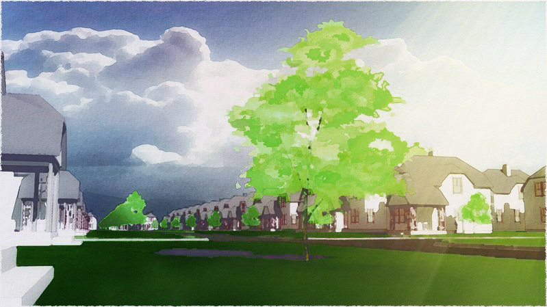
Big storm a'comin'...
-
Tom, I was wondering what it would be like if you lightened the shade/shadow and put some yellow on there. Here is a quick mock up.
Love your work, hope this doesn't offend.

-
Absolutely great work as always!
-

SchreiberBike...the clouds were picked to match in the center section (and could be better matched, I agree), the fading of the sky to the right was "artistic license" (which seems not to have worked so well :`)
Cheffey...tried several similar (and thanks for your post, it prompted me to try again) but I wanted to retain the greenish light of a big storm. Above I did yellow-up the neon trees (which still look a little too "lime") to better fit with the grass (probably should fix these in SU), and cooled the greys just a little to fit the overall wet-chilliness. Better?
Will add the sky back in when I get the chance to play again and put it all together...you guys are helping alot, thank you very much!
-
The only other thing I can think of would be a Gradient from the background to the foreground on the grass plane... Darker in the background to lighter in the forground.
I was thinking that the sun was peeking out on the right of the image and the storm is coming in from the background.
BTW what photo editor/paint program do you use? -
Yeah, you're right Cheffey, something needs to fight that rather hard edge horizon...and now that you mention it, the crossing road curb on the left really flattens the space back on that side. Thanks.
I use PaintShopPro 11. I like the interface better, it loads all the filters/plugins, and it has some features I didn't find in a trial of adobe elements...but I'm finding you guys are talking about some controls there I don't have...?
-
Can you open a PSD file?
-
It says I can...wha'd you have in mind?
-
Thanks to Cheffey, I explored adding some washes to the image (and also tried to incorporate some of the other helpful advice I've received here)...much more to study and practice, but whadaya think so far? Any of these trip your trigger(s)?


-
Looks a bit oversaturated to me Tom, There are a lot more way you can add a glow effect to your image which are better than messing with the curves you know. For isntance a layer blend will get the job done much more efficient.
-
Out of all of the images posted, my favorite by far is the very first one.

-
Boo...yeah, me too (except for the tree white-out) as a stand alone archpres, but artisticly I was trying for that sky quality just before the tornado storm hits...greenish, deeply saturated, wet impending. I haven't hit it yet, with this own either:

-
@tomsdesk said:
. . . artisticly I was trying for that sky quality just before the tornado storm hits...greenish, deeply saturated, wet impending. I haven't hit it yet, with this own either:
You are aiming high. I'm sure there are others, but Winslow Homer is the only one I can think of who gets that consistently right.

-
i think it's great that you have taken to studying this.
i still think those are a bit too saturated.
it might be nice to find examples of what you are going for, i'm not sure exactly.
is AJ still around he would be one to ask about this.here is what i came up with, i think the lightness to darkness from foreground to background could be pushed more.

-
...cut saturation by -30, darkened the horizon white by -40 (not pretty up close yet), and did a fading dodge from front to back: and of course you were right, as usual, and I'm quite happy with this lesson, thanks!


-
And the last...less moody, maybe more pleasing...?

-
Wow! yes that last one is very nice.

-
I dig it Tom, thanks for sharing your progression. I like the sun rays - I love to see the sun shine through the clouds, it just makes me happy.

-
tom,
your stuff should be hung on a gallery wall! ever thought of printing them on very good thick paper and selling them?
my respects to you as an artist!
Hello! It looks like you're interested in this conversation, but you don't have an account yet.
Getting fed up of having to scroll through the same posts each visit? When you register for an account, you'll always come back to exactly where you were before, and choose to be notified of new replies (either via email, or push notification). You'll also be able to save bookmarks and upvote posts to show your appreciation to other community members.
With your input, this post could be even better 💗
Register LoginAdvertisement


