Capri WIP
-
Howdy yall,
this is my first post in the gallery here, It is a WIP, right now I'm almost done texturing the left side of the street and i'll be moving on to the hotel at the end of the street.
I hope you like it. If you want to see how this image progress, here is the link.Of course comments and suggestion are always welcomed.

9-07-07
Hi guys, instead of making you scroll all the way down and up so that you can see and compare the images progress, ill put them together at the top for your convinience and i'll add a little explanation on what I did and what is left to do.Image 2: So we are finally on the green zone, I'm about 40% done. I worked mainly on the street floor. I'm pretty happy with it. I believe it has the dirt in all the right places. But now I need to touch up the brick texture because it look too new compared with the stone texture. Also, the stone has a hit of reflectivity which it will become more obvious when I get to the lighting stage. Also, the hotel has the main texture applied but the sun is washing it away. Once I do more work on the hotel I will shift the sun so that it compliments more the look of the texturing, so that you can see it better.
PS: this is the exact same explanation is in the podium website, sorry I just dont have the time to write new stuff.
I hope you like it.

Image 3: Image 14: Green zone has been completed (for the first texture pass). Once I do the first lighting pass I will check if there are any touch up needed for the textures. I also started the lighting inside the hotel. You can see the chandelier and a couple of statues I put in there. One thing I forgot about was to model the curtains inside the hotel so I guess ill be going back to modeling for a few minutes before I keep on lighting the hotels interior. BTW, I'll will "light " the scene starting from the green zone, then yellow and then red zone.
[stuckon3d]
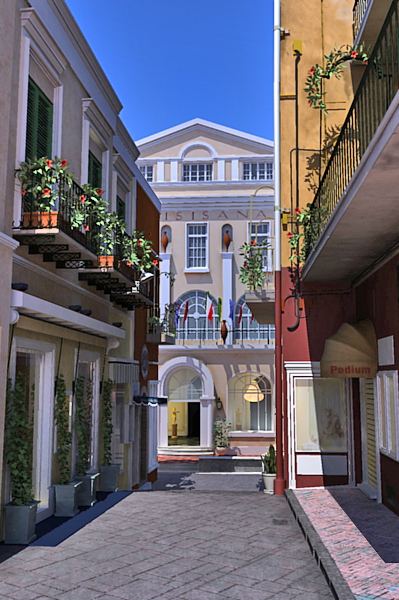
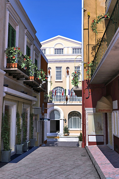
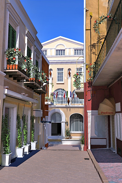
-
Very realistic for a podium render, podium has indeed come a long way! The level of detail is insane, how long have you been working on this? Very well done, keep us updated!
-
@robmoors said:
Very realistic for a podium render, podium has indeed come a long way! The level of detail is insane, how long have you been working on this? Very well done, keep us updated!
thanks Rob, as far as time is concerned, I started 3 weeks ago but I only spent 2 or 3 hour per night, and sometimes non at all( my wife needs me too
 ), to me time is irrelevant, I'm doing this for fun and to brush up on my skills because at work I'm only doing one aspect of 3d which is lighting. I cant wait to get to that stage for this image, but I must said that im really enjoying modeling and texturing in SU too.
[stuckon3d]
-
Excellent image!

The one and only thing that irks me about it, if I may, is the street floor - I think that if you spent some time finding a good set of textures for a nice bit of paving or cobbles - then altered them to really sit well in the scene (you know, have some realistic change to the material as it reached the edges - a bit of dirt - something like that, and increase the specular of the texture through the middle where people have made it shinier due to their walking there). . . that would really just finalise this wonderful image for me.
Look forward to seeing any updates on this one!
Cheers,
Marc x
-
@marcday said:
Excellent image!

The one and only thing that irks me about it, if I may, is the street floor - I think that if you spent some time finding a good set of textures for a nice bit of paving or cobbles - then altered them to really sit well in the scene (you know, have some realistic change to the material as it reached the edges - a bit of dirt - something like that, and increase the specular of the texture through the middle where people have made it shinier due to their walking there). . . that would really just finalise this wonderful image for me.
Look forward to seeing any updates on this one!
Cheers,
Marc x
thanks Marc, and I could not agree with you more, the texture you see there for the floor is just a standin until I get to texturing the green zone. If you are going what? let me explain, I divided my texturing work in three areas, red. yellow and green. This is also the way im going to light the image, in chunks and then put them back together in photoshop. I'm doing this to reduce rendering times and to have more flexibilty.
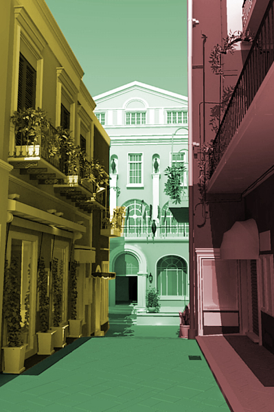
As far as having shinier areas where people traffic goes, that is a great idea, I'll try to pull that off on the texture itself and on a few slates by adding a little reflection to them. thanks for the input.

[stuckon3d]
-
Hi stuckon3d (I like to use your real name
 )
)On first moving onto this thread I thought the image
was a photo! Well done on this standard of work and
as the guys have already said, please keep us posted
on progress.Yes, I think Tavi is doing great development work on
Podium. I hope he bring a Mac version on stream soon.Mike
-
@mike lucey said:
Hi stuckon3d (I like to use your real name
 )
)On first moving onto this thread I thought the image
was a photo! Well done on this standard of work and
as the guys have already said, please keep us posted
on progress.Yes, I think Tavi is doing great development work on
Podium. I hope he bring a Mac version on stream soon.Mike
thank you so much Mike, Its always nice to hear nice things about your work.

as far as my name... is "Cris" , yup no "h".[stuckon3d]
-
You mean this is not a photo


Very nice work Cris.
-
@unknownuser said:
You mean this is not a photo
 8O
8OVery nice work Cris.
thank you Eric, you are too kind but this is not even close to being done, as a final image that is, texturing on the other hand and im almost there. I added a new image with a little explanation on what I did on it.
Enjoy.
[stuckon3d]
-
First texture pass complete, moving on to lighting the scene next. Actually I already started lighting it a little already. check out the chandelier inside the hotel lobby.

The image is at the top of this thread. C&C are always welcome.[stuckon3d]
-
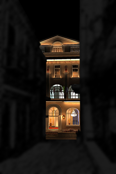
the first hotel light pass is done! I decided to break the green zone in two part. The foreground part of the street and the hotel in the background. This makes more sense for compositing the image. Also the window do not have any reflection, I will do this in a separate pass after im done lighting the entire image. So far I have used 22 omni lights and 20 LEM and as you can see the render times are still very decent. About 25 minutes at 800x600 full quality and antialiasing. SO... yellow zone here I come!
Hope you like it, C&C are always welcomed.
[stuckon3d]
-
Amazing Stuckon....

It's certainly an adventure to follow your progress on this scene.
Also very cool how you could limit that render time. I guess you are right to add the reflections later to limit R time on the test renders.Looking very cool....Somehow the scene with that lighting reminds me of a 'going out' night in the Quartier Latin in Paris on a summer night.
It shows that you really are a lighting expert.Cheers,
Kwistenbiebel -
i really love the night rendetion of this series
-
Thank you guys, your comments make me all warm and fuzzy inside, it also makes me want to push myself even harder and do even better.
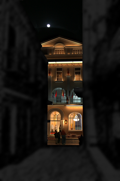
Here is a second light pass for the hotel with some people and a moon added.Enjoy!

[stuckon3d]
-
Cris
Can you link a larger picture?
Looking fantastic, so much detail that gets lost at such a small size.
thanks.
-
@solo said:
Cris
Can you link a larger picture?
Looking fantastic, so much detail that gets lost at such a small size.
thanks.
Thanks solo, the thing is that I dont have the full composite at full res yet (3076x2304), but here is the link to the raw image of the hotel lighting which is (3076x2304). Unfortunately, I cant post the image here, it is telling me the file is too big.

[stuckon3d]
-
I've been having so much fun lighting this shot, I just could not stop this weekend, so here is the first light pass for the yellow zone. Some of the plants and the glass reflections are left out on purpose so that the renders go faster, but as you can see, you can pretty much tell what is going to look like with them anyway. So what Am I going to work on next? Some of my omni lights are creating burn on the window shops and doorways, so this will be fixed of course, also the floor in the foreground is just a temp floor, the way I envision this is having pools of light coming from the window displays. I think it will make the picture look very enchanting.
[stuckon3d]

-
It is already very enchanting!
But I think the too much light in the front distracts the eye from the hotel a little bit - that has so much warmer (thus less) light. But it can also be the "light leak" or something you are mentioning...Really nice!
-
@gaieus said:
It is already very enchanting!
But I think the too much light in the front distracts the eye from the hotel a little bit - that has so much warmer (thus less) light. But it can also be the "light leak" or something you are mentioning...Really nice!
Thank you Gaieus, that was a good observation, and you are correct the green zone is competing with the yellow zone in brightness so the eyes dont know where to look first. What I will end up doing to guide the eyes better is attenuate the lighting as it goes further into the street thus by the time your eyes hit the hotel, it will looked frames in semi darkness, thus making it pop up and show its full spendor. what do you think about that strategy?
[stuckon3d]
-
Someone told me that the human eye (read psychological eye) is drawn first to those parts of an image with the 'warmest' colors/light, as those warm colors are considered to be mentally pleasing.
That's the reason why good photographers often choose to shoot images where the object is lit with warm light while the not so important info in an image is left cold coloured. (the 'Chiarro-scura' effect)
In that perspective, I can understand Gaieus reasoning that one would expect the hotel to be center of focus and thus having the 'warmest' appeal.
Those people you added, walking towards the hotel, point out that you want the hotel to be that attraction point. I would expect lighting to follow the same philosophy, but hey, the image isn't finished yet right?
 ....First see what the genius will make of it
Hello! It looks like you're interested in this conversation, but you don't have an account yet.
Getting fed up of having to scroll through the same posts each visit? When you register for an account, you'll always come back to exactly where you were before, and choose to be notified of new replies (either via email, or push notification). You'll also be able to save bookmarks and upvote posts to show your appreciation to other community members.
With your input, this post could be even better 💗
Register LoginAdvertisement


