Digital watercolour...
-
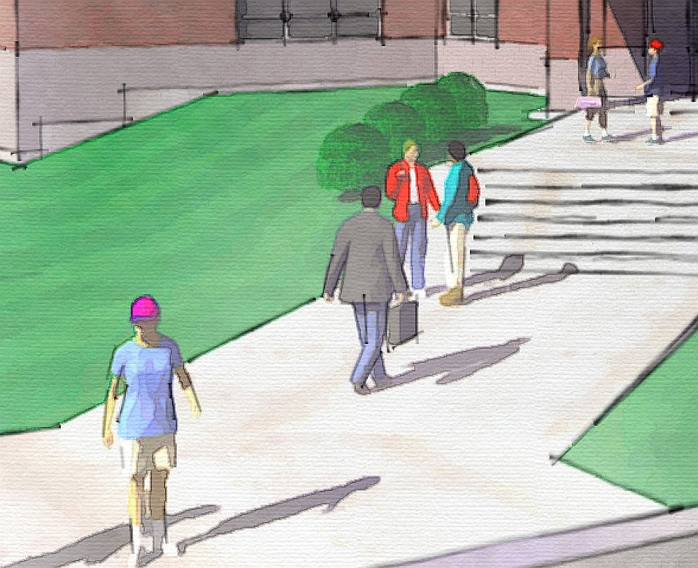
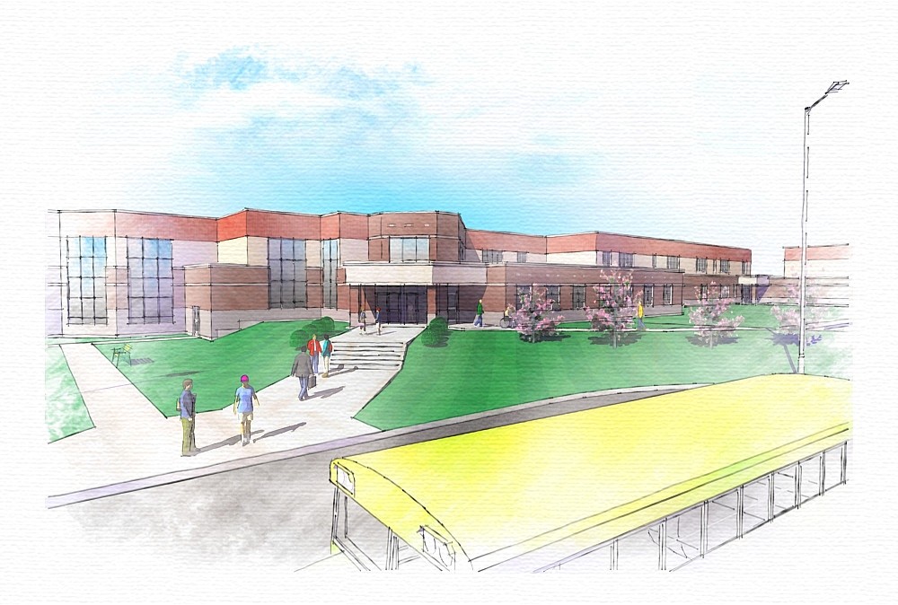
I was commissioned to SU model this high school by an architect friend who is designing it. I decided to take a break from the modelling and do a digital watercolour of it just for fun. I attach both the watercolour, and a zoomed-in view that shows more detail.
I used a couple of SU styles I developed for FormFonts. Specifically I used my 'Soft Graphite Sketch' style to do a line-work only export from SU. I did another export using my 'Lonely Shadows' style -- the exported image had only the shadows - no edges or colour. I also exported a standard textured image without edges. The three SU exports were then brought into Xara Xtreme Pro where I manipulated and combined them.
Regards, Ross


-
Ross
beautiful work. love it
alan -
Ross,
I think that this is one of my fav's that I've seen so far. I'm not sure why, but the bus and the linework specifically there is continually drawing my interest. I really love this image and think it might be on my desktop for study for a while.Thanks
-
Great work as usual, very nice.
-
Thanks guys. I kinda like having the bus there --- it makes it very obvious that it is a school. I don't remember where I obtained that bus component. It may be from the vehicles Brandon posted at the official SU forums.
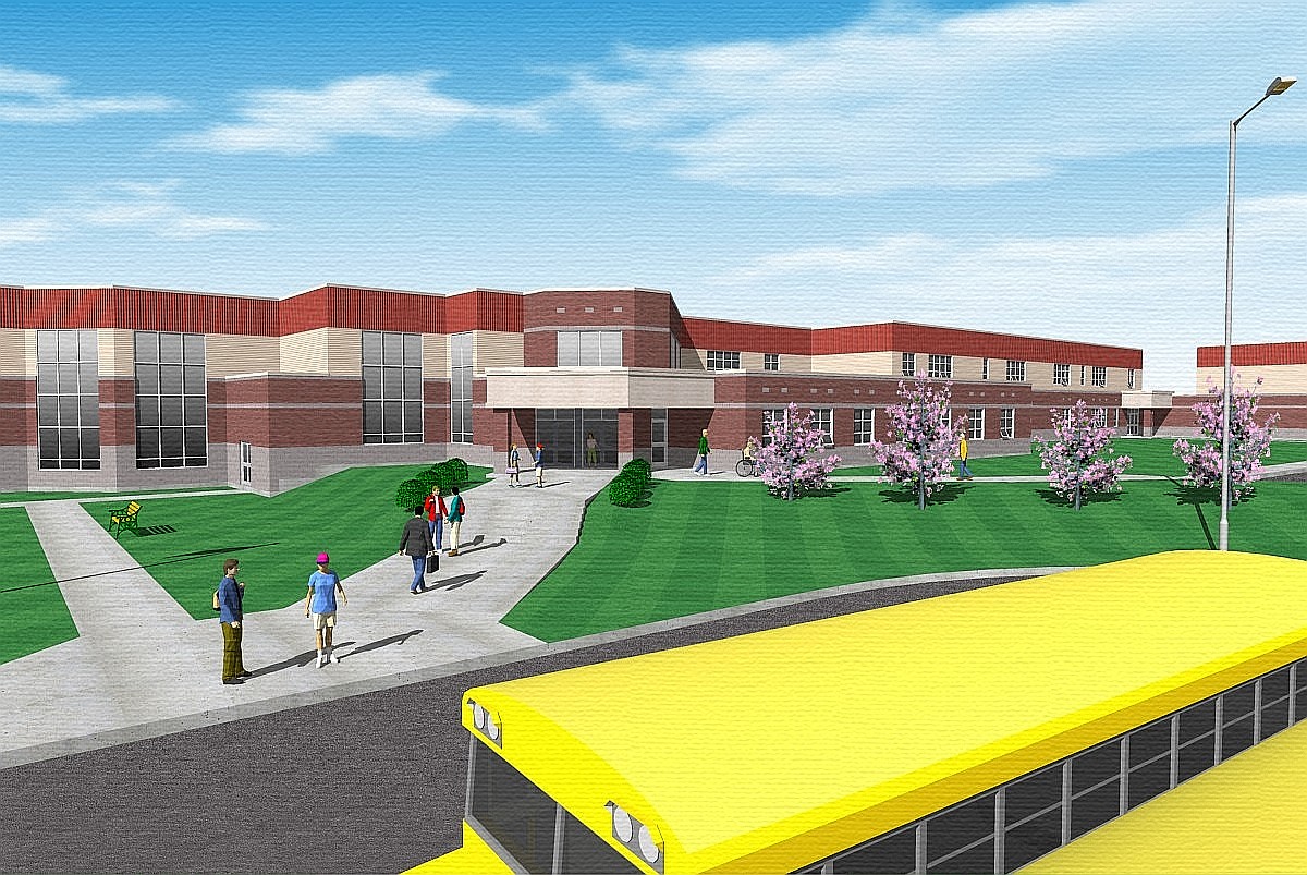
For my client I provided a series of SU exports that I processed only by sharpening and adding texture. (Both those tasks were done using the free Microsoft Photo Editor that came XP Home Edition). I attach the one that corresponds with the digital watercolour. The sky is a transparent png backdrop in the model -- I like that approach because I can alter the colour right in SketchUp just by changing the SU sky gradient colour.
Anyways I find this simple, fast, way of post-processing fairly effective. Do you agree? (I may be out to lunch -- perhaps it doesn't work).
Regards, Ross

-
I love the bus in the foreground, it definitely tells you you are looking at a school. and it punches up the brightness and excitement.
Bob
-
The bus... hmmm... On which side of the street do they drive in Canada?
Anssi
-
Like them ross, looks natural..
-
Thanks Guys!
Here in Canada we drive on the right like the USA. That parking lot is for buses only -- and has space for 16 school buses. There will be two rows of eight. The school will have separate car parking & drop/pickup areas. Here on Prince Edward Island almost all of our schools are 'Consolidated'. What that means is a series of regional schools were built to replace the old one & two-room schoolhouses that used to be common here 50 years ago. With the consolidated schools kids are bused in from more rural areas. Many kids have a 45-50 minute bus ride to get to school. The new school in the drawings is in a town but few of the students actually live walking distance to it. More than 95% will be bused.
Regards, Ross
-
Really nice Ross.
I personally prefer the second image to the watercolour version, but then it's just a matter of different tastes.
I agree with all that has been said, you have framed this building really well.I did not realize you could use the transparent png to create the sky like that, it's a very good idea! Are there any of these png's available for download?
Dylan
-
Dylan -- the architect I did the images for prefers the non-watercolour ones too. I'm glad because there's a lot of work to produce several watercolours. Not so hard to do each one but hard to do them as consistently as is required.
In the Materials/components/styles forum I will post the alpha-transparent sky I typically use. I'll include some tips on using it effectively.
Regards, Ross
-
Ross,
funny it comes from a guy wearing a yellow t-shirt, but I find the color of the bus a bit too aggressive! Ends up distracting my attention from the school fasade.Here in Ontario schoolbuses are painted a warmer yellow colour. I think your rendering may look better with a more orang-y bus, not a lemon-y bus, if possible

cheers,
Marek -
@marek badzynski said:
"Here in Ontario schoolbuses are painted a warmer yellow colour."
I don't want to be bugging but as far as my memory goes (back to 1990 when I spent a semester in the USA) the buses were actually a little bit "warmer yellow", too. This - to me - of course does not destract any value of (especially) the water colouring.
But I didn't know such buses are used in Canada, too!
-
You guys are correct about the bus colour being too bright. I should have caught that -- don't worry - heads will roll in the quality control department! (I'm the head of quality control since as a one-man show I have to wear all the hats).
Here in Canada we use the same traditional school buses as are used in the US. They are the same traditional colour too. BlueBird is the big manufacturer of school buses. I went to school in them years ago, my kids do the same today. The pics at the BlueBird site show the traditional colour.
Regards, Ross
-
Ross, really nice as usual! It might be the pixelation of the detail, but these remind me of the work of a young woman I knew in grad school...she would wet finger smudge then rework her pastel drawings for a really unique effect.
I also now remember, with a smile thank you very much, her hue changing brightly stained tongue (along with several other quite interesting physical attributes :`).
-
No one caught the grass going all the way to the face of the curb either. I like the image, though. I would prefer the windows to be a more uniform size (especially in the large banks), but maybe the architect knows something I don't.
[AcousticGarden]
-
AcousticGarden - you are right about the curbs. If I had spent more time on it that would have been one of the next things I'd have worked on.
The thing is you can always add more & more detail but it has to stop at some point. The architect I did these for was paying by the hour & needed them quick for a meeting. I had sent him a work-in-progress view and he responded that there was enough detail and to proceed to give him the several views he needed. Its the ol' "good enough" philosophy. Much of my modelling is that way -- I stop when the client feels it visualizes what they think is important. I may not always agree but that's how the cookie crumbles. Sometime I really would like to do a portfolio-type piece and take it to more of a "personal best" kind of level. I've never done that before as almost all my modelling has had time or budget constraints.
Regarding those windows -- My client wanted the smaller sections at the bottom of those large windows. They would be operable with fixed glazing above.
Regards, Ross
-
Very nice images Ross, I like them alot. You creat the best styles!! I love them

-
Great grass Ross. I like the mowed stripe look. How'd you create that effect?
Thanks.
-
well done . specially about the line works ... IMO u may change the colors so that not to be so pure . here i can share my recent experiences :http://art-yeganegi.blogspot.com/2008/05/digiwatercolor-fun.html
Hello! It looks like you're interested in this conversation, but you don't have an account yet.
Getting fed up of having to scroll through the same posts each visit? When you register for an account, you'll always come back to exactly where you were before, and choose to be notified of new replies (either via email, or push notification). You'll also be able to save bookmarks and upvote posts to show your appreciation to other community members.
With your input, this post could be even better 💗
Register LoginAdvertisement


