Car renders,WIPs&videos
-
thx igor
-
and the 3 wheeler
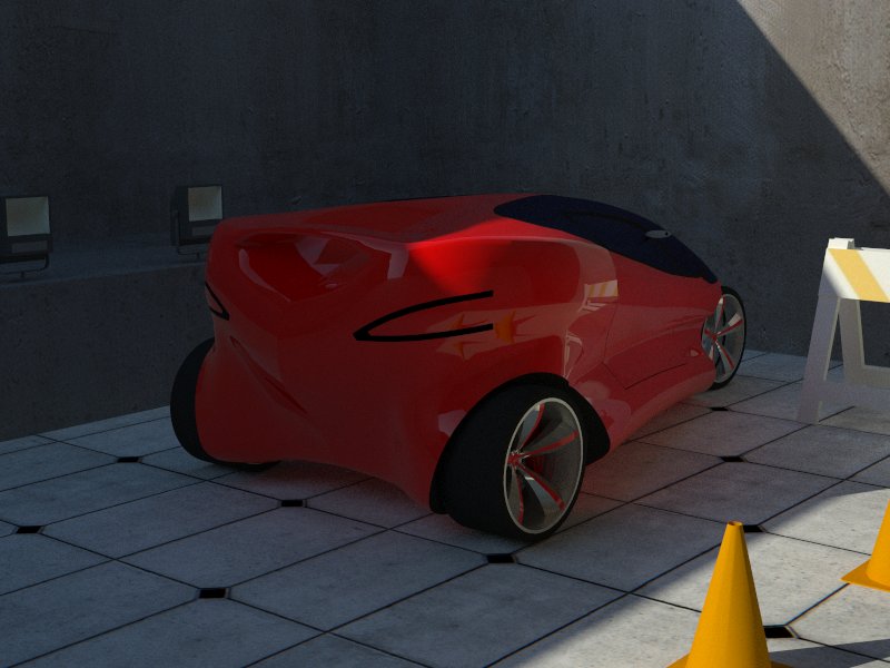
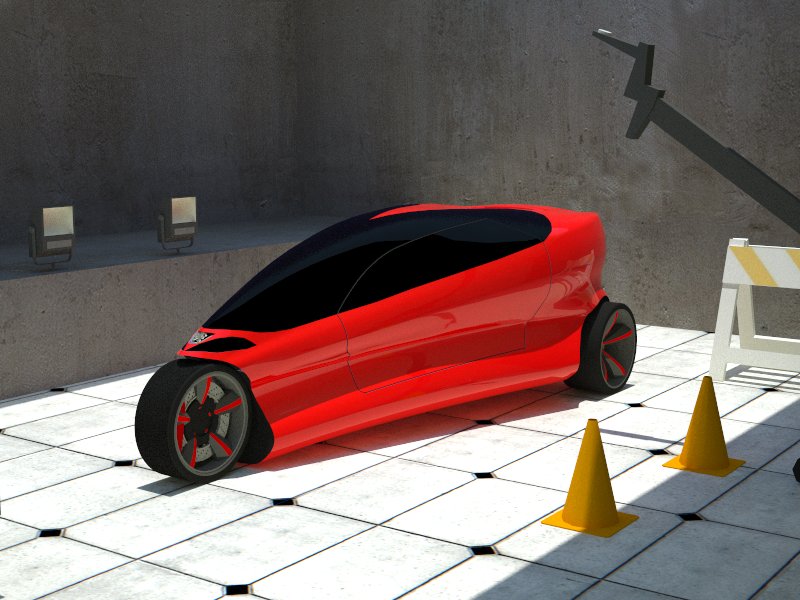
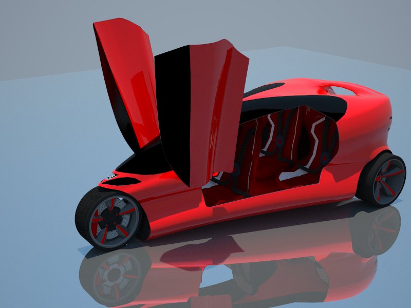
-
damn... dude ... THIS is why i want to be like YOU!!!!!!!!!!!!!!!!!!
-
of of ray,u ll be(not like me,i m not so good,u ll be better) step by step and u re just 14 or 15
-
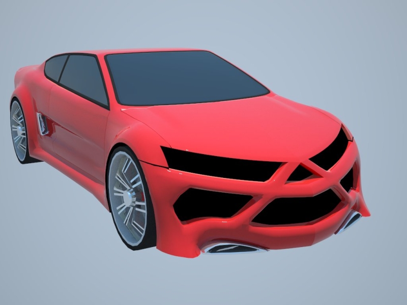
my last concept WIP
-
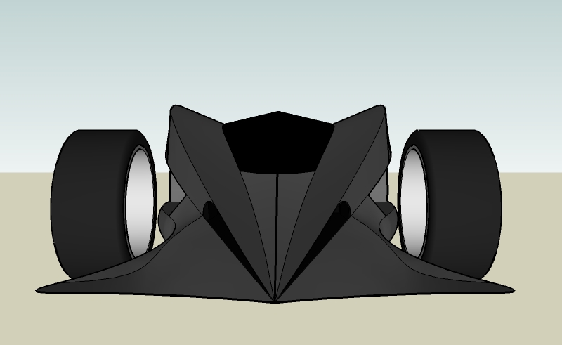
Front looks somewhat like a Halloween pumpkin ^^
nice concept!
-
yes a lil
if i see this car on the street i definitelly start runing away

-
Nice car!! It has an aggressive appeal to it
-
my sugestion is to not have sutch a strong triangle. the bottom half looks GREAT, but the top half looks kind of disproportional. my suggestion is to move the lines that make the top half of the triangle apart, and put some head lights in the far right and left sides.
and yes, it looks like a jack-o-lantern.
and btw, are you using subdevide and smooth?
-
i can t remake it anymore and sincerely i like it very much how it is
and yes,for some parts i used subdivide because takes to much if i ll make them with hand
thx
-
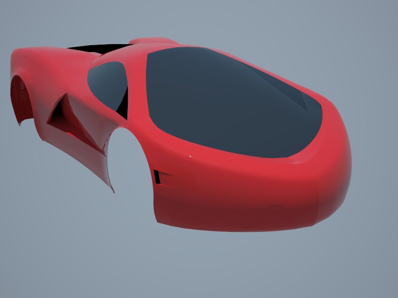
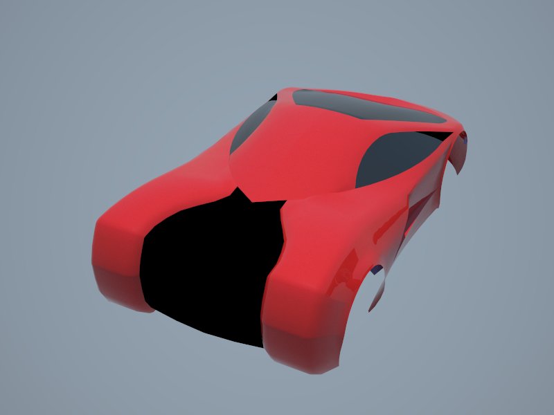
my last concept car WIP
-
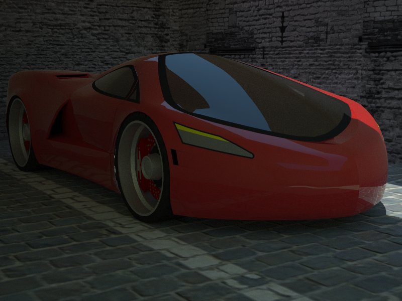
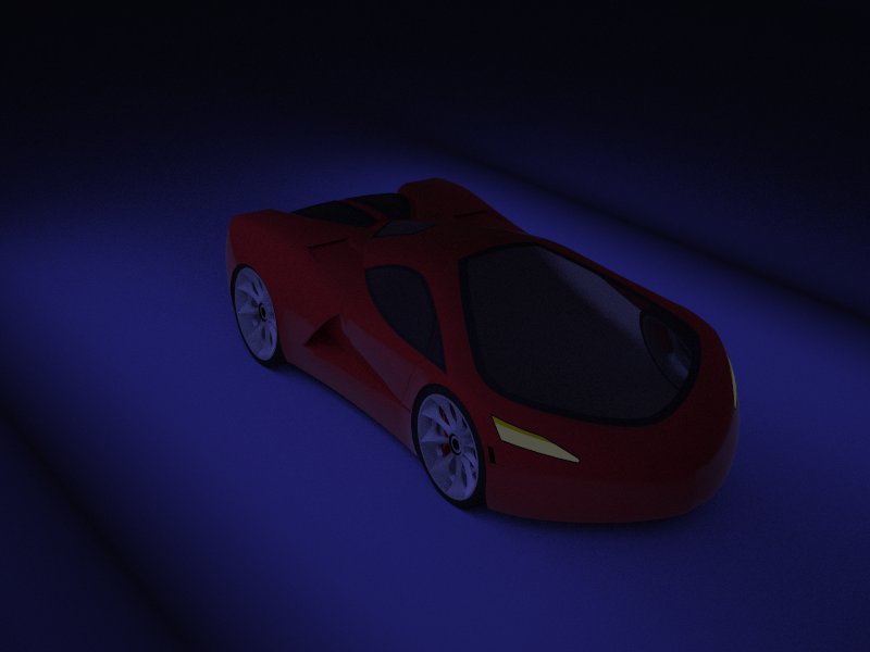
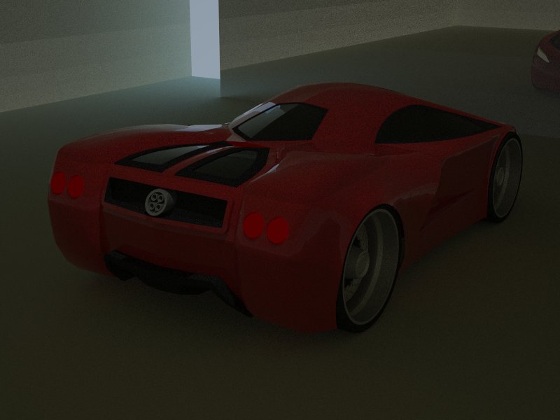
some upgrades but still wip
-
-
i m like a child
 ,i just discovered the emissive layer and i`put some emissive colours on the front and rear light and with more light those colours wouldn t look good
thx for comment
-
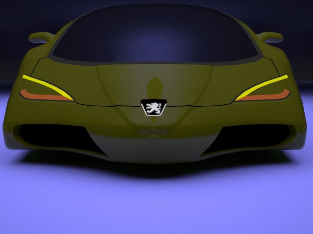
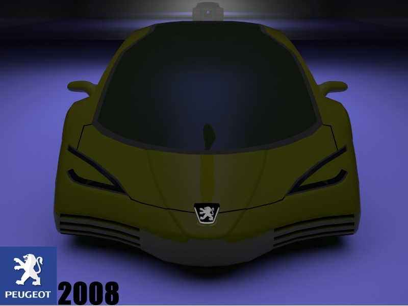
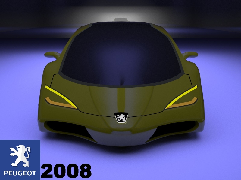
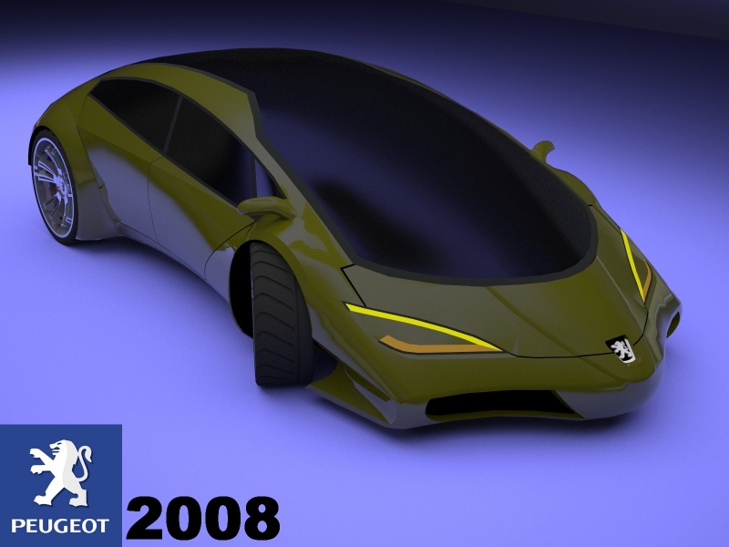
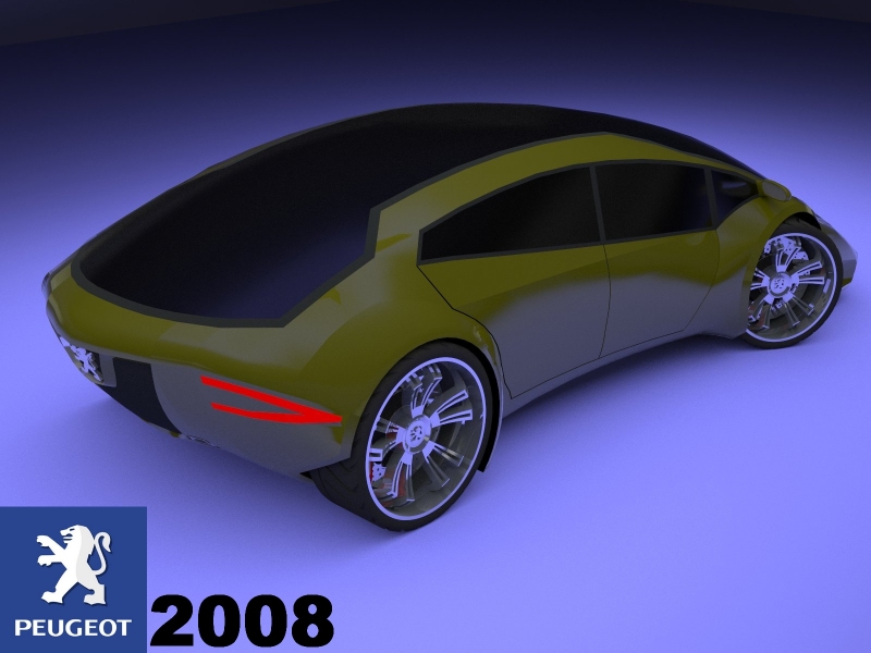
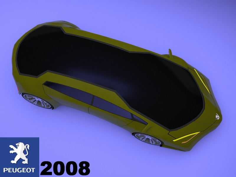
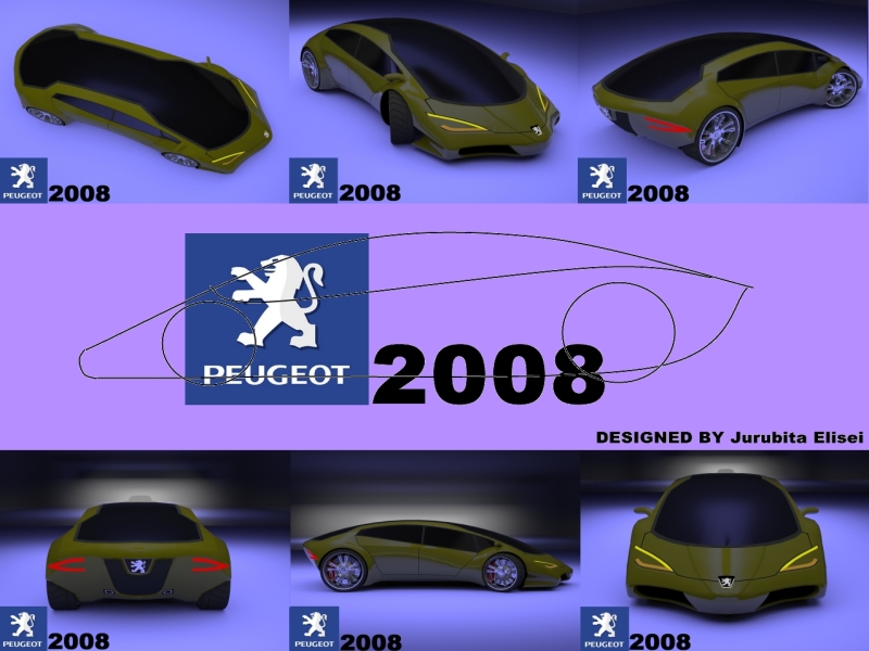
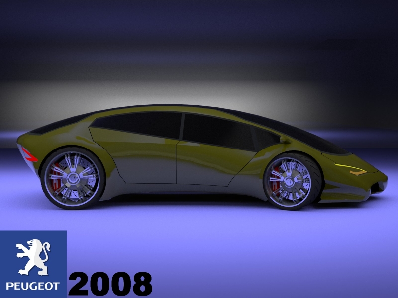
is not the final work but it s almost close(this and the 3 wheler will be my entries on the Peugeot concept car contest)the name of this will be Peugeot 2008
the second image is before aire prises modificationis there the possibilities that the size of the pictures that we upload here to be 1024:768 maximum?
-
this is the final work
-
..
-
.
-
Looks like a very mean fish out of water on wheels. Although very original this is one of those cars that you love or hate....
-
i can t hate a car...
unless it has gas and battery and don t start

but if doesn t i ll fix it(if i can,else is a waste of money)
Hello! It looks like you're interested in this conversation, but you don't have an account yet.
Getting fed up of having to scroll through the same posts each visit? When you register for an account, you'll always come back to exactly where you were before, and choose to be notified of new replies (either via email, or push notification). You'll also be able to save bookmarks and upvote posts to show your appreciation to other community members.
With your input, this post could be even better 💗
Register LoginAdvertisement


