Easy digital watercolor
-
I'm sorry but much of the discussion about actions goes over my head since I'm not a Photoshop user. I do have a basic understanding of them and wonder about an alternate approach to using them. My thought is perhaps seperate actions could be created that would process the various SketchUp exported images that make up a digital watercolour. Typically I find I'll export a colour only (no lines & no shadows); a lines only; and a shadow only (I do that using a style I developed for just that - available at FormFonts - it is Called "Lonely Shadow"). My technique process involves processing each of those images in their own fairly typical method - ones that I'm suggesting could be actions - and then visually merging them using transparency effects. It is that visual merge that I'm suggesting might be better left to a manual approach that brings 'judgement' into the process. I just find the settings I use when trying to visually merge the various layers will vary from one digital watercolour to another. They are affected by the particular colours used and where I want to add visual focus. In other words, the visual combining part is the artistic stage perhaps best not left to an action. I do see that actions could speed up the preliminary portion.
One digital watercolour tip I'd like to share (besides the one about the 'Lonely Shadows' style) is to remember you can use the individual imports more than once. For instance, take the colours-only layer. I typically process copies a few different ways and then bring them together with the visual merging. On one copy I might strongly adjust the levels so all the highlights are powered up, midtones powered down, and shadows ramped up. When overlayed with transparency over other differently-processed versions you'll find it can greatly add to the tonal variations in the resulting image. Similarly I find I will typically process at least two versions of the lines-only layer for merging into the final rendering. Same for that shadows only layer.
Regards, Ross
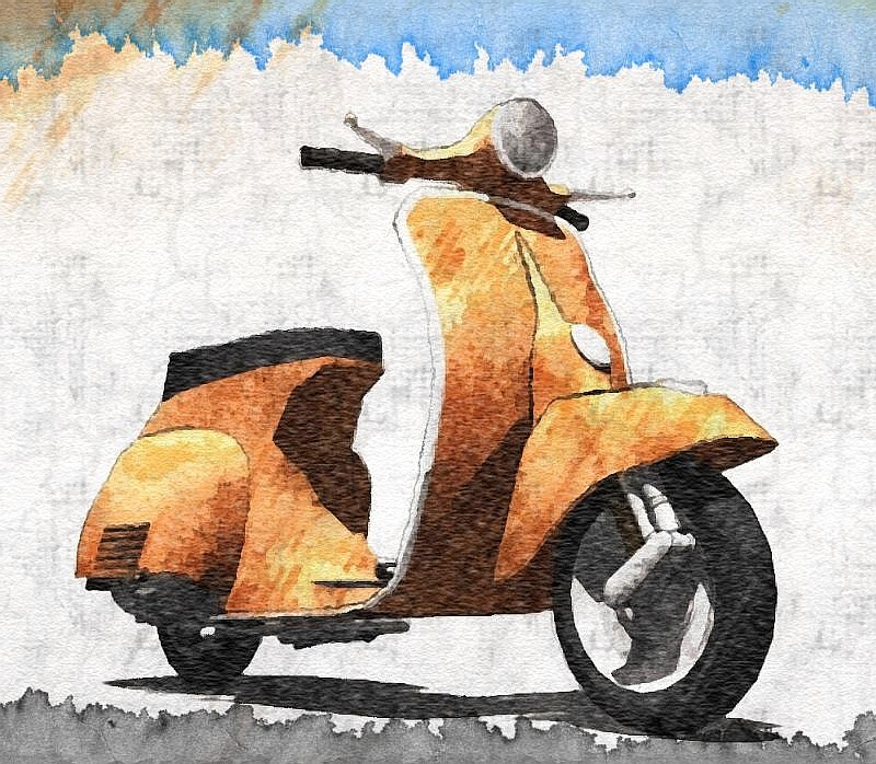
I attach a digital watercolour made from pure sketchup exports. It features the Vespa modelled by Allister for FormFonts. The rendering was done in a series of experiments where I was trying to develop my techniques. I do think the vespa rendering is overworked but a reasonably successful experiment.
-
Further to Ross --
I've tried several times to use PS actions* but have not had any results that compare favorably to the tried-and-true Dennis, Grant Marshall, or Worncall methods. They all involve multiple exports from SU (line, shadows, color/texture) and layering in Pshop plus the various filters and plug-ins.Here's a very quick application of Grant Marshall method (without the benefit of multiple exports from SU which would make a much better result). Grant's method is still the best (in my book) for getting a watercolor feel.
*I do use actions, but in multiple sets on various layers as Ross suggested.
-
it sounds great !! and what are the steps to reach this, plz?
-
@majid said:
it sounds great !! and what are the steps to reach this, plz?
majid, are you asking PKast, Ross, or me?
-
yes i mean you plz

-
majid,
I have sent you a PM. -
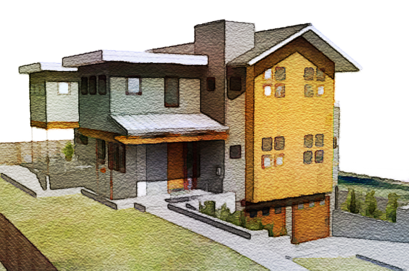
I've been trying to achive watercolor look in photoshop and here is some thoughts of mine:
First, I haven't yet seen any of you actually use a watercolor paper texture with the right grain. To me it look like either burlap or canvas.
I also think anything believeable must contain human mistakes and simplifications.
Study how the colors in a watercolor painting is usally brighter/lighter than in a photo.
A central part of watercolor paintings is the way water affects the different color pigments. (I dont know the correct english words for the different effects.) Like blooming and edgebite and so on.
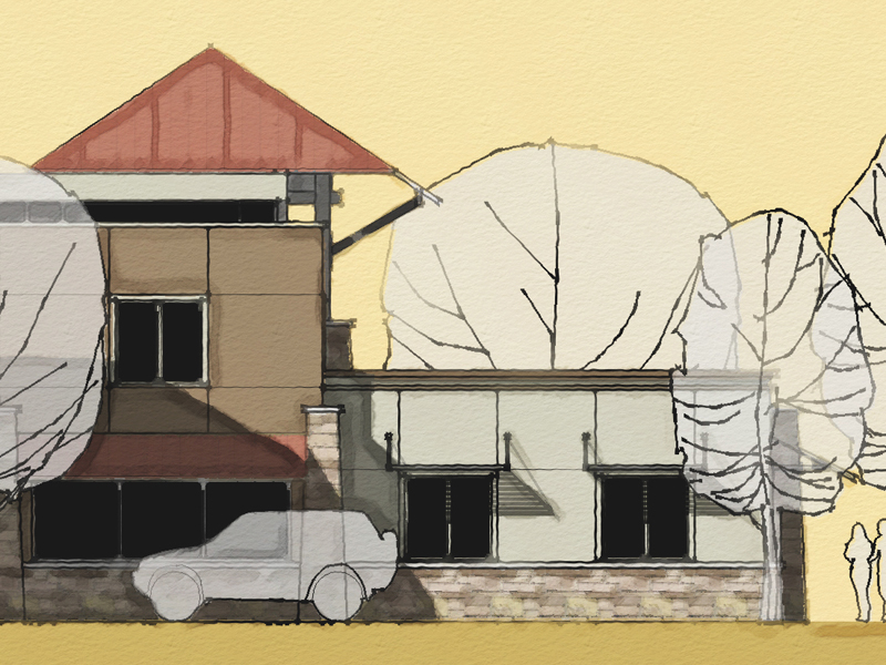
Here is a photograph I turned into a watercolor painting in Photoshop.
What do you think?

-
Most Excellent!
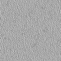
Do you have the paper texture in a format you can share?
Regards, Ross
-
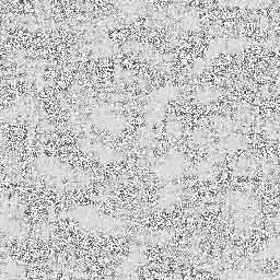
Its a small jpg. Here you go. Open in PS and Edit define pattern then use the paint bucket with the pattern on a new layer and set blend mode to. Linear burn. Try scaling it up to 200-400% for "bigger bumps".
Not always 100% opacity for that layer. Experiment. But dont stop at just using a paper texture. Look at paintings and try different PS brushes. There are some great for spatter and such.

-
here r other .hope u njoy
-
Pixero - wow! that is really impressive. could you post your method please
Ross - i like your work. i followed your thread awhile back, when you were experimenting with different techniques with the vespa. looks really good.
regards,
jb
-
Pixero,
Very good. You're watercolor and Ross' earlier one in the post are very impressive results from just plain jpegs. If you would be so kind as to share your technique that would be great.Best,
PKast -
here's my shot at it, with line overlay and a "find edges" layer on the poster layer. its not coming out as soft as some of the other posts here, maybe its because of the lines
-
here's another try with lightened up linework
-
Cool!

I really like that last one! Looks great!
Regards, Ross
-
mirjman - i really like the last one too. really cool look. post more.
jb
-
Very nice... as was said, the last one

-
@unknownuser said:
Pixero - wow! that is really impressive. could you post your method please
My method isn't a "one click" solution. I use very different settings depending on the image but the basics is:
First color correct the image to brighten and saturate it a bit to make it look more like a painting colorwise. Then I usually use surface blur filter to get rid of some detail. (I Make most changes on a copy of the latest layer to be able to paint back detail with a layermask if needed.)
Then I apply some filters on the surface blurred layer. It can be water color, drybrush or paint daubs or poster edges depending on image. I then mix between different effects with layer masks and also applies the paper texture above. Usually scaled up 200-300%. I Also use bits and pieces from real watercolor painings to get the typical watercolor looks like blooms. Then I Use some photoshop brushes for some spatter effects to get those tiny human mistakes that help selling it as a painting.
Collageing and filtering in Photoshop is the best we can do until Moxi is ready: http://visgraph.cse.ust.hk/MoXi/
-
@majid said:
and here is the PR render of the first subject . i did it not too tight , the floor bump is too heavy , and the TV & vase & plants R not good at all ... btw here it is
Nice, i like the lighting in this picture, it looks so realistic. Thanks for uploading these pictures.
-
thanks SK LION
Hello! It looks like you're interested in this conversation, but you don't have an account yet.
Getting fed up of having to scroll through the same posts each visit? When you register for an account, you'll always come back to exactly where you were before, and choose to be notified of new replies (either via email, or push notification). You'll also be able to save bookmarks and upvote posts to show your appreciation to other community members.
With your input, this post could be even better 💗
Register Login


Advertisement