Hoboken Cinema
-
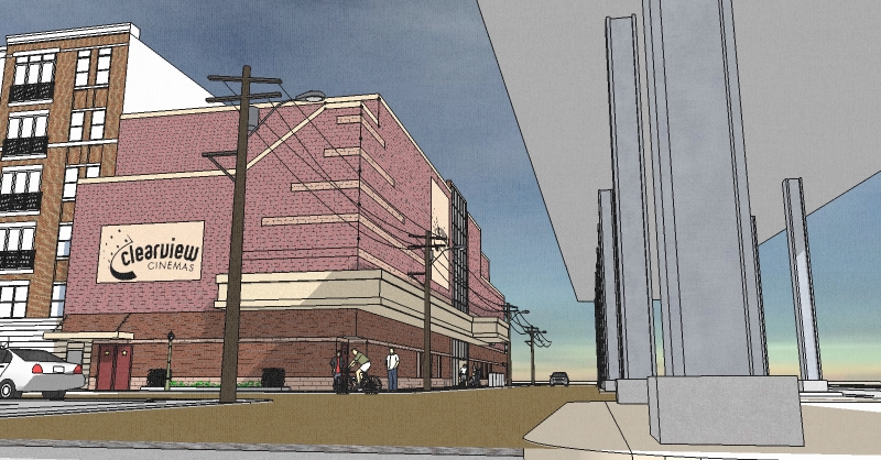
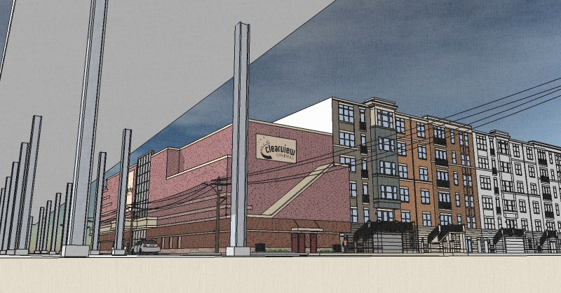
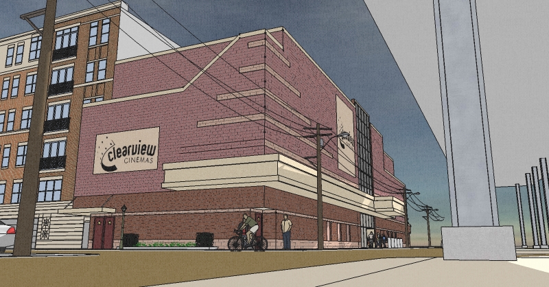
This is another project, currently out for bidding. A 20,000 square foot, two level cinema to be built in the shadow of a viaduct and the northern edge of Hoboken, NJ. No parking - everyone walks in Hoboken.
Comments welcome.
Allen

-
Second view

-
Last one

-
Looks really GREAT..!!

I like the angles you've chosen..!! -
Thanks Frederick,
With the viaduct so close to the building, it was tough finding a angle to view the building from. Wish me luck, bids are due in a week.
Allen
-
looking good! i like the design... keep up the good work and best of luck!
-
Nice color I like it, nice composition....
allanx
-
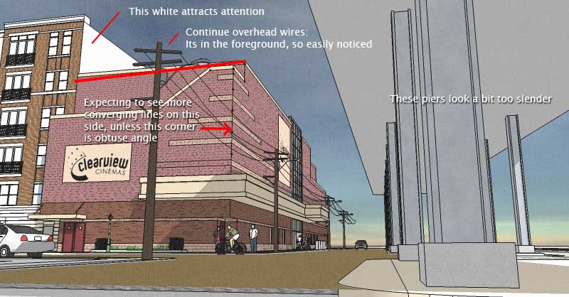
Some nitpicking from my part, please don't mind:

-
Guite,
No need to apologize, you're quite correct in your comments. Wish I had the chance to show these images to you before posting.
Appreciate it, thanks,
Allen
-
Nice clean design.
That's a cool sky. How did you do it?
-
Hi Ecofeco,
Thnaks for the compliments. The sky is a skydome component I d/l from Formfonts.
Allen
-
@allen weitzman said:
Hi Ecofeco,
Thnaks for the compliments. The sky is a skydome component I d/l from Formfonts.
Allen
Nice. Thanks for the info.
-
I can't count how many photos I have had to modify with photoshop to get rid unsightly powerlines. The first thing I noticed in this image was the powerlines. Out of habit, my first thought was "he forgot to get rid of the powerlines".
Brain warp!! Its not a photo.
I really like your images. They portray a feeling of actual presence on the site.
Good Job!
-
Thanks Bob. Bids are due tomorrow!
Stay tuned...
Allen
Hello! It looks like you're interested in this conversation, but you don't have an account yet.
Getting fed up of having to scroll through the same posts each visit? When you register for an account, you'll always come back to exactly where you were before, and choose to be notified of new replies (either via email, or push notification). You'll also be able to save bookmarks and upvote posts to show your appreciation to other community members.
With your input, this post could be even better 💗
Register LoginAdvertisement


