WIP Log Cabin
-
Still working on it, but I thought I'd post some of the details I thought turned out nice. So far....
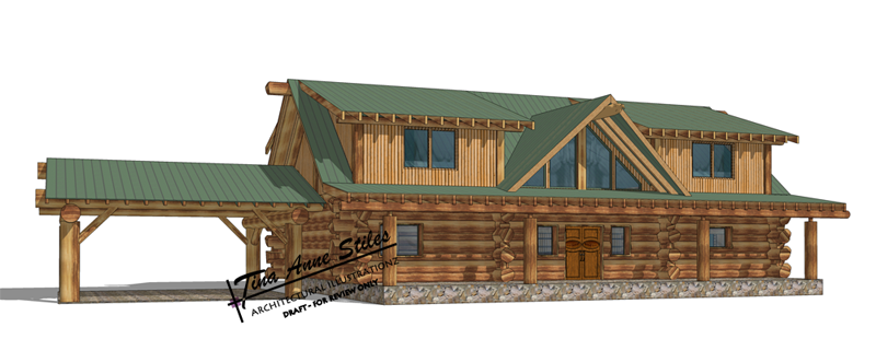
-
Some details....
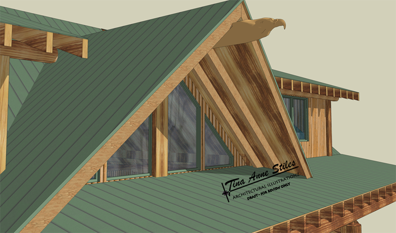
Eagle Ridge detail THANKS BOO!
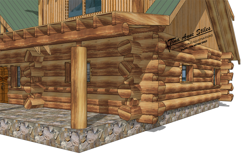
Blunt cut edge logs...
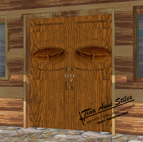
Carved wood door with eagle inset
-
Tina... fantastic
I have yet to see a cabin so detailed and realistic, the woodwork is just incredible... I bet your client was very very pleased. thanks for sharing
-
Rock solid
 Great work tinanne.
 -
Great job Tinanne
Wonderful details. It's my dream house.
-
 Thanks guys. It has been a challenge that I didn't expect. My first reaction was "no prob" being so full of myself. I was humbled. Not because it was "so hard" but that there were a lot of details that I did not foresee.
Bruce: thanks for the hug. I need one after working on that stupid animation I worked on ALL night!!
 My other "full of myself" moment. "Sure, I can do that" said the full-of-baloney-artist, who's NEVER done an animation!
 -
Well, Bruce, it'll have to be a group hug...
Tina, besides being one fineexample of the power of the straight SU output in the right hands! this post is just what I needed as well: it's what it's really all about to be here.
Kuddos on the detailing and material usage...and the totem-esque doors are just wonderous!
My very best!, Tom.
-
Well I haven't posted what I was working on {it's 200+mb} but I need some help REAL bad and fast, lol! I have a post going with Paul Russam who does some really beautiuful animations.http://www.sketchucation.com/forums/scf/viewtopic.php?p=35492#p35492 hopefully I will gleen some tips from him or I'm in BBBIIIIGGGG trouble!
-
Yes I must agree, it's a very beautiful model and looked like it was a nice challenge.
-
@unknownuser said:
tinanne...i have lost ya...that link won't work for me. Point me to your animation if you can....cheers!
-
@unknownuser said:
tinanne....Thanks ..it works now.
I enjoyed the movie. The building is really cool...I love the simplicity of the materials trees etc.
It's still a WIP but it's coming along, thanks!
@unknownuser said:
Thoughts......I like to turn the pause off between frames so it is a bit smoother. When I go inside a building I usually widen the camera angle to somewhere between 60 and 90 degrees. Last thing...slow down the panning a bit.
Yes, I had finally figured out how to fix that. The movie I had uploaded was actually the wrong one! I uploaded the last draft. You can see it now.
@unknownuser said:
Cheers!...saw the new avatar. Beauty and talent!! that`s not fare!..lol
 Thanks
 -
Some test runs of a new style I've been developing... OH and thanks to Ross for the Pencil style.
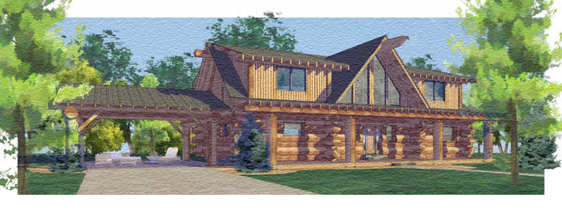
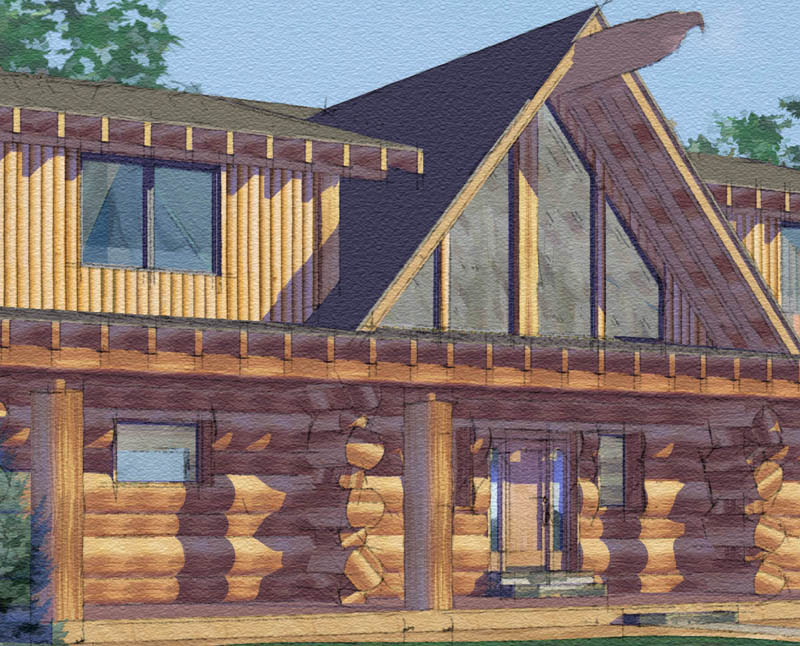
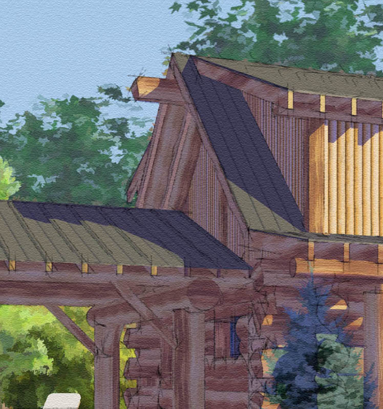
-
that's gorgeous...
awesome water color... how do you keep it from running and messing up the drawing? lol...
I saw your portfolio... so I have to say I'm not surprised it looks so good...
-
Very nice.
-
Tina,
I love this cabin, such a clean model. I've admired your work ever since you posted the Rio Plaza rendering, I love it. I noticed you do a lot of work in Utah, some time ago I was checking out your work and couldn't help but think "that's St. George, Utah!" and what da ya know, lot's of work in Utah. I'm from Cedar Hills, just south of Salt Lake City and my in-laws have a second home in St. George, so we spend time down their in the spring and fall, to hot in the summer. Anywho, Nice work!
-
Is it Piranesi that you use to give it that style or Photoshop?
-
Really beautiful Tina, as Bubba mentioned, is this Piranesi?
-
@spence said:
Tina,
I love this cabin, such a clean model. I've admired your work ever since you posted the Rio Plaza rendering, I love it. I noticed you do a lot of work in Utah, some time ago I was checking out your work and couldn't help but think "that's St. George, Utah!" and what da ya know, lot's of work in Utah. I'm from Cedar Hills, just south of Salt Lake City and my in-laws have a second home in St. George, so we spend time down their in the spring and fall, to hot in the summer. Anywho, Nice work!
Spence, you got it. My business started in SG almost 14yrs ago so I've been blessed to build up a great clientelle down there. It took a couple of years to get them to trust that I could do the job, but I finally won!!! LOL Great place. I'll be back down there for a couple of weeks in September. I'm looking forward to it, but not to the heat.
 Thank you for your compliments.
@unknownuser said:
Is it Piranesi that you use to give it that style or Photoshop?
I used to use Piranesi as much as I use SU. But as I've become more comforatable in PS I'm finding less need for it and feel that PS is much more versatile. Although, I think it's much easier to place entourage with Piranesi. I love it for that!
-
tinanne
very very nice workmike d
-
Tina,
Absolutely beautiful work on the watercolor. I love the setting and I'm glad you posted those detail shots. Those show much more depth and commitment to detail. (everyone squint and look at the door handle)Also, i wanted to add if you are using a mac you can drop your animation in and put a slo-motion effect on a clip if you render it out too fast. That has been a timer-saver for me in the past.
Hello! It looks like you're interested in this conversation, but you don't have an account yet.
Getting fed up of having to scroll through the same posts each visit? When you register for an account, you'll always come back to exactly where you were before, and choose to be notified of new replies (either via email, or push notification). You'll also be able to save bookmarks and upvote posts to show your appreciation to other community members.
With your input, this post could be even better 💗
Register LoginAdvertisement


