Kitchen model - first customer!
-
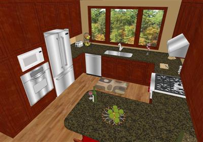
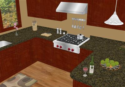
My first customer! (Though I'm not officially "open for business", so to speak, still working out some details...

I still have some finishing touches to add (walls across the hall so it's not a big open white space, cabinet hardware, an outdoor view without a porta-potty, colors, etc.) but I would be glad to hear any suggestions on how I could do this better.
Larger Image here Kitchen SW Iso Wide Angle.jpg
 Larger Image here Kitchen NW Iso.jpg


-
Very nice, Nick! (What's the panarama program again?) Only thing bothering me is the color saturation of the cabinet material...a bit bright red for my taste (sure love that rug, though, nice touch).
-
Thanks Tom. I agree it's a bit too saturated. I think the cabinets are to be painted anyway - so the look will be totally changed before it's done.
Gocubic is the name of the panorama generator program. Coupled with the cubicpanoout.rb it's a pretty easy and quick process. I got the rb at Ruby Library Depot.
-
Thanks Nick, I'll give it a try (first free time I find :`)
-
Looks great, Nick. And congrats on your first client. I agree with Tom, the texture on the cabinets is too much - it's hard to make out any detail. You might try lightening the color on the door panels (or the frames) just a tad - enough to give it some contrast, yet still appear as the same species of wood.
-
It looks good so far, maybe turn on shadows?
You could turn them on and run the dark slider up high so it doesn't look too dark. -
hi, nick. i like it a lot and agree with tom about the saturation problem.
a kitchen is a good sized work for a first job. besides, you can make architecture regardless the size of the commission.
good luck.
-
Hello Nick,
Looks great man! I just heard about the PV thing just yesterday and tried it today. It worked great except I had some areas of the PV that were shaded darker in areas. Did you get any dark areas? If so, how did you avoid them? Also do you have any experience in doing this via Kerkythea?
regards,
lapx
-
Nick,
Great start and congratulation on Your first
customer.
-
Thanks everyone. I'll keep your suggestions in mind. and I'll post the next iteration here.
@lapx - I didn't notice any dark spots, you can view it via the link in my initial post. and I don't have any experience doing this in K. though it seems the concept would be the same - just render 6 images: forward, right, back, left, up, down. then grind it out in gocubic.
-
Nick, I solved my problem with the dark shadows thanks to Gaieus. The trick is to have the sun for shading boxed check with sun off. It worked fine. As for K I understand there's a better way to do it with only one spherical rendering which would save time but i'm not sure how that method works and what programs are needed to accomplish the stitching. Maybe someone with more expertise can help us out.
-
With the cubic pano out ruby you can set that it creates camera views in corresponding scene tabs which later you can export to Kerky and and render there (you obviously only need to set up the materials, lights and such once) finally simply use GoCubic again.
Sorry if it was already answered above - I just ran through again but could not find.
Martin ("FormerlyKnownAsMartin") made a beautiful panorama this way.
-
Nick, congratulations! Nice job!
Needs some depth through shadows or shading, can't wait to see the next pass.

-
Tina and Bruce, thanks for your encouragement. It's nice to know I've got friends here rooting for me.

-
nick,
i must say it looks better now, sunnier perhaps. i hope the final material is not too dark so that you can keep this quality.
-
thanks Edson. I agree it looks better and brighter. I believe the final cabinet material will be white painted as shown.
-
where it's at right now...
still holding off on post-processing - waiting on info to finish up details, revisions, etc.
larger version here: KitchenNWpspsm
larger version here: KitchenSWpspsm
![KitchenNWpspsm[1].jpg](/uploads/imported_attachments/PCOY_KitchenNWpspsm1.jpg)
![KitchenSWpspsm[1].jpg](/uploads/imported_attachments/6ogP_KitchenSWpspsm1.jpg)
Hello! It looks like you're interested in this conversation, but you don't have an account yet.
Getting fed up of having to scroll through the same posts each visit? When you register for an account, you'll always come back to exactly where you were before, and choose to be notified of new replies (either via email, or push notification). You'll also be able to save bookmarks and upvote posts to show your appreciation to other community members.
With your input, this post could be even better 💗
Register LoginAdvertisement


