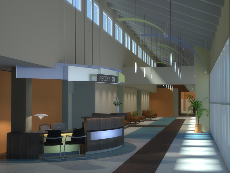
A new interior shot from me Kerkythea, SU, and Photoshop
-
Hey guys,
Heres one of my latest ones, I've been working on this for a really long time (they keep redesigning it!)
anywho, comment, and critique much appreciated (and please be very harsh with your crits, I want this perfect)

-
the day light is looking amazing!!
The reception area, to me looks a little 'plastic'. Some clever texturing and components could help there.
plant in the vase on the desk doesn't look natural.
Are the walls going to have some texture...drywall??...control joints?...or is it smooth paint?
a little noise in it could help...maybe.
The metal part of those chairs could be more shiny?
my two cents.. -
as the french would say... "oooh la la"
-
and as we Indians say... WAH!!! KYA BAAT HAI!!!


kudos!!! -
Holy cow poo, that's looking good.
The atmosphere is spot on but it need some reflection/shiny stuff to lift the flatness a bit.Remember its a model of a building not the building its self, you can (if your allowed) cheat/lie a bit with materials and maybe make for example the floor out of a polished stone instead of carpet.
-
That's awesome, wonderful job!
-
Thanks for the kind words guys!
unfortunately I am unable to play with the materials at all... They've already been decided... I do agree however that the area behind reception requires some work, maybe a little post production faux lighting... humm!
Hello! It looks like you're interested in this conversation, but you don't have an account yet.
Getting fed up of having to scroll through the same posts each visit? When you register for an account, you'll always come back to exactly where you were before, and choose to be notified of new replies (either via email, or push notification). You'll also be able to save bookmarks and upvote posts to show your appreciation to other community members.
With your input, this post could be even better 💗
Register LoginAdvertisement


