Quick Design
-
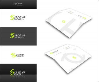
A quick logo and businesscard design I did for Scott. Just wanted to share
 .
.
-
Nice work! I can not wait for my business cards!
Scott
-
Nice work. I especially like the reflected logo. The whole logo is very versatile.
Are folded cards common where you are? Very rare in the US.
-
I am not going to use it as a folder card. I am just going to have front and back printed. It is a good idea they say to have both sides printed that way no matter what side a person is looking at they still know whos card it is. I have attached a D size sheet I am working on with the new design. Comments are welcome. I really like the green that way when someone has a set of my prints they KNOW they are mine.
Scott
-
Love it Rob,it's eye-catching, uncluttered and elegant. Very well thought out, I've been looking for ideas for cards and that is the best I've seen yet.
Cheers Bill. -
Thanks guys I appreciate the positive feedback
 , As for the letterhead and such Ill get to that this evening Scott!
 -
I have to say it is nice to have people to bounce ideas off of not to mention people to just do things as favors.
Scott
Rob,
Take your time, as I think of more ideas I will let you know.
-
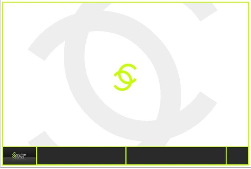
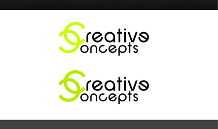
I like the perspective effect. Though, personally, I feel the light green on white background is, well, too light. The intertwined C's is a nice idea, I would prefer it to be bolder. Looks very good in the dark background.
Guite
-
You're both going to hate me... I really like the design- colours and layout are great, but the first thing I thought when I saw the reversed CC logo on it's own was, well... see below. Sorry


-
-
Guite: Bolder? what do you mean?
-
Jackson: I showed the design to a lot of people but youre the first one to bring Chanel up
.
I just designed the logo, didn't even know Chanel had a similar logo. Haha.
-
-
@robmoors said:
Jackson: I showed the design to a lot of people but youre the first one to bring Chanel up.
Proof indeed that art is subjective! If it's just me who noticed it then it's obviously not an issue.
I ought to say I wasn't for a moment implying plagiarism, it's obviously just a simple case of two slightly similar designs independently created.
-
Plagiarism did not even cross my mind, plagiarism is also not the case here even if I did copy of Chanel, it would be by inspired if that was the case because the two C's different from the way I created them.
But the two C's are a logical way to go when designing a logo for a brand with two C's in them such as Creative Concepts.
-
Nice work Rob,I like the design and style.
Very modern. I dont think it has a resemblence with Chanel, but if one is to look
around for a while one would find similar designs around. What Im trying to say that whatever You do today on the other side of the
globe or just around the corner someone might be doing a similar thing.
So Ill close with the following:All inteligent thoughts have
already been thought,
what is necessary is to think them again.- Johann Wolfgang von Goethe
-
Thanks Mateo, personally I found this qoute of Albert Einstein to be very inspirational and typical for graphic design:
"Imagination is more important than knowledge, for a while knowledge defines all we currently know and understand, imagination points to all we might yet discover and create"
-
@robmoors said:
- Guite: Bolder? what do you mean?
Kind of like the lower one in the attached comparative image.
Guite
-
Ah more heavy you mean, yeah subtile difference but I like it a little lighter. Thanks for the suggestion!
-
the coincidence pointed out by jackson is very common in the creative fields. lots of people working at the same time, facing the same problems and sharing the same kind of info makes it possible for two designers who have not heard from each other to reach similar solutions.
this is bound to happen. i would not bother about it. even if channel had been rob's inspiration, it is ok. as a friend of mine said: "every project begins with the best example of its kind. it is a proof of intelligence to use what has been well done. why reinvent the wheel if you do not need to?".
-
You must teach architecture somewhere don't you Edson?
I recognise all of your phrases. Not that that makes less right. There spot on and I design and live by those phrases. -
yes, rob, i have been teaching architecture for 24 years (wow, all that!).
i must say it is a great learning experience as well, because to be able to help people to learn architecture one has to be always evolving, looking around, being suspicious of one's certainties.
every end of semester i realize i have learned a lot from setting up a program for my design studio and helping the students to come up with their designs.
-
@robmoors said:
Ah more heavy you mean, yeah subtile difference but I like it a little lighter. Thanks for the suggestion!
Design and its' perception is subjective. As I have mentioned in my first comment, it's just my personal preference.
Hello! It looks like you're interested in this conversation, but you don't have an account yet.
Getting fed up of having to scroll through the same posts each visit? When you register for an account, you'll always come back to exactly where you were before, and choose to be notified of new replies (either via email, or push notification). You'll also be able to save bookmarks and upvote posts to show your appreciation to other community members.
With your input, this post could be even better 💗
Register Login


Advertisement