House Practice
-
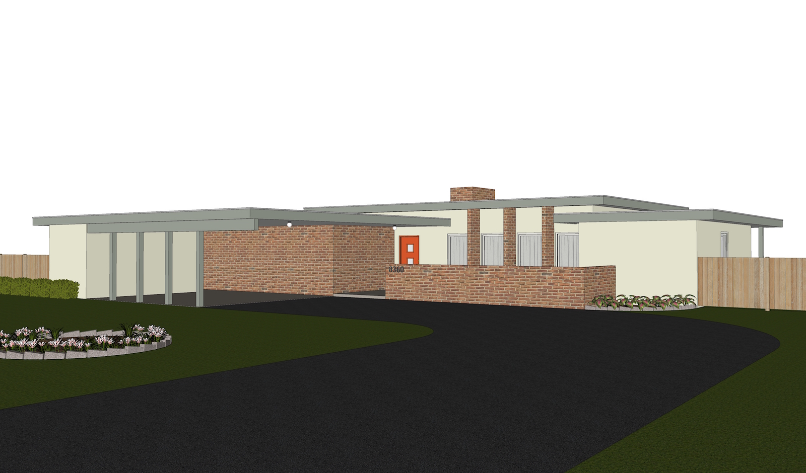
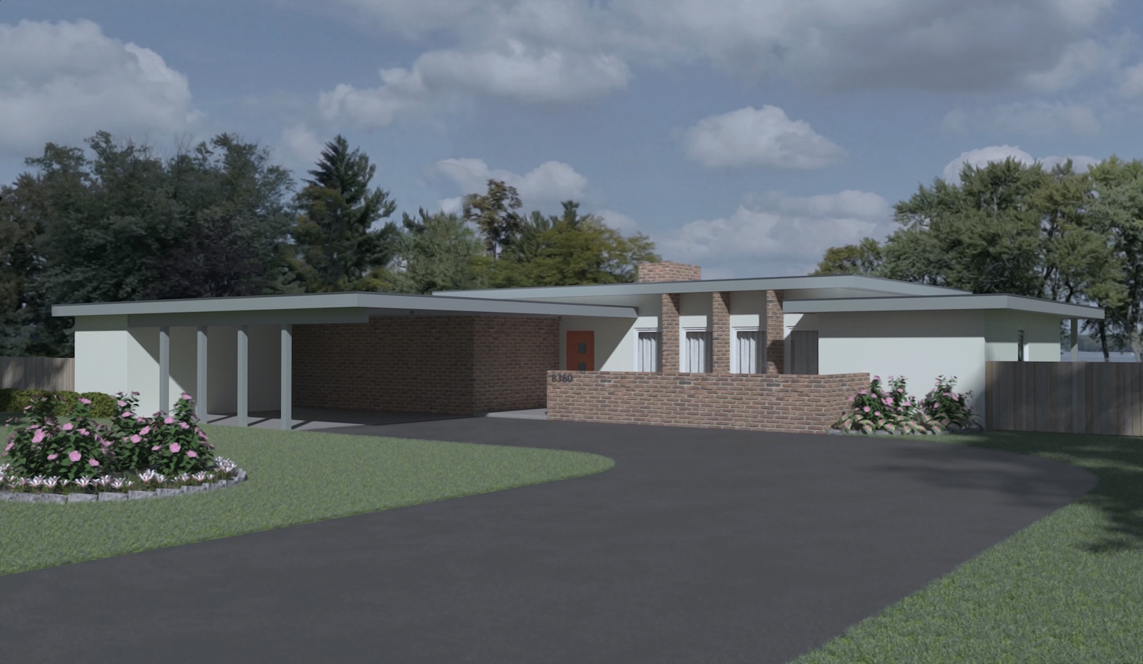
Probably should do more of these. Not an architect although I studied it a loooooong time ago. Can't hurt to practice this stuff once and a while. Cleaned up an older practice model, changed some textures and things. New render in Twilight. You can't see the hibiscus bushes in the raw SU view as I used Twilights "proxy tools" The hibiscus are crazy high poly...
-
Looks good, but I can make a suggestion? Put some shininess on the paint areas and add some bump to the brick.
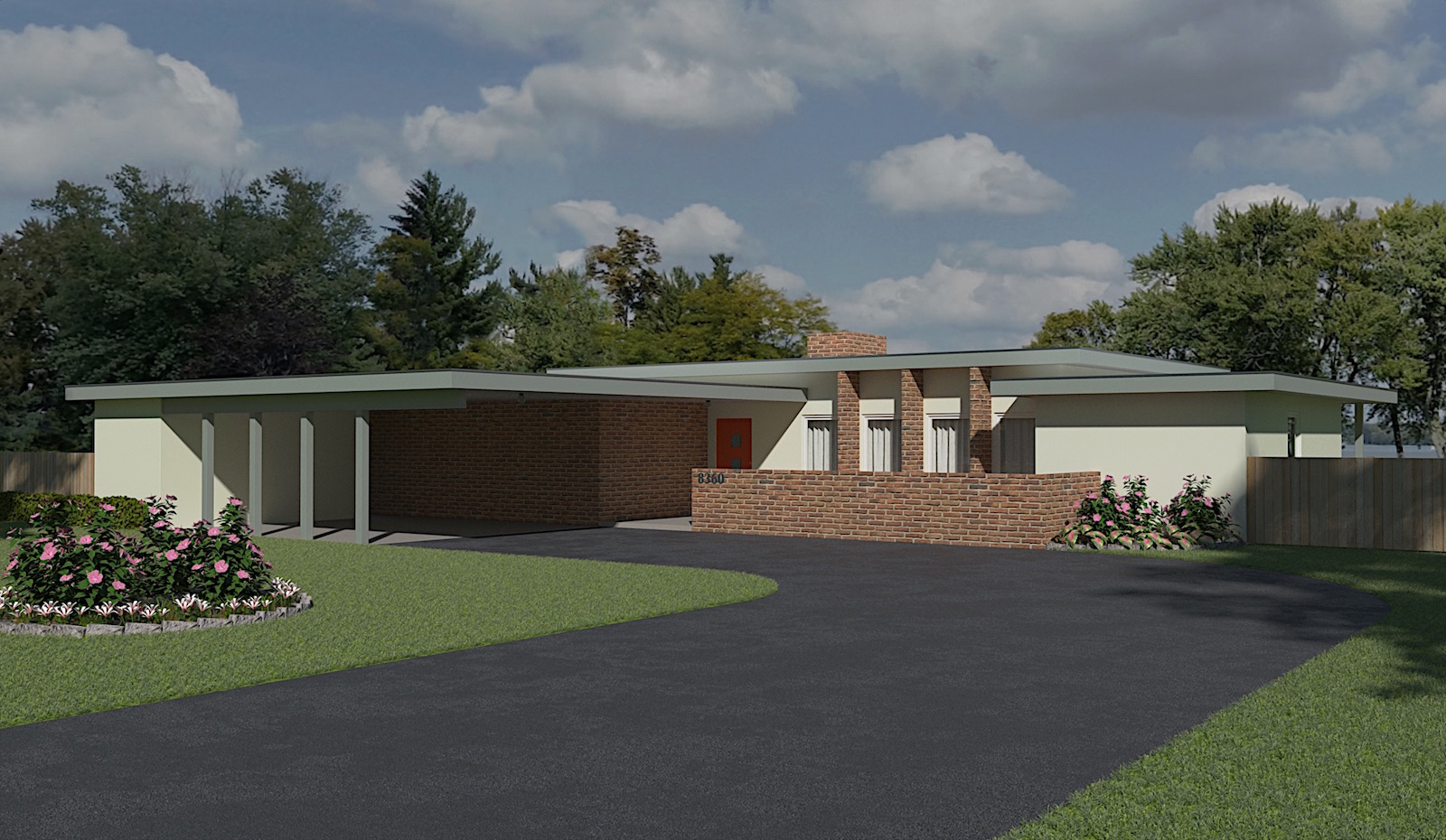
Adding and even exaggerating shininess and bump textures improved my renders tremendously.
-
Thanks for your input Bryan. Just so you know everything in the model has the desired bump and specular maps etc. applied.... The bump on the walls is not intended to be a heavy stucco type finish. I did "tone" things down in post pro to suit me figured it might be a little "somber" for some peoples taste. Posting the original render, it might be more to your liking. Only thing in post pro was a mild "de-noise" and slight "sharpening" of the image....

-
To me, and just my opinion of course, the second definitely has more presence.

-
I have to agree that the second is more vibrant. It's a bloody fine result.
-
Thanks Bryan , thanks Mike. Your both probably right in the second image being the better. Need to remind myself not everyone has the "gloomy" brain I have

Hello! It looks like you're interested in this conversation, but you don't have an account yet.
Getting fed up of having to scroll through the same posts each visit? When you register for an account, you'll always come back to exactly where you were before, and choose to be notified of new replies (either via email, or push notification). You'll also be able to save bookmarks and upvote posts to show your appreciation to other community members.
With your input, this post could be even better 💗
Register Login


Advertisement