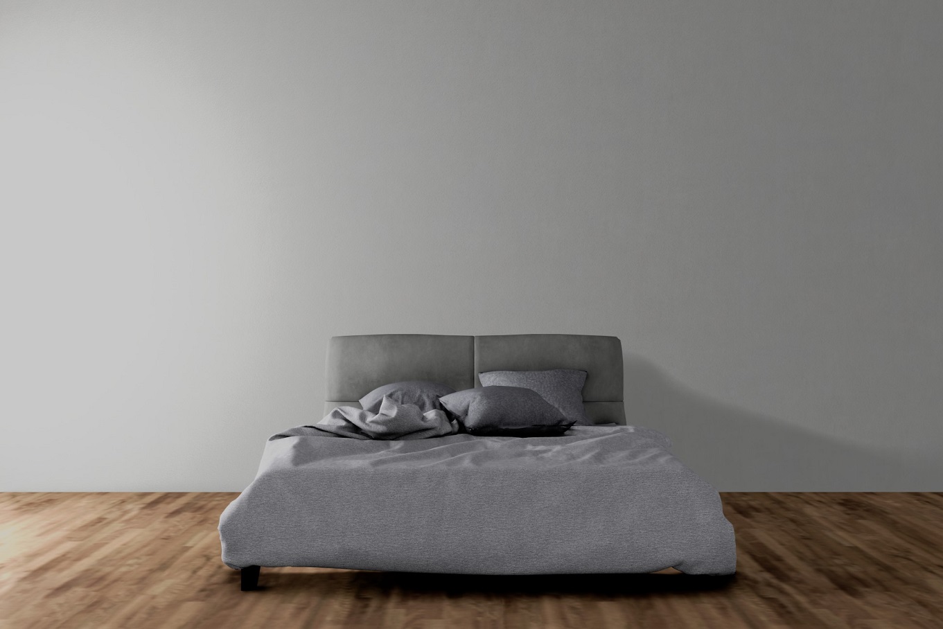
Eevee Morning
-
Blender Eevee + Sketchup.

-
everything is fine as an architectural presentation, but if realism is the aim then seems that the underneath shadow is too dark while the drop shadow on wall is too flat and lacks gradual attenuation.
-
I dig gthe simplicity of the image. If there was some kind of trim/moulding/base on the wall, it'd go a long way towards making it look more real.
-
I'm fascinated by the crumpled sheets! Awesome.

-
Nice!
-
Nicely done, I agree with Majid though.
Hello! It looks like you're interested in this conversation, but you don't have an account yet.
Getting fed up of having to scroll through the same posts each visit? When you register for an account, you'll always come back to exactly where you were before, and choose to be notified of new replies (either via email, or push notification). You'll also be able to save bookmarks and upvote posts to show your appreciation to other community members.
With your input, this post could be even better 💗
Register LoginAdvertisement


