Piano Room
-
Hi everybody :
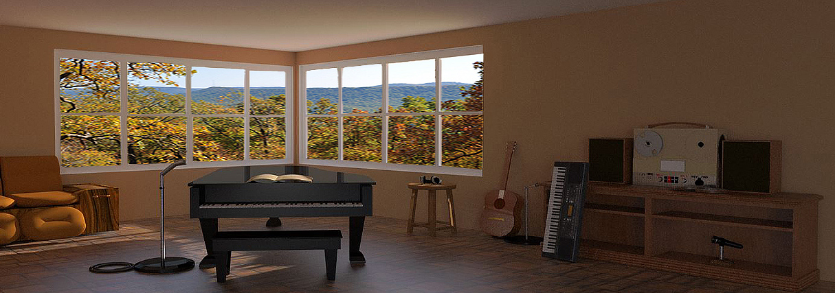
               I need some advice on this one.   I'm having a problem with scaling the scene.   In this one, either the sofa and piano are too small.  Or the credenza and electronics on it are too big.  I kept looking at it, and I couldn't decide. But, it does seem to be "out of scale".  In that sense, it doesn't seem like a smooth transition from left to right in the pic.  Also, I'm not done with it yet.

                                                                 garystan
-
garystan, try searching the internet for real world dimensions of the various objects. check them against the models dimensions. scale up or down as needed. one more thing , having a corner so close to the center of the scene rarely looks quite right. play around with your position in the scene until you find the "sweet" spot.
-
You are improving, getting better with the furniture etc. If the piano is a 'grand' it needs to be bigger. https://en.wikipedia.org/wiki/Piano. The sofa is difficult to size as they are all different but a quick look around might give a better idea of the average.
Keep going, you are on the right track, as for the setting of the scene it is something of a trial and error process but again take a look at the architecture sites and you will see a pattern of sorts.
-

Piano Size Conversion Chart Metric To Standard Sizes
Piano Size Conversion Chart Metric To Standard Sizes,Free Upright Piano Information of pianos offers more than 300 pages of free information and prices on buying, selling, rebuilding, ages, history and appraisals of pianos. We provide many free services for buyers, sellers and owners. Find the age of your piano--fast, free and convenient. This site is all about all pianos, new or used, large or small
(www.bluebookofpianos.com)
-
Composition is key in any image, be it a photo or a render.
Here is a handy tip:
-
Twilight has a tool built-in just for trying out the thirds in a scene and setting up the camera.
-
@pbacot said:
Twilight has a tool built-in just for trying out the thirds in a scene and setting up the camera.
Thea for SU also has it available
-
Thanks for sharing the video Pete. Some good advice.
-
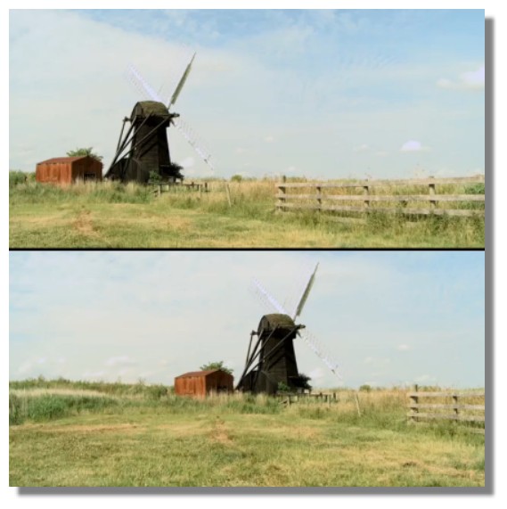
Even if the cameraman did use different parts of the windmill to align in each part of the video.
-
-
Purely academic and subjective!

More barrier for one, more grass for the other!
Not sure that the first is more dynamic!
All tastes are in nature!

-
Hey guys :
                I watched the video. It has some good pointers.  I  cropped the rendering with the "positioning" mentioned in the video.   I hope this looks better.

                                                               garystan

-
Hey guys :
                Hope I'm making any  sketchucation mistakes.  I just wanted to let you guys know that I watched the video.  Some good  ideas there. So I kinda adjusted the  Piano Room....thinking about the postioning.   Hopefully, this is an improvement.

                                                                   garystan

-
garystan, the scale of the piano is still bothering me. did a quickie search. The measurement from the floor to the bottom of the piano "case" is approximately 28 1/2" ( where your knees go when playing ), from floor to the top of the "lid is 40".your bookcase/credenza seems to dwarf the piano in size. most low bookcases and credenza's are usually 28" - 30" high on average. the next thing is just personal preference. I'd move the camera position to the right where you would have a more raking view of the wall with the bookcase. I'd rotate the piano a little clockwise so your not looking so straight on at it. It would also bring more of the sofa into view. All that said" by george your standing at the plate swinging at the pitches". Keep it up it's how you learn and get better.

-
As far as scale goes, since you asked. I am just imagining someone sitting on that couch and the on the piano seat. Someone who would sit on that seat might have their legs dangling at the couch.
How wide is the piano? how long is your guitar?
-
@tuna1957 said:
garystan, the scale of the piano is still bothering me. did a quickie search. The measurement from the floor to the bottom of the piano "case" is approximately 28 1/2" ( where your knees go when playing ), from floor to the top of the "lid is 40".your bookcase/credenza seems to dwarf the piano in size. most low bookcases and credenza's are usually 28" - 30" high on average. the next thing is just personal preference. I'd move the camera position to the right where you would have a more raking view of the wall with the bookcase. I'd rotate the piano a little clockwise so your not looking so straight on at it. It would also bring more of the sofa into view. All that said" by george your standing at the plate swinging at the pitches". Keep it up it's how you learn and get better.

quote="tuna1957"]garystan, the scale of the piano is still bothering me. did a quickie search. The measurement from the floor to the bottom of the piano "case" is approximately 28 1/2" ( where your knees go when playing ), from floor to the top of the "lid is 40".your bookcase/credenza seems to dwarf the piano in size. most low bookcases and credenza's are usually 28" - 30" high on average. the next thing is just personal preference. I'd move the camera position to the right where you would have a more raking view of the wall with the bookcase. I'd rotate the piano a little clockwise so your not looking so straight on at it. It would also bring more of the sofa into view. All that said" by george your standing at the plate swinging at the pitches". Keep it up it's how you learn and get better.
@tuna1957 said:garystan, the scale of the piano is still bothering me. did a quickie search. The measurement from the floor to the bottom of the piano "case" is approximately 28 1/2" ( where your knees go when playing ), from floor to the top of the "lid is 40".your bookcase/credenza seems to dwarf the piano in size. most low bookcases and credenza's are usually 28" - 30" high on average. the next thing is just personal preference. I'd move the camera position to the right where you would have a more raking view of the wall with the bookcase. I'd rotate the piano a little clockwise so your not looking so straight on at it. It would also bring more of the sofa into view. All that said" by george your standing at the plate swinging at the pitches". Keep it up it's how you learn and get better.

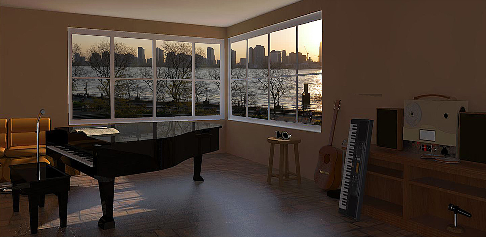
/quotetuna1957 : I did some re-arranging. Resizing the furniture. Adjusting the view......etc............. Hopefully, this looks better. garystan

-
@solo said:
Composition is key in any image, be it a photo or a render.
Here is a handy tip:
solo :
I did a little work on it. Re-arranging the furniture.....point of view...scale...etc. Hopefully, this looks better. (And, keeping the 2/3 rule in mind).garystan

-
ditto what pbacot said. a few comments, the corner of the windows still catches my eye first, then I go to the various objects in the room. Pick the object that you want to be the focal point and adjust your view so that is what the eye is drawn to first. I'd increase the field of view some so you have more of the left side of the scene in view. I'd try lowering the eye height a little maybe. It just take trying different angles and such until you hit that sweet spot. Keep experimenting ....

-
@pbacot said:
Good work! Feeling much better with piano etc. The exterior picture is the wrong perspective for the room. You'd want the horizon lower and the vanishing points sort of going along with the window grid.
pbacot :
I wasn't sure about where to set the horizon. I didn't want to give the impression that the room was high up. As for the pic itself.......I wasn't sure about that either. Thanks for your comments (advice). garystan -
@tuna1957 said:
ditto what pbacot said. a few comments, the corner of the windows still catches my eye first, then I go to the various objects in the room. Pick the object that you want to be the focal point and adjust your view so that is what the eye is drawn to first. I'd increase the field of view some so you have more of the left side of the scene in view. I'd try lowering the eye height a little maybe. It just take trying different angles and such until you hit that sweet spot. Keep experimenting ....

      tuna1957 :

                  Taking a closer (and second) look at it.  Yeah.....I think you're right about the perpsecive of the background.  I take it......this part of the learning process.....

                                                                     garystan
Hello! It looks like you're interested in this conversation, but you don't have an account yet.
Getting fed up of having to scroll through the same posts each visit? When you register for an account, you'll always come back to exactly where you were before, and choose to be notified of new replies (either via email, or push notification). You'll also be able to save bookmarks and upvote posts to show your appreciation to other community members.
With your input, this post could be even better 💗
Register LoginAdvertisement


