A SketchUP movie!
-
Hello modelers from all over the world!I'm Leonard and I want to show you something very cool.
I've been working to a movie, mostly a documentary called "Journey through space and time".It is a documentary about universe, made entirely in SketchUP(I used a few green screen effects).It's a little too long but I think it's worth.So please, tell me what do you think about it.It is cool or it is bad?Any comments are welcomed. Here is the link https://www.youtube.com/watch?v=nVYoiAKKNPY%26amp;list=UU6HicRTnJ6OUIn1pGYF0new
Please like it, comment and subscribe! Thank you! Have a wonderful day!
-Leo Leonard
-
Planets? Cool

-
Amazing univers!

-
I'm glad you like it! This is about Titanic.Is the best movie! Enjoy: https://www.youtube.com/watch?v=aZiPoK42qJ4
-
You have obviously put a lot to time and effort into these, and it shows

A few ovbservations -
In the first movie "Journey through space and time", the narration at the beginning is overpowered by the music, then it is ok for awhile, but at around the 3 minute mark the narration really jumps in volume.
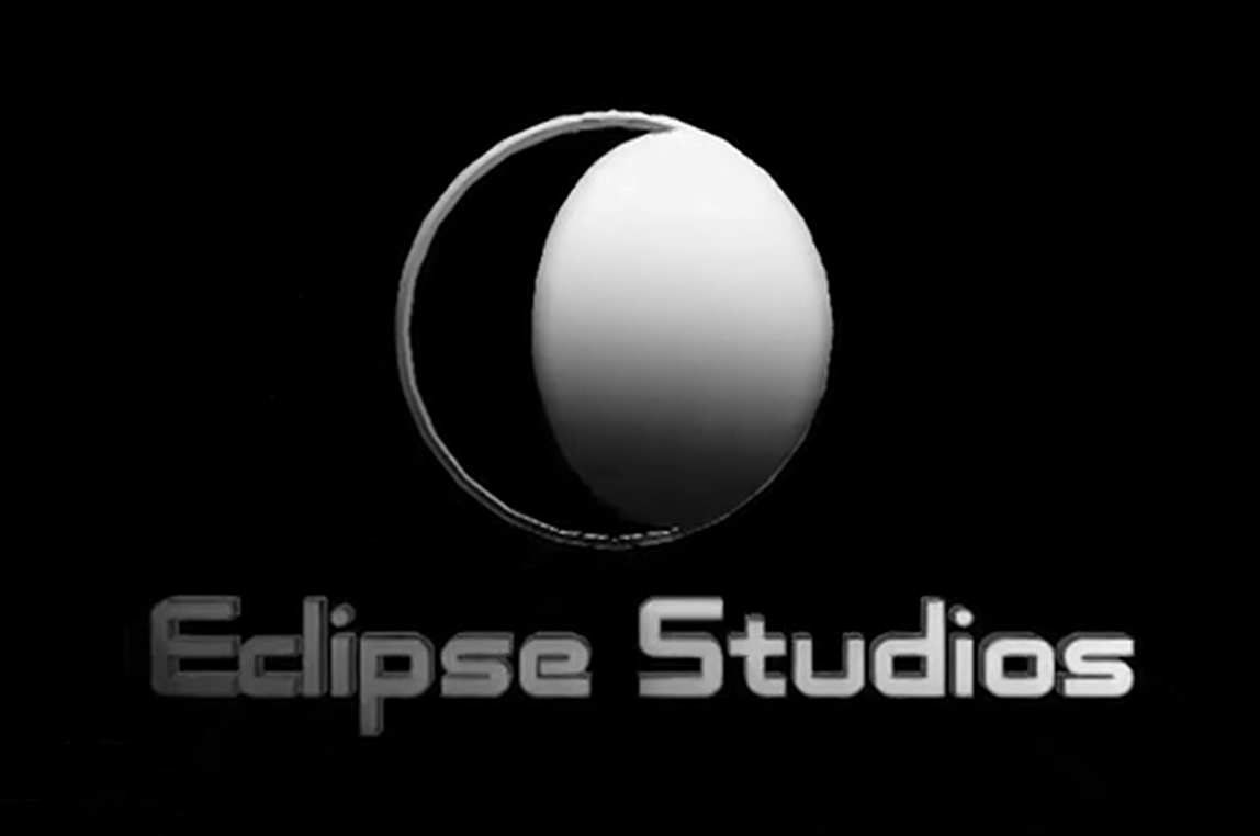
Also, not to be nitpicky but if you are going to continue to use to use this logo at the beginning of your movies...

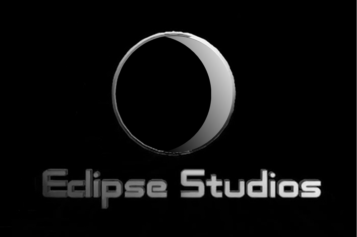
if you really want it to depict an eclipse the shadow should be moving in front of the moon or sun or whatever, like so...

As I said, nitpicky. I really was impressed by your work.sorry, I'm bored. I'll go away now
-
Quite an undertaking. Good job on editing! Some of the sequences really work well considering the resources. Good job!
-
Thank you so much for your support! I am glad to see other poeple who like my work! I'm also glad that my work wasn't in vain! Share the video with your friends! Thank you again!
-
Here is the other logo! https://www.youtube.com/watch?v=6XIzry7upmE
P.S YouTube compressed it too much.The original it doesn't look like this, but anyway I'll delete it!
Maybe you know a cool program for creating an awsome logo! Cheers!!! -
@hellnbak said:
You have obviously put a lot to time and effort into these, and it shows

A few ovbservations -
In the first movie "Journey through space and time", the narration at the beginning is overpowered by the music, then it is ok for awhile, but at around the 3 minute mark the narration really jumps in volume.
Also, not to be nitpicky but if you are going to continue to use to use this logo at the beginning of your movies...
[attachment=1:1qxl9rcc]<!-- ia1 -->2015-01-16_180730.png<!-- ia1 -->[/attachment:1qxl9rcc]
if you really want it to depict an eclipse the shadow should be moving in front of the moon or sun or whatever, like so...
[attachment=0:1qxl9rcc]<!-- ia0 -->2015-01-16_180730 b.png<!-- ia0 -->[/attachment:1qxl9rcc]
As I said, nitpicky. I really was impressed by your work.sorry, I'm bored. I'll go away now
First: can you tell me what nitpicky means? I couldn't find it o translate! Sory:)))
I know, in the first 3 minutes the narration is a little too quiet and then, BOOM, it's louder.That's a render problem. I used Camtasia Studio 8 to edit the clip and almost everybody knows that Camtasia have a sensitive script, to say like that. If it slows down a bit, it won't load, it crashes imediately. So I left it as it was, I didn't render it again! I was affraid )
)
In The Titanic movie, I made the final render with Cyberlink Power Director. I'm pretty much impressed by its features. It's a very strong program.It works a bit slower because of my PC (2GB RAM), but it doesn't crash like Camtasia.
As for the logo, I'm waiting to explain to me what's nitpicky means.I don't want to get you wrong.
I'm planning to change the logo, but I want to make it in a cool software not SketchUP. Also I made a new logo but I didn't include it in my last movie! I'll upload it and leave here the link!
Hello! It looks like you're interested in this conversation, but you don't have an account yet.
Getting fed up of having to scroll through the same posts each visit? When you register for an account, you'll always come back to exactly where you were before, and choose to be notified of new replies (either via email, or push notification). You'll also be able to save bookmarks and upvote posts to show your appreciation to other community members.
With your input, this post could be even better 💗
Register LoginAdvertisement


