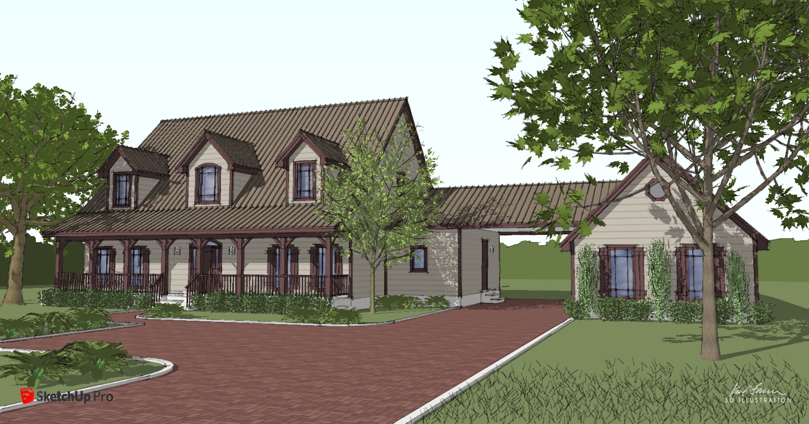
Old school...
-
Old school SketchUp style.

-

-

-
Nice.
 Where are those trees from? They look very good.
 -
Beautiful! What is not to love about vintage SU style....and of course a person who can lay it down....pro job!
-
Well done, Karl. Now that's a little house I could see myself living in.
-
Thanks everyone! The trees are mine; I created them myself.
-
Karl did you happen to see this?
http://sketchucation.com/forums/viewtopic.php?f=15%26amp;t=60146%26amp;hilit=+Austin
-
@krisidious said:
Karl did you happen to see this?
http://sketchucation.com/forums/viewtopic.php?f=15%26amp;t=60146%26amp;hilit=+Austin
Thanks Kris. I did see that link but I am retired and I just do this for enjoyment!

-
Very good, the grass are 2d pngs with transparency or 3d models?
-
@jaceguay said:
Very good, the grass are 2d pngs with transparency or 3d models?
Everything in the model is 3D.
-
Nice work. Good trees too!
-
@karllarsen said:
Thanks Kris. I did see that link but I am retired and I just do this for enjoyment!

Kool, maybe you might know someone locally who could help him. I think he's outside of the country so it's hard to find dependable people.
-
@krisidious said:
@karllarsen said:
Thanks Kris. I did see that link but I am retired and I just do this for enjoyment!

Kool, maybe you might know someone locally who could help him. I think he's outside of the country so it's hard to find dependable people.
Edit: they're in Dallas. It's just too hard to get paid anymore - that is why I retired.
-
Ah, didn't see that he was in Dallas... It is hard to get paid nowadays.
-
Looks great, good use of the sketchy style. I'd get rid of the red SU logo - it kinda draws attention.
-
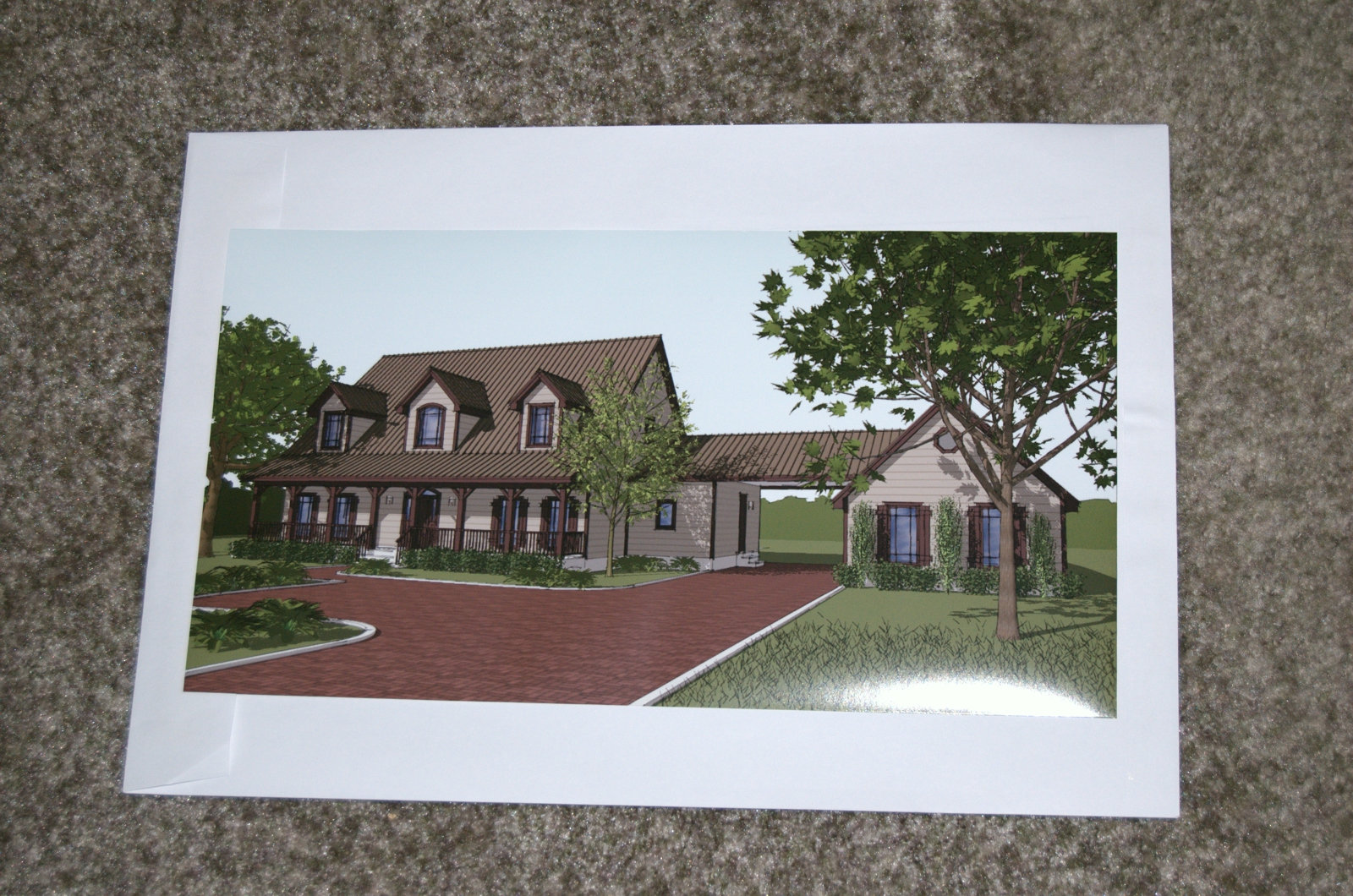
My goal is to derive a style of affordable, quick-to-produce, pleasing architectural illustrations that can be created within SketchUp without the need for add-on rendering programs - thus the SketchUp logo. I'm getting close! I had the image printed last week via latex ink jet and am highly please with the result. Sorry for the glare from the camera flash but this is the printed image (17"x9") resting on top of the envelope it came in to distinguish it from the carpet.
Not too bad for what I am trying to achieve!

-
It's really refreshing to see someone willing to forgo rendering when presenting his model. Doesn't happen enough here.
Hello! It looks like you're interested in this conversation, but you don't have an account yet.
Getting fed up of having to scroll through the same posts each visit? When you register for an account, you'll always come back to exactly where you were before, and choose to be notified of new replies (either via email, or push notification). You'll also be able to save bookmarks and upvote posts to show your appreciation to other community members.
With your input, this post could be even better 💗
Register LoginAdvertisement


