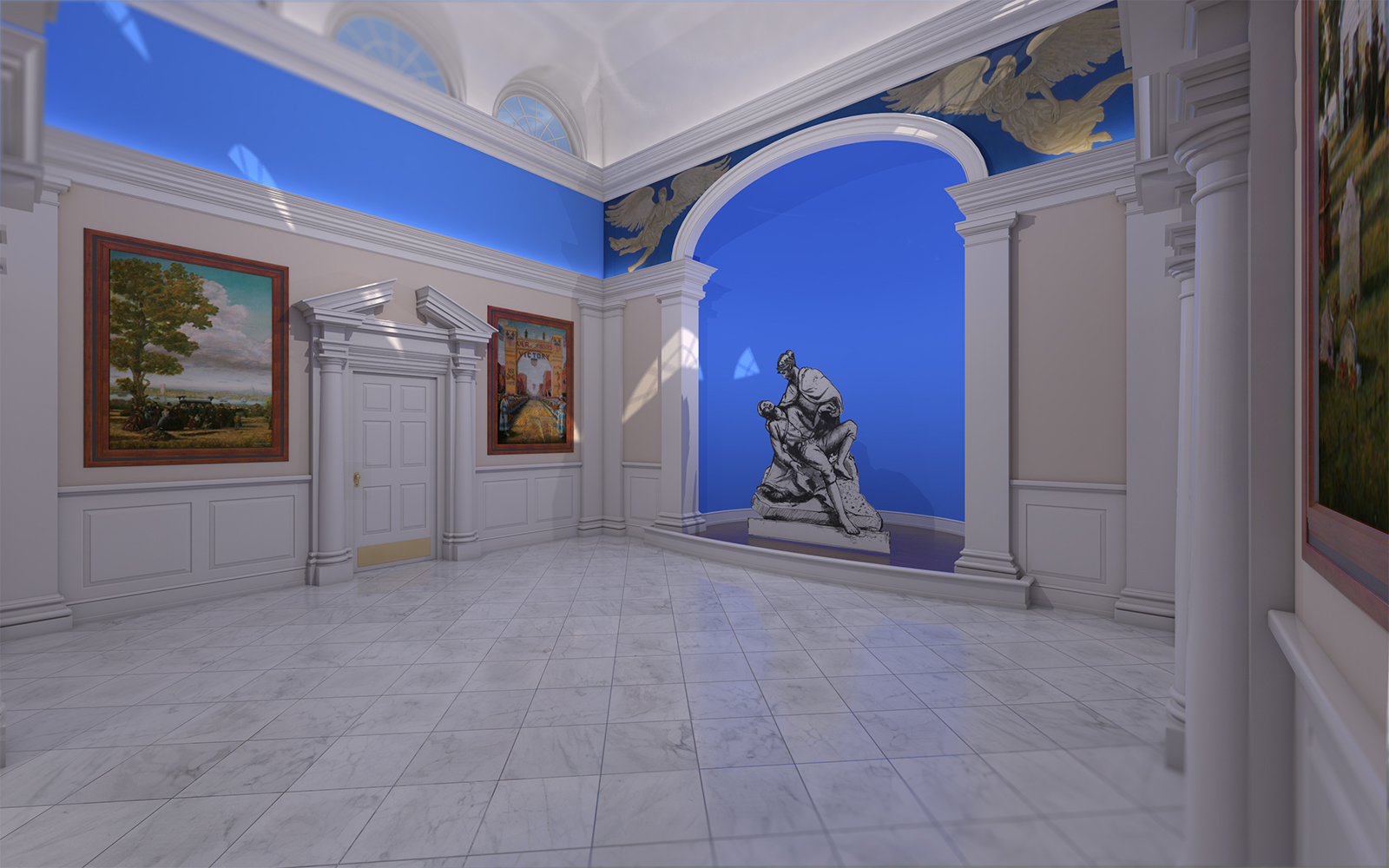
Interior Render (V-Ray) Want Critiques/Comments
-
I did this awhile back for work and the project was finished so I was able to pull in some materials and have been trying to finish it out.
I haven't finished pulling in all the artwork that is there but I'm about 90% there.
My main concern is just the overall look. I was trying to go for an ultra-realistic look but I feel like it just doesn't look right. I think it's mostly the walls. Do any of you use a bump map or lightly textured material for painted walls? I think there are probably too many sharp edges on the moulding and trim... Just babbling, but critique away.
-
i will leave the comments on the lighting and materials to the rendering gurus on this forum, cause there are guys here with far more knowledge than me
but as an architect i cant help to comment 4 things:
- the perspective seems overstretched (i dont know if that's the right word, english is not my native language) or maybe its just an illusion caused by the floor tiles, IDK...
- i cant understand the camera blur... it seems to happen only in the top-left and right-bottom of the image... its strange
- are you sure the floor tiles are in the right angle? seems odd for an orthogonal room
- the paintings frames lack a sense of depth... again, i dont know if that's the right word, but they seem flat (i wont mention the sculpture, cause im guessing it will be replaced by a 3 dimensional one)
but i love the detail on the door frame and columns, with some tweaks i think it has potential to be a great render image
-
oh, ok... so the tiles are actually well textured at a 45º angle
my bad... i guess its just a question of personal preference, i always prefer the floor design aligned with the walls in my projects
-
@jonfar said:
i will leave the comments on the lighting and materials to the rendering gurus on this forum, cause there are guys here with far more knowledge than me
but as an architect i cant help to comment 4 things:
- the perspective seems overstretched (i dont know if that's the right word, english is not my native language) or maybe its just an illusion caused by the floor tiles, IDK...
- i cant understand the camera blur... it seems to happen only in the top-left and right-bottom of the image... its strange
- are you sure the floor tiles are in the right angle? seems odd for an orthogonal room
- the paintings frames lack a sense of depth... again, i dont know if that's the right word, but they seem flat (i wont mention the sculpture, cause im guessing it will be replaced by a 3 dimensional one)
but i love the detail on the door frame and columns, with some tweaks i think it has potential to be a great render image
-
It's probably the field of view. At 35, the room looks claustrophobic. I agree though, I should probably dial it back down a bit.
-
It's tilt shift blur, just a personal preference.
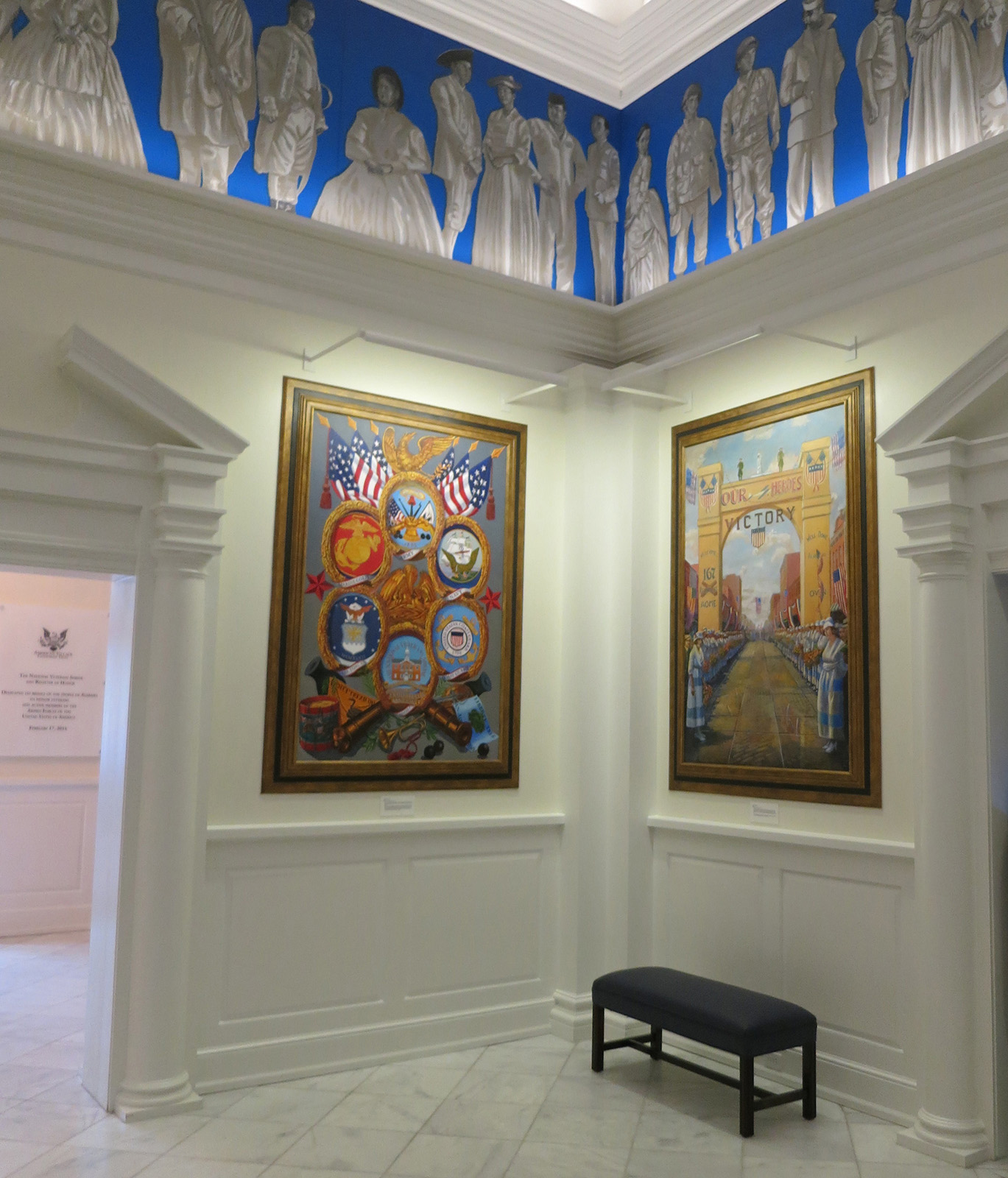
3&4... i'll attach an image of the actual project.
-
The second picture looks great!
Hello! It looks like you're interested in this conversation, but you don't have an account yet.
Getting fed up of having to scroll through the same posts each visit? When you register for an account, you'll always come back to exactly where you were before, and choose to be notified of new replies (either via email, or push notification). You'll also be able to save bookmarks and upvote posts to show your appreciation to other community members.
With your input, this post could be even better 💗
Register Login


Advertisement