.mid century remodel. ::updated 12.15.11::
-
Good design and presentation.
-
I have to say I am torn at the use of photoreal and an artsy background the 2 conflict to me. All in all I like the house design, I am just not sold on the composition.
Scott
-
I always find your work inspiring, Jason. this one is no exception.
I'm curious - how are the boards projecting out over the entrance door (image 5) supported, and what gives them lateral stability? -
scott... I was waiting to see if anyone had a reaction to it.. I was unsure about it too....but the background was already there, so I figured I'd give it a go... probably won't go that route again, but its also not the end of the world

daniel.. there's a support going across underneath them.. which is shown as metal, but in reality will end up being wood.... and there will be simpson strong ties attaching the boards to that.
-
Er, can I drool now? That is one serious update of Eichler's style and I love it!
-
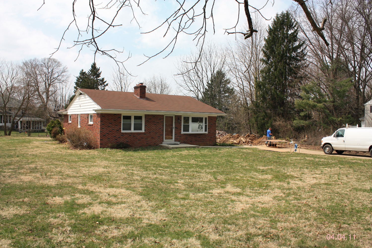
this project has finally begun... it was slow slow to start and now construction is going just as slow for some reason. here are a few pics of the progress though..

-
the composition is good but the render must be reviewed in some things:
more realistic lighting; bakground possibly related to the place where the composition will take place: no tiling effect in the grass, and I think a night render could be really great .Congratulations for the buildings! -
Love design and elegant structure.
-
Ahhh making the world a better place. Keep the photos coming.
-
I imagine after three years the garden should have grown in nicely.
-
this project spurred some ridiculous lawsuits, so i honestly have no idea if it ever even got finished.
-
Lawsuits? over what? how bad it made the neighbors look? I'd love to have that house built next to mine.
Hello! It looks like you're interested in this conversation, but you don't have an account yet.
Getting fed up of having to scroll through the same posts each visit? When you register for an account, you'll always come back to exactly where you were before, and choose to be notified of new replies (either via email, or push notification). You'll also be able to save bookmarks and upvote posts to show your appreciation to other community members.
With your input, this post could be even better 💗
Register LoginAdvertisement


