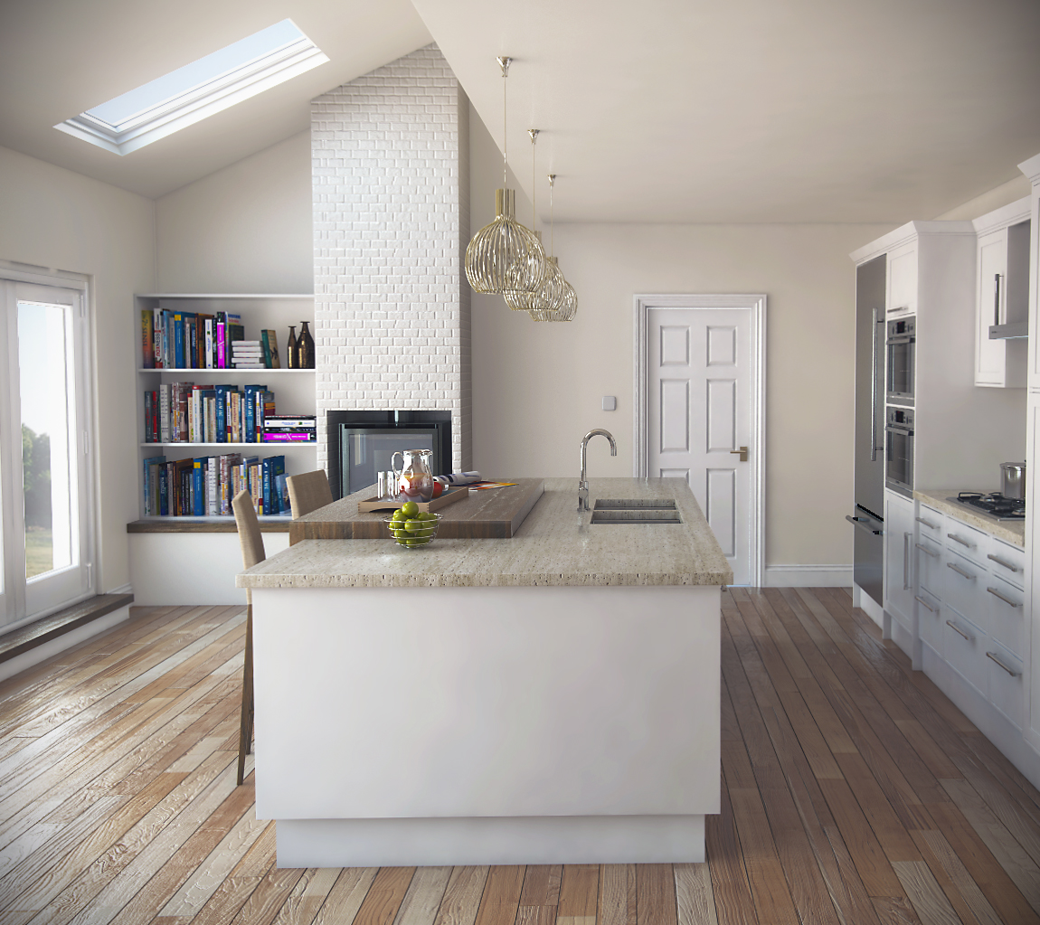
Kitchen Vray sketchup WIP
-
A little preview

-
Wow! Very nice!

You call this a "preview?"
Looks finished to me!
-
Cheers Bryan

-
Looking very nice. The floor could be better. It looks plastic because of the wrong combination of strong bump and strong reflection (which is anti bump). And also would be better to rotate it 90 deg IMO.
-
I hate to say this... But... It's the clay. The simple clay is spectacular... The standard render is good, but the clay... Mmmm. I like it.
-
SRX: Cheers definitely agree with you about the reflection being a bit on the high side. Though gonna have to disagree aabout rotating 90 deg, they shoudl run parallel with the bi folds : )
Kristoff: I also like the clay renders, hopefully the finished product will look better once I have more detail.
-
Yeah I reckon for sure the boards are in the right direction - going along the kitchen / doors.
But true that there is a little too much bump to the floor and the brick. BTW I think the brick mapping is out of scale, worth checking.
-
Cheers Richard, definitely agree with you on the brick scale...sometimes you can look at the same image for too long and you overlook things. It takes an outsider to point it out.
-
hi sorry to bring up a old post but loved the quality of these renders,
i am new to vary so wondered if you could share more about you settings an what lights were used
cheers
lee
-
Very nice model and renders, Nicholas.


Take care,
_KN
-
Nice.
-
Thank you David & Ken.
Lee - Not quite finished yet, keeps getting postponed by paid work. PM me your email address and I'll send you the visopt when finished.
Hello! It looks like you're interested in this conversation, but you don't have an account yet.
Getting fed up of having to scroll through the same posts each visit? When you register for an account, you'll always come back to exactly where you were before, and choose to be notified of new replies (either via email, or push notification). You'll also be able to save bookmarks and upvote posts to show your appreciation to other community members.
With your input, this post could be even better 💗
Register LoginAdvertisement


