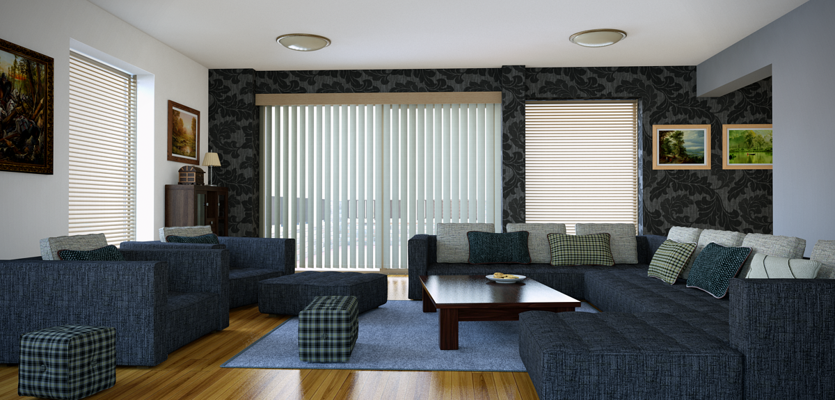
Living room interior
-
Living room interior. Modeled with Sketchup, rendered with Thea studio, BSD, time 3 hrs 20 min.
C&C are welcome.

-
Looks good. The two pictures on the far wall look to bright, as in no shadow anywhere around them etc.
All in all tho, a very nice model!
-
Nice. Are those ceiling lights really that large?
-
Excellent, almost too realistic.
You need a fault somewhere, a cushion out of place or one of the sections of the blinds twisted slightly so the gap is irregular....
-
Very nice!
-
Thanks for comments.
@rafferty94 said:
...The two pictures on the far wall look to bright, as in no shadow anywhere around them etc...
I didn't notice that there is no shadows around the pictures
 and, yes, frames are too bright.
@box said:
...You need a fault somewhere, a cushion out of place or one of the sections of the blinds twisted slightly so the gap is irregular....
Thanks for the advice.

@jpalm32 said:
Nice. Are those ceiling lights really that large?
Yes, these lamps are really large about 580mm diameter.
-
you should separate the paintings from the wall, like half a centimeter, so that they dont look like glued to the wall, but hung on
apart from that, its almost perfect
very good one
-
@xonpt said:
you should separate the paintings from the wall, like half a centimeter, so that they dont look like glued to the wall, but hung on
apart from that, its almost perfect
very good one
Thanks,
I did a 5 mm space between picture and wall, but, I think, there was no shadows around the frames because of bad lighting. -
@ginchius said:
@xonpt said:
you should separate the paintings from the wall, like half a centimeter, so that they dont look like glued to the wall, but hung on
apart from that, its almost perfect
very good one
Thanks,
I did a 5 mm space between picture and wall, but, I think, there was no shadows around the frames because of bad lighting.well, then i shouldnt have said anything, because you actually did what i said... my bad, sorry... lol
but its weird how that spacing didnt cast any shadows
even so, the images are great!
-
Wow looks really cool. How much of the room was there when you started out (if any). Some solid work!
-
@xonpt said:
well, then i shouldnt have said anything, because you actually did what i said... my bad, sorry... lol
but its weird how that spacing didnt cast any shadows
even so, the images are great!
Later I'll try to rerender this interior to fix mistakes.
@mortenstorgaard said:
Wow looks really cool. How much of the room was there when you started out (if any). Some solid work!
Thanks for comment,
Just one room was when I started
Hello! It looks like you're interested in this conversation, but you don't have an account yet.
Getting fed up of having to scroll through the same posts each visit? When you register for an account, you'll always come back to exactly where you were before, and choose to be notified of new replies (either via email, or push notification). You'll also be able to save bookmarks and upvote posts to show your appreciation to other community members.
With your input, this post could be even better 💗
Register LoginAdvertisement


