Latest Work: Exhibition Space
-
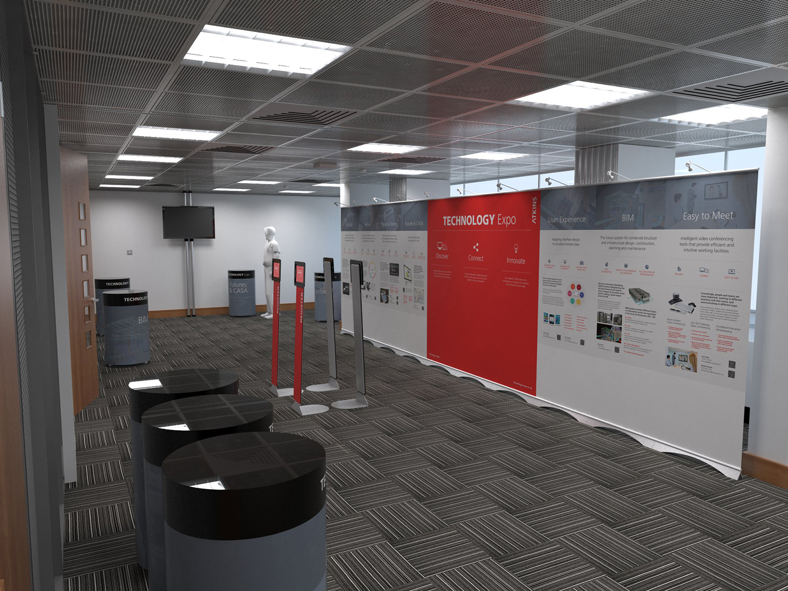
Just produced this to help the print designers show how the room will look.

-
LOOKS GREAT, TOBY
-
I think the 3d guy in the back it's a bit out of place . Maybe a textured model would be better .And the floor is distracting(too much bump ?).
I'm not really a render guys so this might be just a personal opinion ! -
That's a render?

-
@daniel said:
LOOKS GREAT, TOBY
Thanks Dan.
@ely862me said:
I think the 3d guy in the back it's a bit out of place . Maybe a textured model would be better .And the floor is distracting(too much bump ?).
I'm not really a render guys so this might be just a personal opinion !The 3d guy was left over from a context render and they client liked on that and so requested it be kept.
The carpet is really that loud in that conference room, there is hardly any bump on it.
@bryan k said:
That's a render?

Thanks Bryan, really appreciate your surprise. I've been going for realism so it is a shame that the client wanted the SU man in it.

-
Well done sir.
-
Render is good..Looks real but I think a few things can be refined
- The near objects can be more detailed.. In real life there are few objects with this sharp corner- even 1 or 2 mm round corner can help.
- The AC Grille.
- and of course the human model. Otherwise can be mistaken for photo.
4.The ceiling tiles bump looks too strong- but maybe thats the designof the perforation.
Good JOb!
-
Honestly, I thought the mannequin was, well, really a mannequin.

-
Incredible! The ceiling in particular IMO is stunning. The only question I have: are the mechanical diffusers 2D? They appear to be flat, tapering 2D surfaces. Bulkier blades or 3D would be stellar! But, I'm a noob, aspiring to do what you do, so... enough said.

-
@boofredlay said:
Well done sir.
Thanks Boo!

@cuttingedge said:
Render is good..Looks real but I think a few things can be refined
- The near objects can be more detailed.. In real life there are few objects with this sharp corner- even 1 or 2 mm round corner can help.
They are table with a foamex wrap, so i wasn't sure how the edge would look.
@unknownuser said:
- The AC Grille.
The AC grill is a guesstimation from images and is just single faces (trying to keep the poly count down)
@unknownuser said:
- and of course the human model. Otherwise can be mistaken for photo.
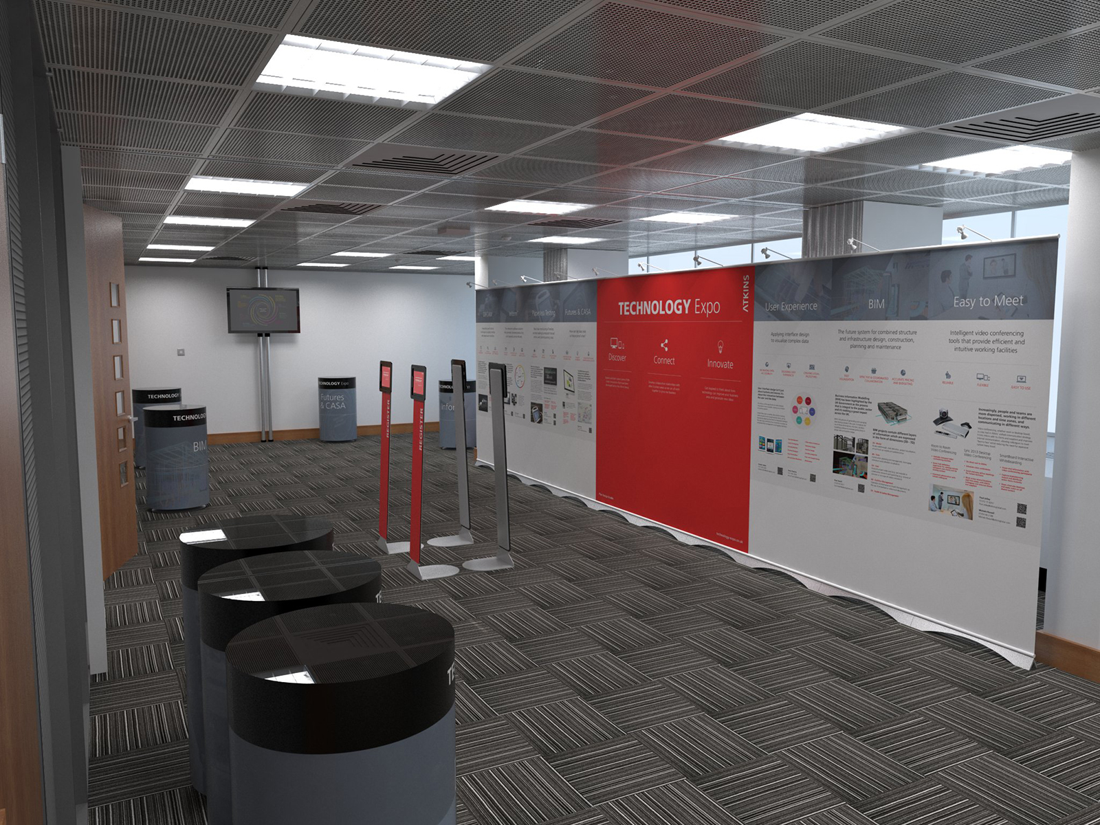
Yeah it is a shame, however thank you, i will try to do a render sans person
@unknownuser said:
4.The ceiling tiles bump looks too strong- but maybe thats the design of the perforation.
I am not sure either, it's a bump the does the perforation and the recess for the frame holding the tiles (nod to ThomThom for the bump technique)
@unknownuser said:
Good JOb!
Thanks

@bryan k said:
Honestly, I thought the mannequin was, well, really a mannequin.

Oh good, then that was totally planned

@gubermensch said:
Incredible! The ceiling in particular IMO is stunning. The only question I have: are the mechanical diffusers 2D? They appear to be flat, tapering 2D surfaces. Bulkier blades or 3D would be stellar! But, I'm a noob, aspiring to do what you do, so... enough said.

Yeah the diffusers are 3D but barely

I will have a go at doing them properly
Thanks for the praise, i'm not as good as some.
-
No dummy

-
Great Image

-
Hello! It looks like you're interested in this conversation, but you don't have an account yet.
Getting fed up of having to scroll through the same posts each visit? When you register for an account, you'll always come back to exactly where you were before, and choose to be notified of new replies (either via email, or push notification). You'll also be able to save bookmarks and upvote posts to show your appreciation to other community members.
With your input, this post could be even better 💗
Register LoginAdvertisement


