Small Jazz Club
-
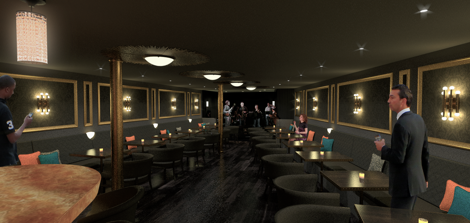
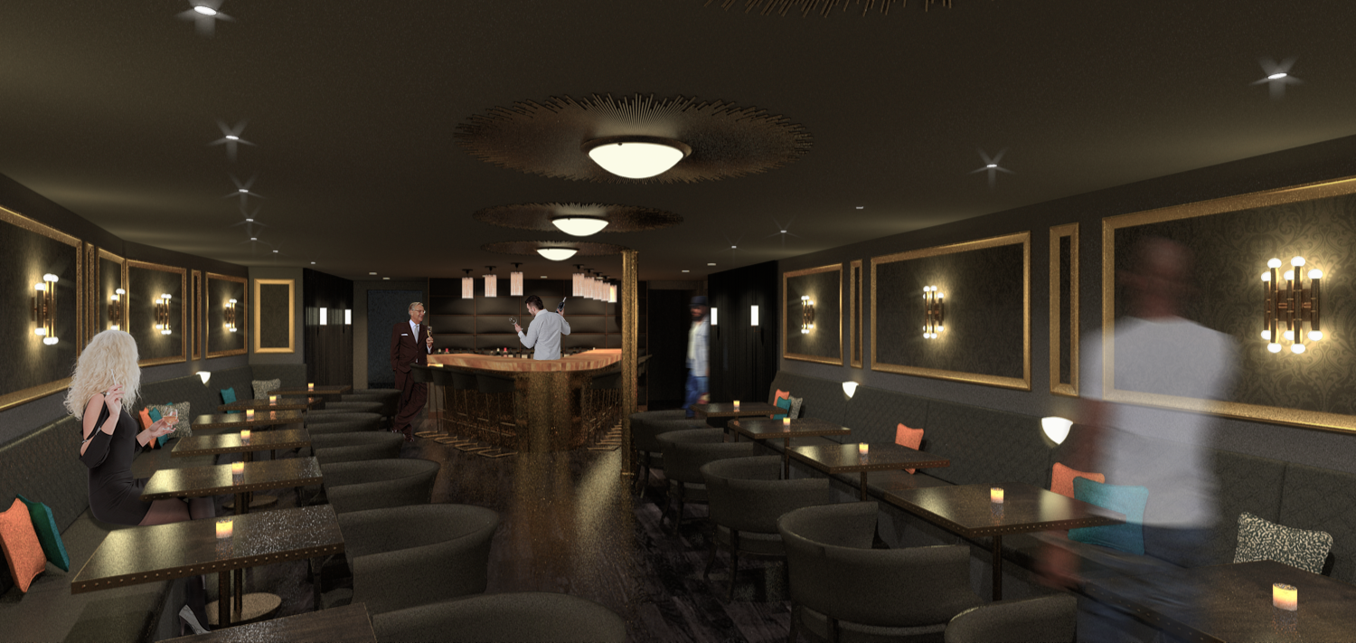
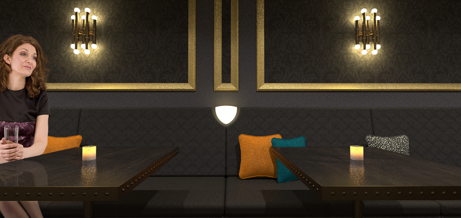
..few quick images of a small basement jazz club. SketchUp/Thea/Pshop


-
Good images, but the people are a problem imho. I think the blurred transparent person is best. It's a tricky thing at that range & detail.
-
Great shots... love the lighting and composition choices. The woman in that last shot looks either tipsy and/or incredibly bored with her date

-
yes, people are always my big downfall... I definitely don't spend enough time blending them in (or just don't have the skill!). I haven't looked at these since I completed them and looking at them now the people really really stick out.
-
Nice renderings, Jason. Design-wise, I think those lights on the bench backs are problematic - people will brush up against them, or lean back on to them.
-
Lovely interior, and FWIW, your people aren't that far off the mark... compared to some of the awful stuff we see in some achitectural renderings

I thought you might find this link interesting and helpful (i know i did)
A.
-
@andyc said:
FWIW, your people aren't that far off the mark...
 Yeah I hope my comment wasn't taken as a crit... I just liked the expression on the face of the woman you chose. I think the people look almost NPR stylized-ish and I dig it a lot.
 -
Jaz club or lonely hearts club?? Is that girl in the last image dreaming of me? I know most of them do!
-
I think she just might be, Richard.
Andy..thanks for that link, that's great. Thanks for the critiques, guys.. I'll keep trying with the people.
-
Good job!
Woman in last picture looks like Robb's mother
Hello! It looks like you're interested in this conversation, but you don't have an account yet.
Getting fed up of having to scroll through the same posts each visit? When you register for an account, you'll always come back to exactly where you were before, and choose to be notified of new replies (either via email, or push notification). You'll also be able to save bookmarks and upvote posts to show your appreciation to other community members.
With your input, this post could be even better 💗
Register LoginAdvertisement


