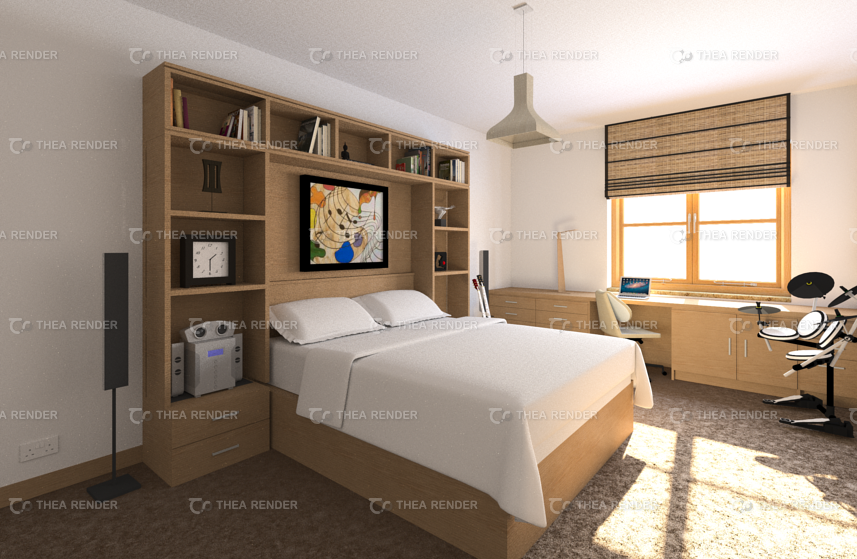
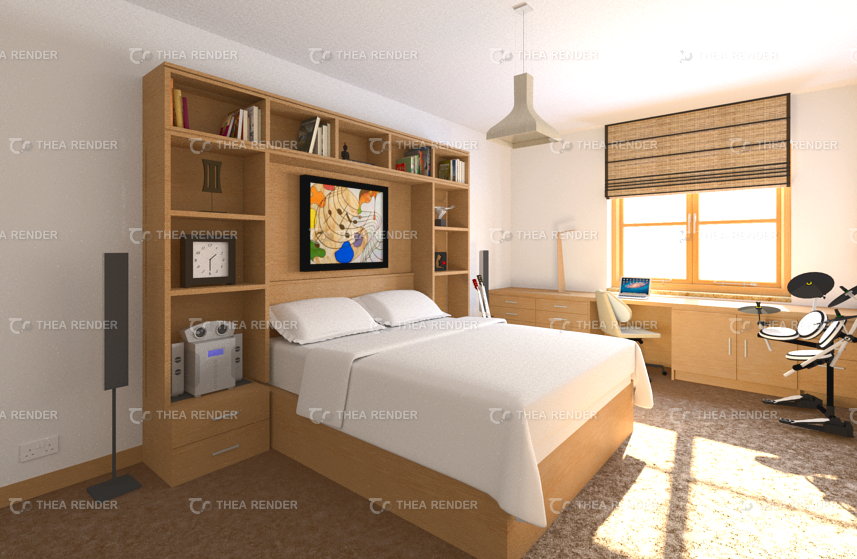
My first Thea render - Bedroom scene
-
I decided to try out Thea and this is what I've managed to achieve so far in my first few tries.
I've included both the raw render and one that was adjusted in GIMP. I'm aware it's a bit overblown in the second pic near the window (not to mention it lacks a background image), but aside from that, I would appreciate any comments and critiques on these renderings.
As you can see, I'm using the trial version. I'm just trying out different renderers to see which one is suitable for me. I am thinking of doing freelance visualisation full time and I'm not sure Podium is the long term answer.


-
Very nice!
-
Thanks, Bryan!
-
Nice first render. I prefer the first for some reason.
-
Hi John.
I guess probably because the second image looks a bit flat and lighting is blown out compared to the first.
I'm impressed with Thea so far, though. The ability to adjust things on the fly as it renders is also another plus.
Anyway, thanks for the feedback.
-
For interior (and why not exterior renders) you really should try different CRF profiles (http://www.thearender.com/resources/PDF_Tutorials/TheaDarkroomTutorial.pdf) as by default Thea produces quite neutral image (that's intentional so that people have more room for post processing).
-
Hi Notareal,
Thanks for the tips.
Ken.
Hello! It looks like you're interested in this conversation, but you don't have an account yet.
Getting fed up of having to scroll through the same posts each visit? When you register for an account, you'll always come back to exactly where you were before, and choose to be notified of new replies (either via email, or push notification). You'll also be able to save bookmarks and upvote posts to show your appreciation to other community members.
With your input, this post could be even better 💗
Register LoginAdvertisement


