My first Maxwell interior. Advise is very welcome!
-
Hello everyone,
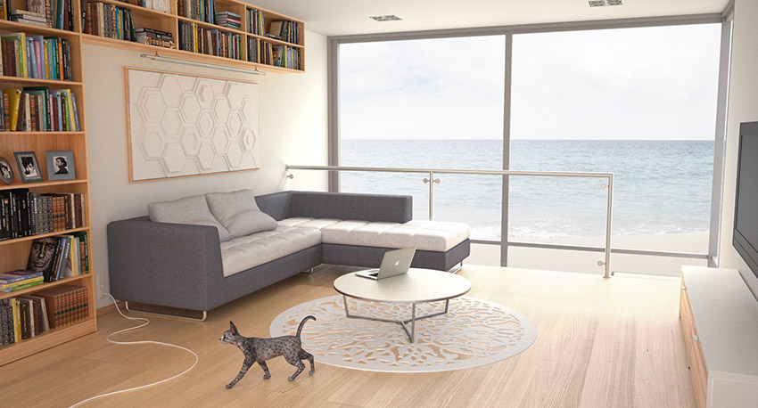
this the first interior that I have done. Any advice is more than welcome! It's an appartement of my own imagination at the sea-side. It is done with Sketchup, Maxwell Render and a bit of photoshop. The floor is overexposed at one point, but I don't know how to avoid this. Also, the carpet under the table has no texture, but I want it to be pretty white, and when I apply a texture, it always becomes gray.
Best,
Pieter
-
Looks great for a first interior, i find Maxwell to be quite predictable. The textures could be improved though. I like the cat & laptop are they free somewhere ?
-
hi Pieterv,
it looks great in my opinion...
if you are using maxwell standalone plugin for sketchup, then in the 'maxwell scene manager' / 'output'/ 'burn'. reduce the burn value to reduce overexposition...
I would suggest to correct the verticals of your perspective using 2 point perspective and shifting lens in Y axis...
best
V -
@Chedda: Thanks! The laptop can be downloaded for free here: http://www.modelplusmodel.com/tech/apple-macbook-pro-15.html
@Novena: Thanks! Interesting, I will try this! Thanks. I am not sure what you mean by "shifting the lens in the Y-axis" Do you mean you would change the composition?
-
It's common in ArchViz renders to use shift lens to essentially create a 2-point perspective image... personally I greatly dislike this and I'll explain why.
The practical reason why 2-point perspective was the standard (back when everything was hand drawn for ArchViz) is because 2-point perspective is much easier to draw than 3-point perspective (what we call 3D)... 1-point perspective is even easier but it tends to be very limiting (so it was rarely used).
So, originally, it was about getting reasonably good results with the minimum work on the part of the visualizer. However over time this look became so common that people began to think this was the "right" way.
However, there is nothing that says that this is the "right" way at all, it's just what people are used to seeing -- and furthermore, it irritates me because effectively we are expected to produce renders with one arm tied behind our backs by denying ourselves the full power of the 3D environment/tools with these archaic "rules".
Moreover, the extreme perspective distortions I often see in ArchViz Renders as a result of this fanatical (nearly religious) need to have the "verticals all parallel" makes my eyes want to bleed

That said, I am no ArchViz specialist -- nor would I want to be one because the first time I had to listen to somebody tell me a render was wrong because of the "verticals not being parallel" I would probably go on a tirade (like this one).
Your mileage may vary... and of course, for the sake of commercial success, it's probably not wise to go against industry conventions too much (even if they are stupid inbred conventions).
I've been holding that one inside for a very long time... I'm sure I just pissed off half the board.

Best,
Jason. -
Amen! (from the not-pissed-part of the board
 )
) -
Thanks for writing down your opinion Jason. Personaly, I also don't really see a problem with the verticals. It doesn't bother me. The time of two-point perspective drawings is about two decades behind us, no? The only time it bothers me is when the wideness of the field of view is really exagerated.
Besides, I used to draw with 3 vanishing points.
Like in this old drawing of mine. I think it makes it much more interesting then with 2 vanishing points.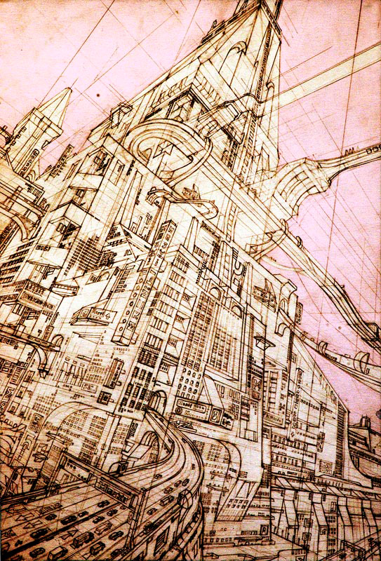
-
wow great drawing!
vertical verticals just appears to be an industry norm. It is not to say you definitely must not have vertical convergence. I feel the photo/render is more natural when it's not completely vertical....but when you start placing renders on a drawing sheet they look horrible when the verticals are all different. It keeps some consistency between renders and I believe it looks more professional. Nearly all architectural photographs maintain their verticals. The human eye nearly always sees verticals, especially in an interior scene and the render would become more familiar if you adhere to this convention. Lens shift is an excellent feature of any render engine.
-
I feel much the same, and I even got into curvilinear perspective back when I was hand drawing, but obviously SketchUp makes perspective drawing somewhat obsolete.

Back on topic -- I would say the render looks very good but there are some places where maybe some things could be improved a bit.
Some things that jump out to me:
- The cat does not integrate as well as I'd like
- The white halo around the railing/window elements unduely draw my eye
- On the texture side of things I think maybe the woodgrain is tiling a bit large for a wood floor -- that is to say that planks of that width would be very unlikely to be commercially available
- The white of the carpet does seem a bit excessively "white"
I can't really find fault with anything else
Best,
Jason. -
Ok from the other side of the argument!
I'm an absolute believer that verticals are almost ALWAYS essential and I'll argue this with you guys for hours if you wish! Ok we all do renders and sure standalone who gives a toss whether the verticals are maintained right? Now take that render and place it to a page as the graphic designer would who puts it to a sign, brochure or webpage.
I guarantee you the first thing he will do is take your image into Photoshop and correct your verticals before he even trials it on the artwork! I'm serious there is not one thing that can destroy a page more than off verticals in an image as it fights with the text, columns, image borders and the page edge / bind themselves! If you feel your interpretation is more important than "selling the project" do the justice of throwing them "way off" vertical (like 30 degress off).
I'm a strong believer that you are better to get the camera set (with or without shift) to maintain the verticals than to let the graphic artist repair the damage as most often the perspective that results is a little weird and depending on the extent of your off vertical - cropped to buggery!
-
@richard said:
Now take that render and place it to a page as the graphic designer would who puts it to a sign, brochure or webpage.
This. I always maintain verticals now. If only to stop everyone moaning


-
@olishea said:
This. I always maintain verticals now. If only to stop everyone moaning
This! Is a good thing!
Yeah I must say it always amazes me when the opposite is argued in the forums. And with that often wonder how many have seen the results of their renders when the graphic Artist has finished with them!
-
Having done my fair share of graphic design over the years I would have to say it is a pretty poor graphic designer who works/thinks so rigidly... but I'm hardly surprised. The world is full of people who treat "suggestions" as "rules" because they can't (or don't want to) think for themselves.
Of course it may not be entirely their fault -- the quality of education for most graphics designers is pretty low... I've had to "re-educate" dozens of them over the years and all came to the conclusion that their "degrees" were all but useless pieces of paper (and wasted money/time).
Best,
Jason. -
The verticality issue only really affects architectural rendering. If you are creating a surrealistic/figurative scene with high FOV/low view angle etc. that's fine.
Have you actually tried rendering the same scene without divergence? See what you think, I believe the image will be much better for it.
Other advice; cat is a distraction, blinds/curtains can add some movement/extra detail/play with light, floor overexposed slightly. Why not try a render without direct sun/only physical sky or hdri. The light can be so much more dynamic. The texture on sofa is repeating and flat. I don't find trailing wires on the floor good design nor attractive (unless modeling a lamp scene!). I believe glass should have some apparent reflection. The material becomes lost between the window and the balustrade. Wall material is perhaps too flat. The book case adds great realism/detail but also draws all the attention towards it, the room becomes vacant without it. Finally some tonemapping and warmth in your light could really emphasize the depth and mood.
Of course these are suggestions not rules, so feel free to tell me I'm full of it.
-
Thanks a lot for the advice Jason, Richard and Olishea!! I will see what I can do with these tips and then post the result.
-
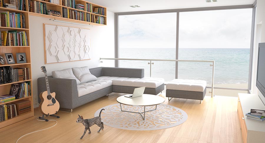
Listening to the various comments, I have applied multiple changes and I think I was able to improve it. (less light comming from the front now and a couple of other tweaks)
Hello! It looks like you're interested in this conversation, but you don't have an account yet.
Getting fed up of having to scroll through the same posts each visit? When you register for an account, you'll always come back to exactly where you were before, and choose to be notified of new replies (either via email, or push notification). You'll also be able to save bookmarks and upvote posts to show your appreciation to other community members.
With your input, this post could be even better 💗
Register Login


Advertisement