Render Experiment
-
10Q
-
Cool. Always interested in partial renders for quick one-offs or preliminaries. The last is perhaps too cute to show a client, though I like it. Maybe that's partially due to the POV and obvious stand-up trees. The shadows of the other ones give them a nice "modeled" feel.
When will a renderer offer direct overlay of SU lines? -
Thank you, Peter. You might be right about that last one. I have some ideas about doing some renders that look like layers of paper cutouts and this has given me some ideas toward that end.
I was also curious about adding "artificial light" in the model.
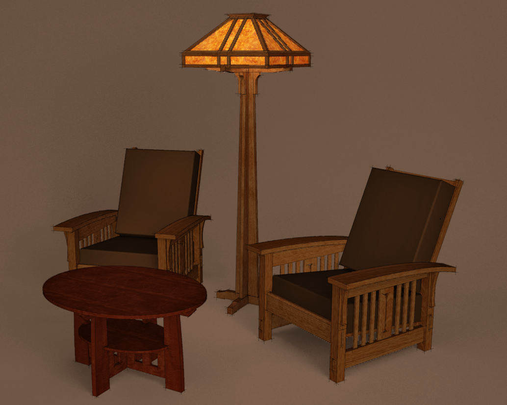
So this is a clay render (I grabbed an image as soon as the render was looking half way decent although I'm still waiting for it to finish up) and two exports from SU. I need to figure out how to get a little more of an effect of the lamp reflecting from the chair armrests but I think it is within my grasp. -
Dave, I have some of your line styles, and I thank you, because they are awesome. This kind of rendering technique is most appealing for architects I think, because it is a mix between
a physical model and the lines they love so much.@pbacot said:
When will a renderer offer direct overlay of SU lines?
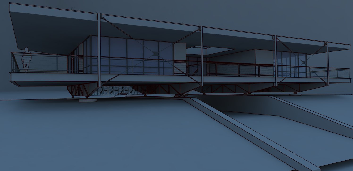
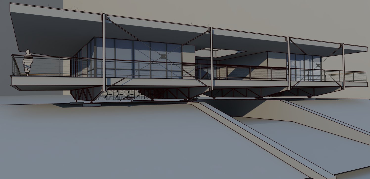
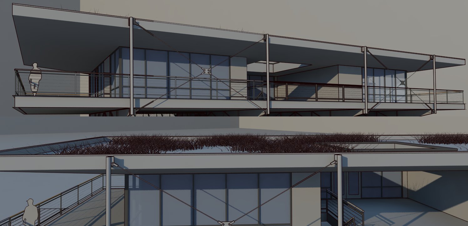
Peter, look what I got in v-ray, after replacing almost all materials whit a toon material. I bet, they can be thinner or thicker depending on the distance from camera or something, but that need more investigation and experiments.
-
Stefan, those turned out very nicely. Thank you for the compliments on my line styles, too. I think your point about the cross between the physical model and lines is good.
After allowing the render to finish and combining the images, I got this.
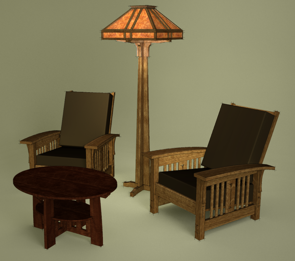
I think I need to reduce the radius of the omni light inside the lamp shade a little or maybe a lot. -
Stephan, Those look cool, so V-ray has it's own edge rendering? You have to apply "toons" textures? I think I've seen something of this before, but I didn't know the edges were from the renderer.
Dave, So what is the process in that last image. Clay with a couple lights sources? SU image overlay? Looks promising.
Peter
-
Peter, there are three images combined here:
- The sketchy edges which are exported separately from SketchUp. I export them at some large size--5000 px wide in this case because I wanted them to be very thin.
- Shaded with textures but edges turned off. This export was at view size.
- Clay render from KT. I put an omni light inside the lamp shade. I also modified the material for the glass in the shade to one of the glass presets so light would come through it. the rendered image is at the same size as the shaded with textures view from SU.
For the render, there is a seamless background. That background was hidden before making the image exports from SU. I'm still trying to work out some minor tweaks to get the lamp shade to glow. It's looking like the clay materials need to be given some reflective and other qualities so they'll create the desired highlights and such. That's dragging this whole process quite a way off the original, simple renders of the 3D blueprints and I'm wondering about the value of having the materials in an image separate from the render. I can see where once things were set up it would be a trivial thing to change materials or colors because that could be done in SketchUp without re-rendering. I guess Thea does that now somehow. Maybe other renderers do it, too. KT doesn't.
-
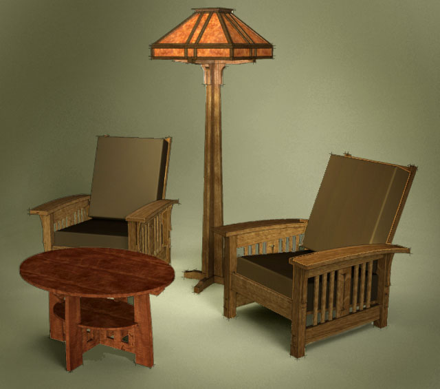
I played with the tone mapping a bit and wonder how it looks to you. I was in a rush, so forgive the many sloppy edges
-
Hi Roger,
It looks nice. the cushions are a little light but then it's just different upholstery. One of my goals is to find ways to reduce the post processing time as much as possible so I've been playing with ways to shortcut it. I also didn't play with it as much as I could have on this image.
FWIW, I did this yesterday while I was drinking a cup of coffee.
-
@dave r said:
FWIW, I did this yesterday while I was drinking a cup of coffee.
Tall, grande, venti or trenta?
-
Grande. Home brewed, though.
-
All are original models or Frank Lloyd Wright inspiration?
-
No. Not FLW. The chairs and probably the lamp are more like Stickley and the table is Limbert. All from the same period. The lamp is really just my design based on a few Arts & Crafts style details.
-
Thx for the info and bravo for the endless creation!

Hello! It looks like you're interested in this conversation, but you don't have an account yet.
Getting fed up of having to scroll through the same posts each visit? When you register for an account, you'll always come back to exactly where you were before, and choose to be notified of new replies (either via email, or push notification). You'll also be able to save bookmarks and upvote posts to show your appreciation to other community members.
With your input, this post could be even better 💗
Register LoginAdvertisement


