Mies Maxwell Challenge
-
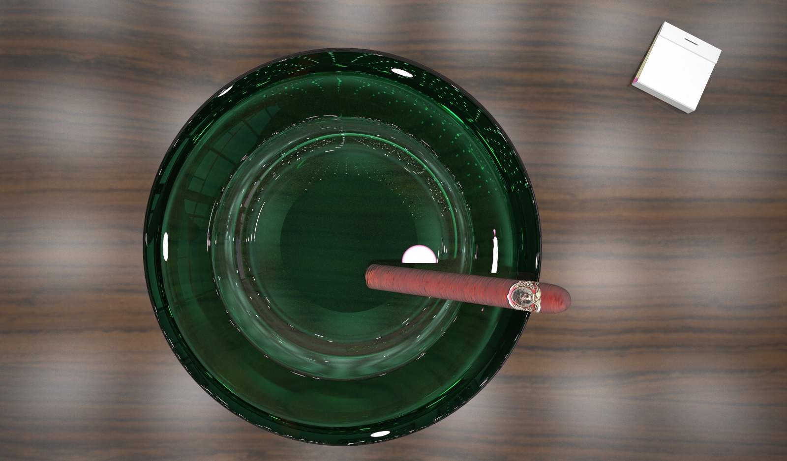
This is one of the images i submitted to Ronen Bekerman's Maxwell Challenge. C&C welcome as always

-
cool image... a little less roughness in the material of the table maybe would be better in my opinion. at the moment it looks a bit too "foggy".
-
Thanks for the reply Carloh. This was a really stubborn render to get the glass clear. I think your right about the table, also the cigar could be crispier. I managed to get it to SL 22 it was quoting another 43 hours to get to 23 lol.
-
congrats chedda! I saw that you are between the 20 finalist... well done
-
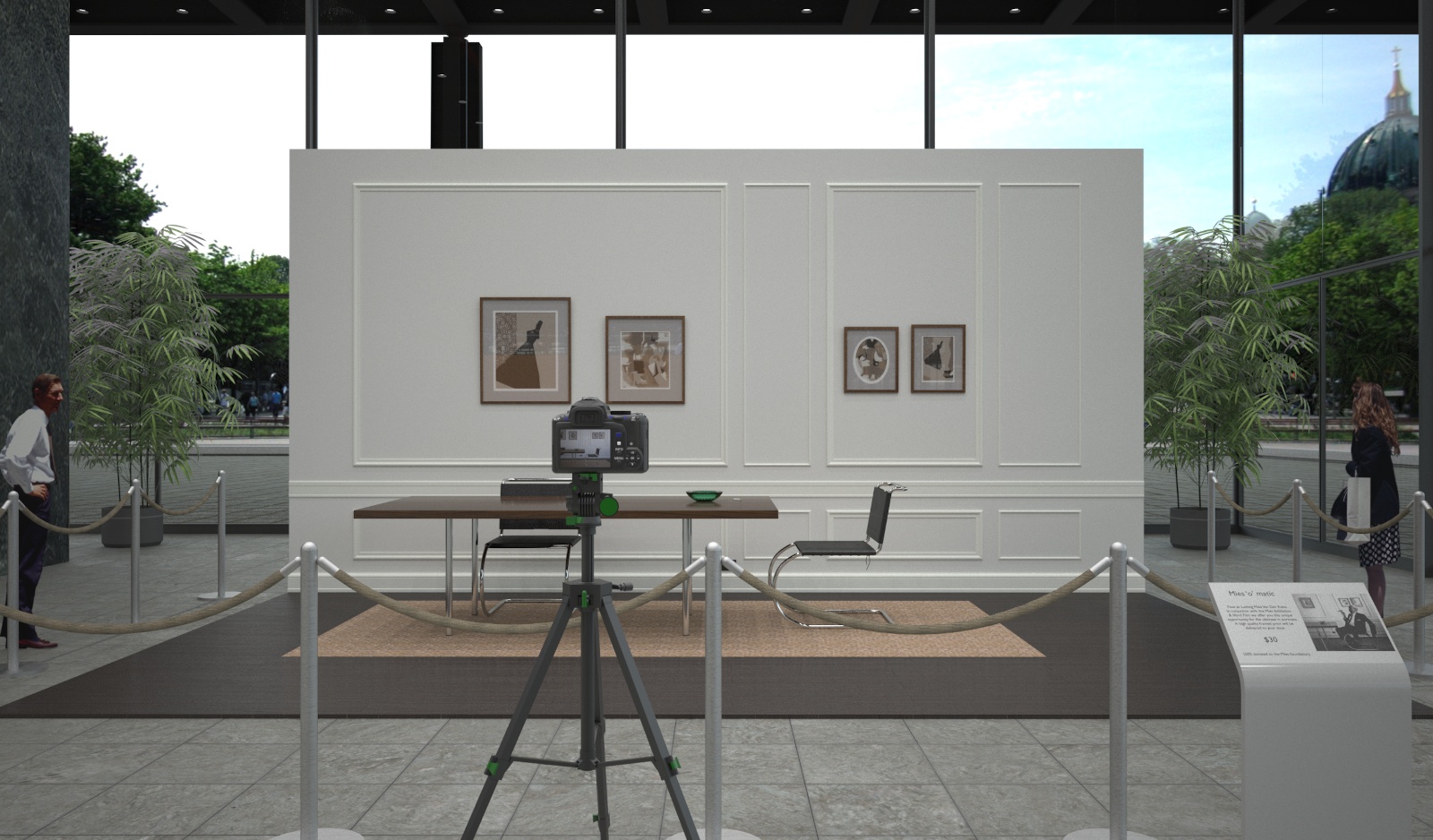
Thanks Novena, i don't really rate my chances against such good competition, but i am pleased to have got so far. Here is the other image i submitted:

-
Hi. Well done, sir.

That's a lot of light sources. I would say you are giving Maxwell a real workout. It is interesting that the daylight through the sidewall glazing doesn't have a more significant effect. Maybe it is evening and overcast?
 -
The number of light sources doesn't seem to slow maxwell down (it's slow anyway lol) Regarding the light there is no sun in the image only the background image which i converted to a hdri. I think most of the other entries used max and other high end high poly wares. Sketchup handled it no problem, only the lighting setup and bamboo was added in studio.The model is available over at ronen's blog if anyone is interested. I have to say it was modelled very well with the use of components etc and is very light.I wish i had more time on this competition but i changed my idea halfway through and almost gave up i think i managed to pull it back just.
-
Really nice work. But it doesn't seem like the ashtray interacts with the tabletop at all, no shadows or reflections or whatnot. Also the matchbook would be more interesting if it wasn't just plain white, there are a lot of interesting matchbook covers out there you could use. And maybe beat up the matchbook a bit, give it some character. These are just my opinions, and you know what they say about those

-
I absolutely love the second image. What a beautiful story!
-
Thanks for the comments guys. I was keen to make a narrative in this image (plus use some objects i have already made). Regarding the matchbox perhaps your right i should have found one with a local address to the museum or his apartment. The ashtray doesn't really interact that much with the tabletop ? Perhaps this is due to the huge amount of light sources ? Would this diffraction etc have arrived at SL 25 (weeks later) i.m not sure. I think the table surface could be the problem as i used the wizard to make a procedural lacquer material.
I have attached the table/ashtray & matchbox if anyone is interested.Sorry about the cigar but i got it from turbosquid.
Feel free to make your own images and post them here (maybe a challenge ?)
-
Hello Chedda, as Dale said the second image is a beauty! the first image you have to look twice to work out whats what. I thought it was a glass tumbler at first! great render though.
John -
Hey Chedda - Mate I could tell straight up which entries were yours! The setting of the dining area just for me needed to be devoid of the camera and maybe some more directional lighting to liven the scene - that said it was probably my favourite!
-
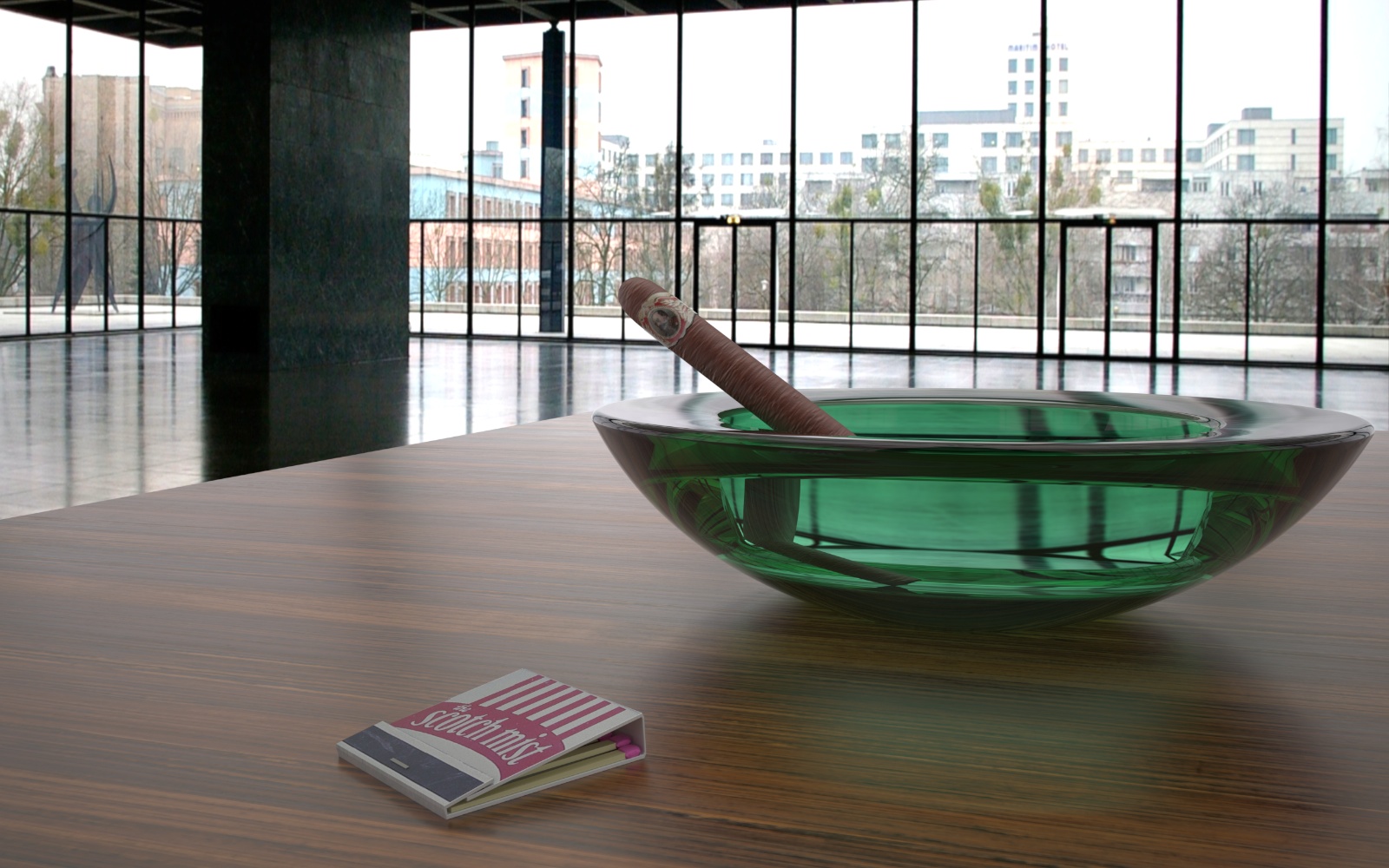
Thanks for the comments John & Richard. Here is another image with a bit more love. It's so mush easier without the actual museum model, hdri ftw.

-
wow this one looks stunning. almost can't tell if it's a photo

a little displacement maybe would fit the cigar?
Hello! It looks like you're interested in this conversation, but you don't have an account yet.
Getting fed up of having to scroll through the same posts each visit? When you register for an account, you'll always come back to exactly where you were before, and choose to be notified of new replies (either via email, or push notification). You'll also be able to save bookmarks and upvote posts to show your appreciation to other community members.
With your input, this post could be even better 💗
Register LoginAdvertisement


