Bathroom with a killer view - concept
-
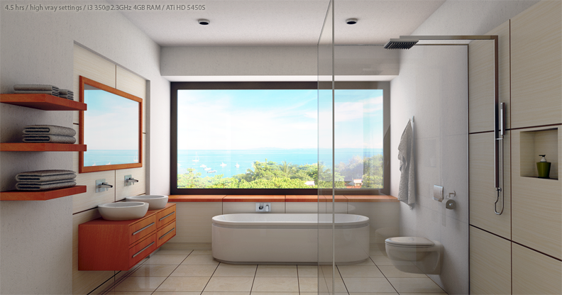
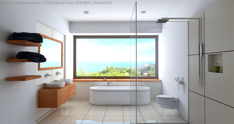
Update: got my new laptop few days ago and I decided to put it to a test. Same image, resolution on image A was 1600px and B 2400px. Higer resolution and 300% faster
 Image B has a focal length at 16mm and A at 24mm. Camera at the same location. Image B has also a displacement map used for dark towels.
Bathroom model was downloaded from the warehouse but I heavily remodeled (walls, floor, sinks, shower, cabinets, ceiling, window, mirror, tub and the killer view of course). It took me about 2 days to remodeled and textured including 5 hrs of rendering with vray and some pp work in ps. I work on dell inspiron i3, 4gb ram, radeon hd 5450.
Looking for some good C&C.
cheers


-
looking very good. i really like the wall texture, where did you find it? maybe some decoration on the window ledge and some indirect lighting from behind the "camera" would push the scene a little more

-
A decent start, I'd say. There's a few things that could be improved, though. At least in my opinion.
- The furniture needs bevelling.
- The floor could do with a little more reflection; it's looking a bit dull right now.
- The bump on the wall and the ceiling is far too strong. In fact, I'd use no bump on the ceiling at all.
- The towels don't look soft. They ought to.
- It's a really bright day outside, and the bathroom has a really big window -nonetheless the interior's relatively dark. Whilst I am by no means a photographer, and can't say whether your image is correct or not, your lighting -to me- looks odd, and not as inviting as it could be.
-
Carloh - texture is from http://www.arroway-textures.com I believe that they have the best ones with all the maps and if you do this for living it's worth every penny.
TomDC - it so happens that I am a photographer and I always try to show and achieve "real world" lighting in my renders. It's early in the morning around 10:00 and the sun is located behind on right, if you look at the shadows on the trees, so you will not get that much real sun in the room.
Towels, I'm still learning how to do them, I used fur plugin to get some effect (but like you say-not soft, I agree). I will try do some changes as per C&C.Thanks for your time and C&C guys. Always good to hear other sketchupers's point of view.
cheers -
thank you very much for the link!

-
@cmoreink said:
(...) I always try to show and achieve "real world" lighting in my renders.
Why would you want to do that? Realism is a means to an end, not an end in itself. (In my opinion, that is.
 )
) -
looks good
 what are your glass settings?
 -
Though not very important I think your glass material needs refractive layer. Overall the greatest benefit would come from some warm colored lights coming from behind the camera. I agree with TomDC on the bumps, bevels, towels, and reflection. You should be able to finish this render quicker with your hardware, without losing quality (I think).
good luck
Ogan -
TomDC, I was told that I'm a perfectionist which sometimes does not play out well
 I will definitely take your advise for future renderings to come.
mystix89, if you would like I could email you the material.
oganocali, I will do the changes and post them as soon as possible. Unfortunately, yesterday I had a small accident while rollerblading. My wrist is swollen, in pain, did not sleep all night and I'm riding on pain killers

Thanks for you time and have a great weekend.
cheers -
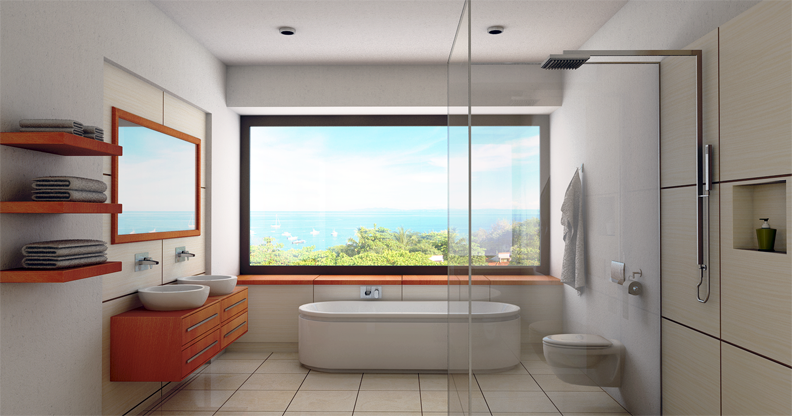
So here it is a new render with some changes as per CC. I'm still not happy with the towels on the left, looks like news paper

cheers

-
Just did an update with a new laptop
 300% faster, look at the first post.
cheers -
@cmoreink said:
So here it is a new render with some changes as per CC. I'm still not happy with the towels on the left, looks like news paper

cheers
You could mess them up a little bit, they look like copy and past jobs, play with the mesh a little bit to make them more unique and you will be fine.
-
so serene and calm bathroom!! are you an architect or interior designer or both?
-
@john2 said:
so serene and calm bathroom!! are you an architect or interior designer or both?
I believe that a view, colours and simplicity make the bathroom so calm and serene
 yes, I'm both plus a phtoographer, web designer, graphic artist, concept designer and so much more... and it's all in one, in me
-
I'm no architect and I don't (can't) do rendering, but I like it
 . It wouldn't be my choice for a bathroom in my home, I like warmth and wood and such, but it's nice.
As far as realism, some observations -
how about someplace to hang some towels beside the sinks, and someplace to put the soap
seems like if the mirror was divided and turned into a three (or four) part medicine cabinet-type affair it would provide a lot of storage space for typical bathroom stuff
some throw rugs in front of the tub, sinks, toilet, would make it less sterile and more inviting and provide warmth for the tootsies
I agree with Liam, the towels are folded too perfectly, they don't look real.
Hello! It looks like you're interested in this conversation, but you don't have an account yet.
Getting fed up of having to scroll through the same posts each visit? When you register for an account, you'll always come back to exactly where you were before, and choose to be notified of new replies (either via email, or push notification). You'll also be able to save bookmarks and upvote posts to show your appreciation to other community members.
With your input, this post could be even better 💗
Register LoginAdvertisement


