Spaceship (Collaborative Project)
-
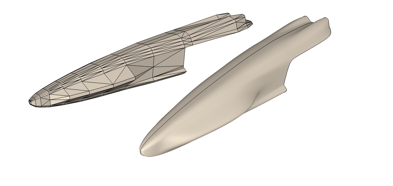
I created that model from an idea I got from this concept, I was working on the top front of the model but like always I get carried away and end up doing my own thing, and that model is what I ended up, it was intended to be the front of the ship but it also has the potentional to be the thrusters, it's a good shape but what part of the ship would it be used for?
-
It should definitely be the front.
I have a lot of favourite ships....can't really decide on one that we should use as referecence.
Lets just write up a description of how it should look.
So it should be a 200m Exploration cruiser with a solid, sleek and sexy shape. It should look advanced, not a cluncker. It's not a warship so it's not full of weapons, though it should definitely have a few for protection and for experiments and other reasons. -
Hey this post has on average 100 views a day, I just relised that, ever get the feeling we are being watched,

So advanced and not a cluncker, streamlined explorer, you have my attention, sexy? Have you being reading "50 shades of Gray" lol, ok let's break it down, how many engines do we need? Is it just an orbital ship or can it land? Do we have a flight deck for shuttles etc...
-
@iichiversii said:
Hey this post has on average 100 views a day, I just relised that, ever get the feeling we are being watched,

I hope we'll eventually have something to show to the people watching us.
No, it's just orbital and might have a few shuttles...maybe attached to the hull?
We'll see if it needs more small modular engines or one big engine depending on the shape. -
I suggest 2 shuttles , I was thinking it would be best to contain them inside I'll give an example of how they dispatch, I think you might like this idea.
Now I think we will get something built, I'm studying your style over to see how I can merge mine with yours, and I have a few ideas
-
Congrads on the thea licence, you lucky dog

-
Thank you and I have to thank the Holy Laws of Hazard.
Are you looking at my gallery on DA?http://marian87.deviantart.com/gallery/
-
Yes guys, you are being watched. Now, I'm just jealous of you two, because you're having fun and TIME to do this. But. I can't imagine what your ship will look like. You guys definitely know your sh.t with all that terminology, but I for one, don't know the difference.
"not a cluncker, streamlined explorer" and so on, but I think you should put here some references, if not for you, at least for us, the watchers.Like I said to Marian, I've already spent an evening browsing concept ships blog.
So, what are you guys building?
-
@stefanq said:
Yes guys, you are being watched. Now, I'm just jealous of you two, because you're having fun and TIME to do this. But. I can't imagine what your ship will look like. You guys definitely know your sh.t with all that terminology, but I for one, don't know the difference.
"not a cluncker, streamlined explorer" and so on, but I think you should put here some references, if not for you, at least for us, the watchers.Like I said to Marian, I've already spent an evening browsing concept ships blog.
So, what are you guys building?
Sure Stefang, we will explain our terminology in future, apologies mate, and cheers for the heads up

-
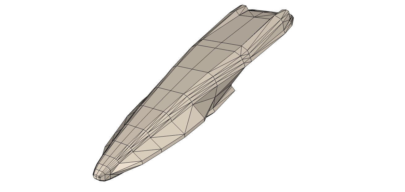
I have being, im just after redoing that last model i did last nite to reduce the poly count, its as close as i could get it, have some fun with it, tear it apart. add to it, bin it if you dont like it,

Removed the model for editing, found a few flaws after posting, will submit again as a new post

-
Now how's this for a clash of styles?

Low poly version and subdivided version.
LOWERPOLY_STARSHIP_CONCEPT.skp

-
Ok fixed the problem with the original model,

-
I dont know, its ok

 thats brilliant, so we got a front section
-
I think is too compact for such a big ship. I'm browsing concept ships again. Darn!
By the way, I just bump into the USCSS PROMETHEUS .... sexyyyyy -
What about making it wider like in this image, make it look more menacing

ALTERATION_STARSHIP_CONCEPT.skpThe image is far wider than the skp file, check it out

-
Yeah, but it's not as sleek. Maybe a bit wider would be ok but that is way to wide.
-
Hows this?

ALTERATION_STARSHIP_CONCEPT.skp -
-
You nailed it there, much better

-
Yey.

What's next?
Hello! It looks like you're interested in this conversation, but you don't have an account yet.
Getting fed up of having to scroll through the same posts each visit? When you register for an account, you'll always come back to exactly where you were before, and choose to be notified of new replies (either via email, or push notification). You'll also be able to save bookmarks and upvote posts to show your appreciation to other community members.
With your input, this post could be even better 💗
Register LoginAdvertisement


