Small Shooting Break.
-
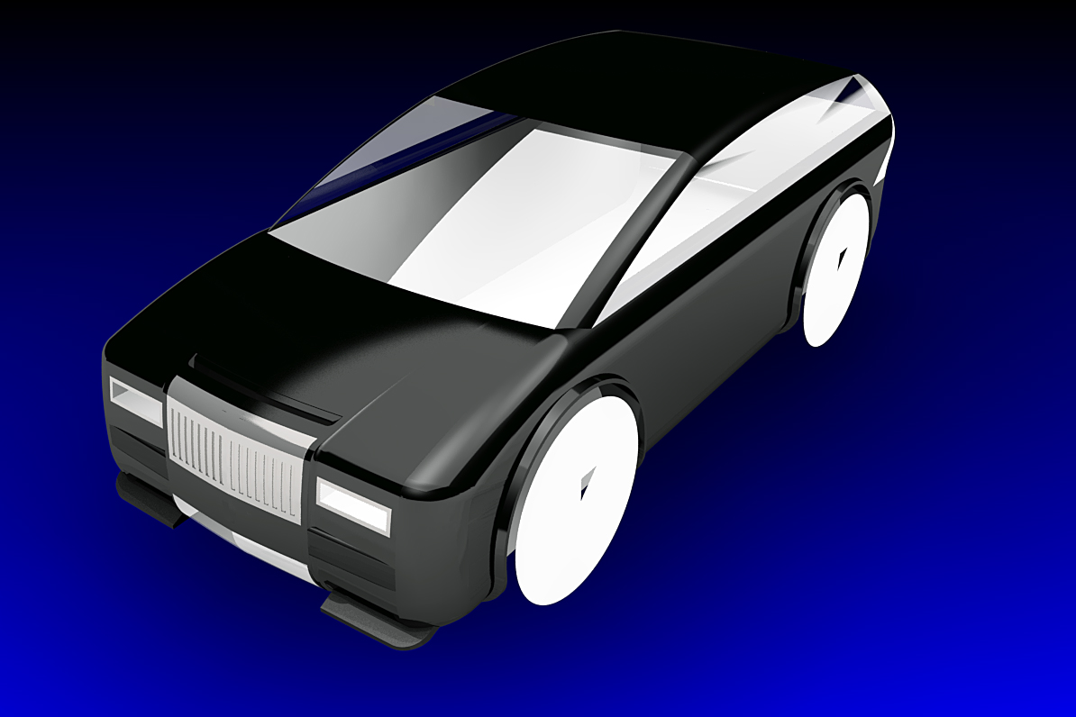
Another wip in the automotive theme, I might even finish this if I like it enough. This particular brief is for a small hybrid town/city var but it had to be a bit different. 10 feet long by 4' 6" wide by 36.5 inches high (42 inches from the road surface).
-
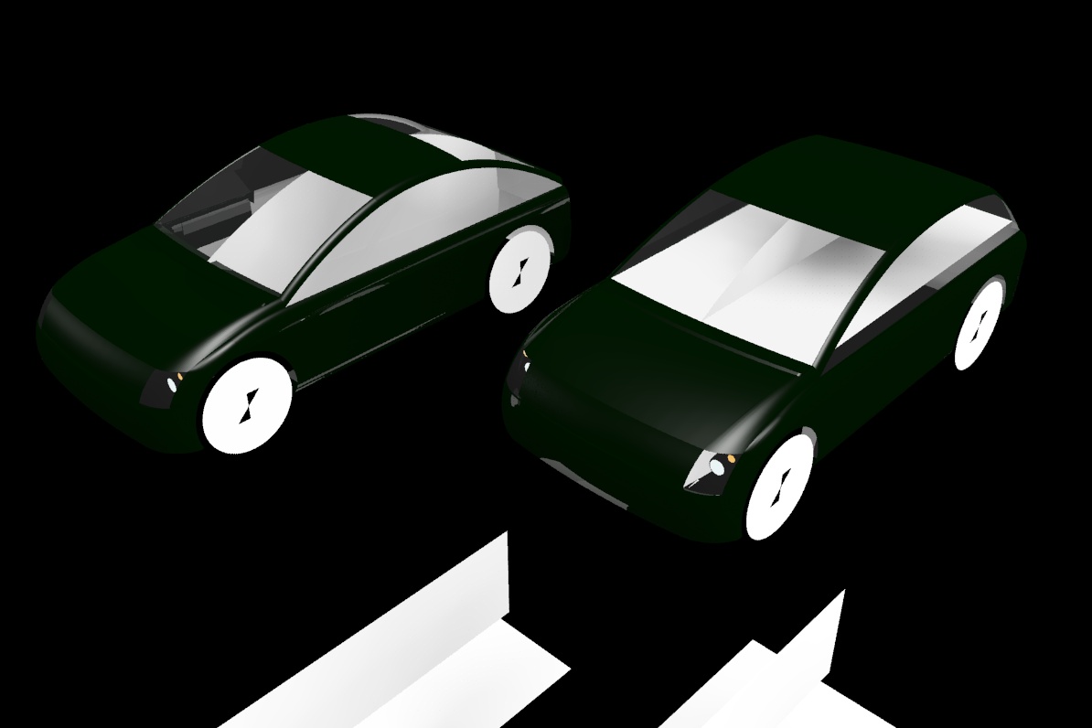
Too square and symetrical. A rethink with coupe and hatchback versions. Roof is the thing changed, below the window line they are identical. Coupe is half an inch shorter but the other dimensions are the same. Wheels are 15 inch so a bit smaller.
-
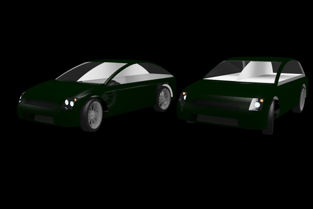
A few more details.
-
Mike may I make a suggestion, can you have a white lit background instead of black so the car concept can be seen better, it blends in too much with the background, very difficult to see

-
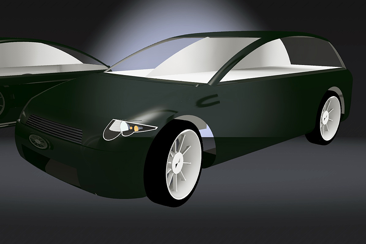
Good point, thanks. I sometimes get distracted and forget the basics. Another renditioner render. Getting more backplates and mats now so this is becoming a more and more useful tool.
-
A good render starts with a good model ! If your model is average, so will be the render . My advice will be that you work more on your models before trowing them into the oven !
Take care and enjoy designing!
Lame sketchover (a poor mouse and no sketching experience ) for some details that would be important !
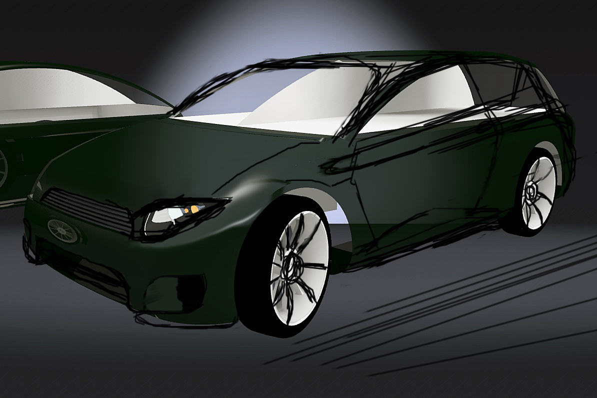
-
I do not mean to be confrontational here but, apparently you are judging my model by your stylistic preferences and this is not a good place to start. You have models which are aggressive and styled for a 'younger' audience where the style you have adopted is something admired.
I am not designing my cars for the rubber band tyre brigade, nothing personal just not what I do, perhaps you can critic the models for a substantial rather than an esoteric reason. At the end of the day it is in the WIP section for a reason too, basically it is not finished yet. Thanks though, I think.
-
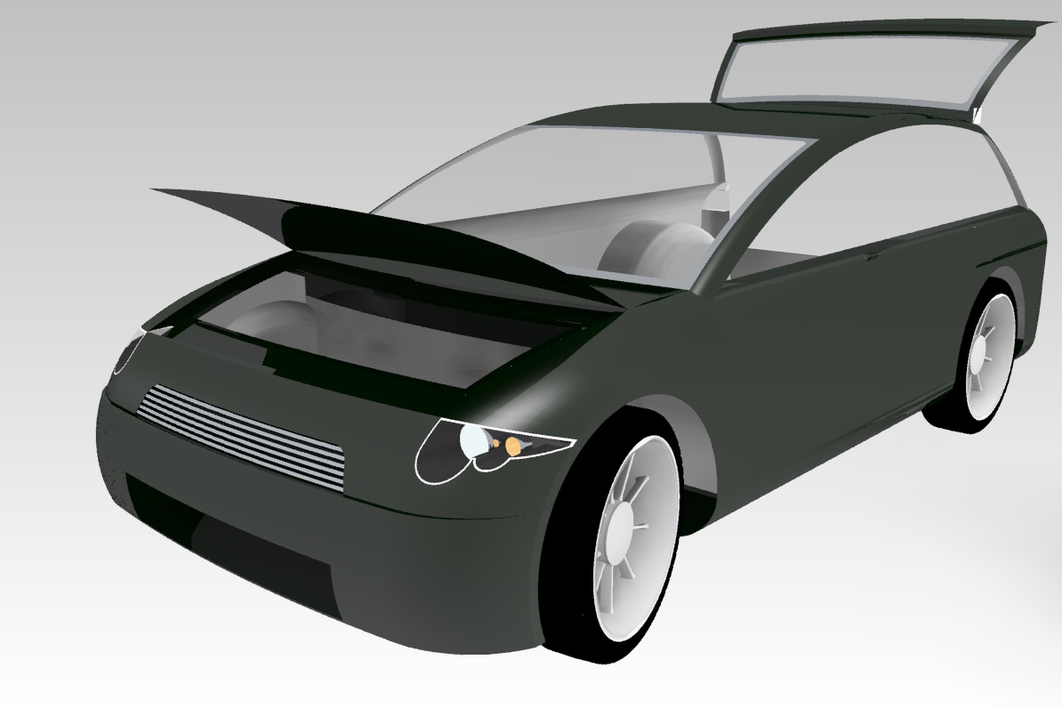
Next stage.
Hello! It looks like you're interested in this conversation, but you don't have an account yet.
Getting fed up of having to scroll through the same posts each visit? When you register for an account, you'll always come back to exactly where you were before, and choose to be notified of new replies (either via email, or push notification). You'll also be able to save bookmarks and upvote posts to show your appreciation to other community members.
With your input, this post could be even better 💗
Register LoginAdvertisement


