Old Afgan ruin
-
A little something i was working on, nothing special, gives us feedback please
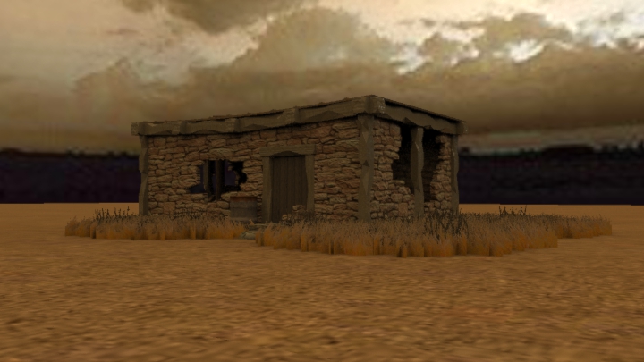
-
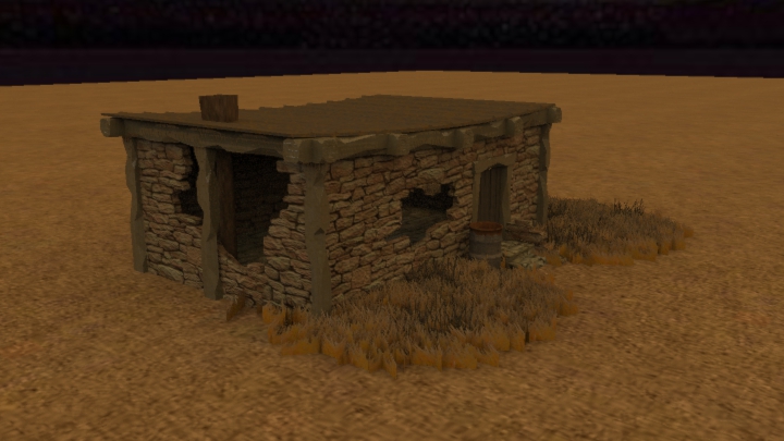
-
Very nice work

Is this where the "knife kick" kicks in ? -
Nice modeling. You could try to find a background with more resolution.
-
Very nice. This has some great potential. I only crit because I want to see more...
Doesn't look like a common Afghanistan background (mountains?) But have I been there? No. Some of the stones around the openings look like they should have fallen in by now. Artistic license?
Is this for a game?
-
@numbthumb said:
Very nice work

Is this where the "knife kick" kicks in ?lol, knife kick was only a animation test numbthumb, you should see what i have now, iv moved onto the gaming side of things thu, sorry about the background, i wasnt trying to make a scene, just rendering the ruin with a HDR for quick result, yes its 1 of many concepts for a game in preproduction, hopefully lol
-
@iichiversii said:
lol, knife kick was only a animation test numbthumb, you should see what i have now
Aah, something like "say hello to my little friend" stuff?
And is that Shaderlight? -
@numbthumb said:
@iichiversii said:
lol, knife kick was only a animation test numbthumb, you should see what i have now
Aah, something like "say hello to my little friend" stuff?
And is that Shaderlight?Belevive it or not but i used crazy talk with the same charater and he says that,lol, yes its shaderlight, baught the lience last year, very easy to use but restricted in some areas unfortunately
-
what you've done really amazed me.

...because I have no idea how u build the wall. looks like u model the brick one by one and put them together and then smash it with a SWAT's metal ram using Sketchy Physics. I really want to know how u create that openings..
Thanks!!!
-
Good job on first image. I actually like the feel of the scene as is. Maybe the timbers are popping out more than you might like.
-
@hussel hann said:
what you've done really amazed me.

...because I have no idea how u build the wall. looks like u model the brick one by one and put them together and then smash it with a SWAT's metal ram using Sketchy Physics. I really want to know how u create that openings..
Thanks!!!
Ok ill give a quick tutorial to ow i did it, not sure if its the only way it can be done but this is my workflow.
First i build the house first with out any flaws, in this image under you will notice the building on the left has no flaws with stone work but has with the woodwork, ill show you a quick tutorial with this also.
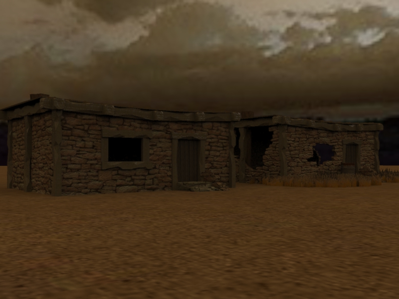
Once i have the building made i remove each wall which are all saved as seperate groups or componants, i the use the line tool to trace out sections of stone i want to remove as illustrated in the image below.
And to create the weathered timber look under you will find another tutorial.
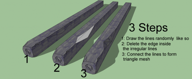
-
@mitcorb said:
Good job on first image. I actually like the feel of the scene as is. Maybe the timbers are popping out more than you might like.
Sorry i should of mentioned, my models are based on a cartoon war game, i over exagerate in my models to add to the look and feel of the game, glad you like it thu

-
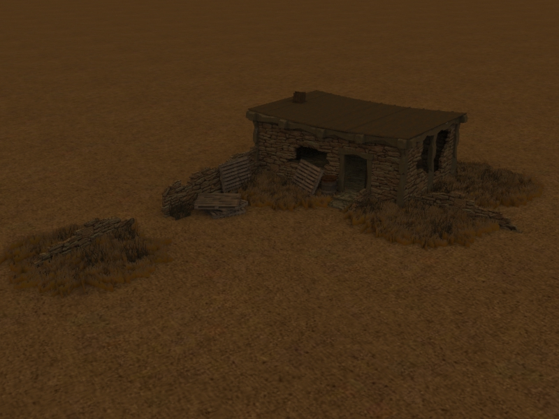
Heres a little more added to the scene, not finished yet, more to be added, I would like to point out the pallets, the pallet is a tutorial in Robin de Jonghs book "google sketchup for game design" fantastic tutorial and if you have issues with texturing in SU you wont after doing the pallet tutorial, thats for sure, the book is great but im running into problems with some parts but thats due to my lack of knowledge of using Gimp and Unity3D, will add more to this scene in the next few days,

-
Have you looked at the histograms of your images? The histograms are so dark that in some of the images, I can not see the buildings at hall. Had to take them into PhotoShop and redo levels just to confirm there is an image.
-
Thanks for the tips and tuts Damien..
Appreciate it so much..
Thanks!!! ( x 100)
 -
@roger said:
Have you looked at the histograms of your images? The histograms are so dark that in some of the images, I can not see the buildings at hall. Had to take them into PhotoShop and redo levels just to confirm there is an image.
I'm sorry I didn't relise, the brightness is so high on my comp it looks fine but I'll bare that in mind in future, cheers for the heads up

-
@hussel hann said:
Thanks for the tips and tuts Damien..
Appreciate it so much..
Thanks!!! ( x 100)
No problem at all Hussel, I'm only glad to help out, if you need anymore help sure get back to me, hope the tut was clear and concise,

-
Funny the settings can be so different.
The images look more detailed on my screen like this:
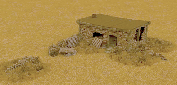
and it's a cool technique. Trying to see how it can apply in other models. Thanks!
-
Thanks Peter, glad you liked it, will post up a better image at some point today, i find your image very bright, maybe its my comp but we will see with the next image, ill get working on it with more added detail

-
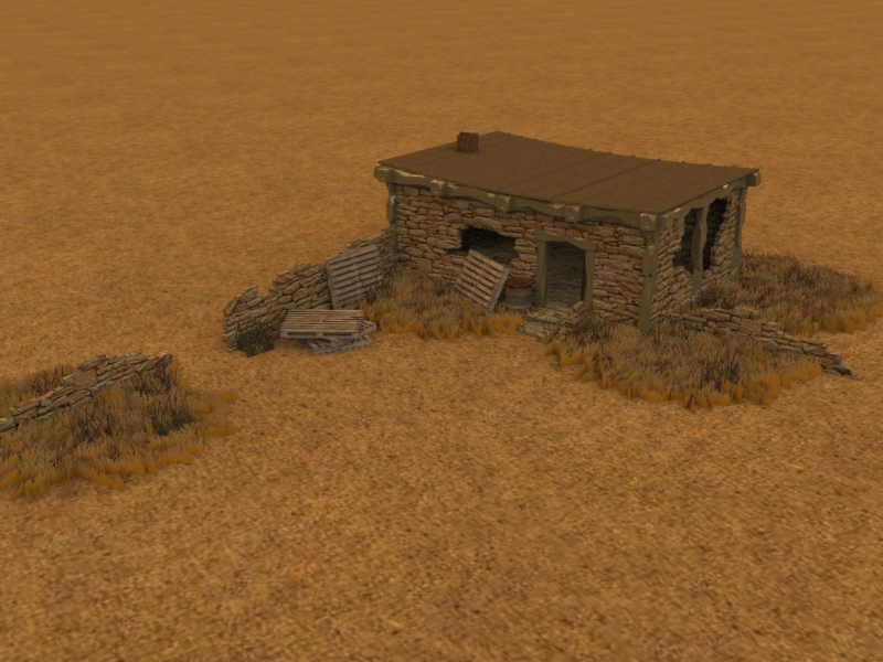
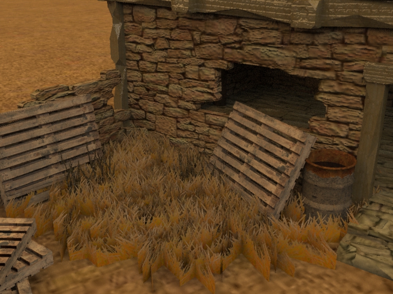
Ok here are a few more images with lighting improvments, also some close ups to enthisize the detail of the pallet and the stone work, let me know if these images are too dark, ill redo them again.

Hello! It looks like you're interested in this conversation, but you don't have an account yet.
Getting fed up of having to scroll through the same posts each visit? When you register for an account, you'll always come back to exactly where you were before, and choose to be notified of new replies (either via email, or push notification). You'll also be able to save bookmarks and upvote posts to show your appreciation to other community members.
With your input, this post could be even better 💗
Register LoginAdvertisement


