Sketchup CNC
-
Hi there alpmeadow.
Googled Carvewright. Cool gadget, though I'm not sure I like the way jobs are transferred to it. Is that a cartridge? There is a fair chance it still uses gcode to operate. I'm guessing that the files are mysteriously put on the cartridge by the software to avoid people tampering with them. If you can't see the contents of the cartridge from windows/mac, you might try the following...
Download ubuntu, burn to a CD, boot your computer into ubuntu (You don't have to install it) and plug-in you cartridge reader and see if you can read it's contents. Linux is always a little more hacker friendly.
If you can't get access to the cartridge, this thread will be of little use to you. -
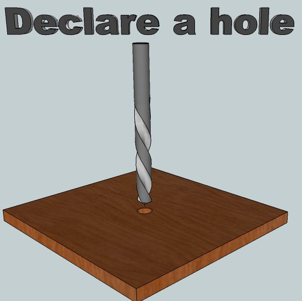
Noel I have a drill icon if you would like to give a look at. I tried to edit the number of pixels to 24X24 but it became too blurred

-
Can you believe it never occured to me to design the icons in sketchup?
 Live and learn. If you remove the text (I doubt it'll be legible at 24x24), zoom out till it's the same size as the icons in sketchup, hit the print screen or "prt scr" button on you keyboard (One never knows if one is being condescending), then just paste it into paint or whatever application, you should be set to go. Scaling images can be tricky. Paint will mess up your resolution by essentially deciding "this pixel goes this one can stay", while apps like GIMP will scale smoothly, merging pixels together.
Great start. Could you also attatch the skp file so I can include it in the source code? If you like, I'll take care of getting the png file from the model. Do you think you could model the other 4 icons?
PS: did you get the drill bit from the warehouse? I wouldn't know where to begin to get a spiral!
-
Yes I did get the drill bit from the warehouse I do however have the helix plugin but ran out of time trying to get the effect I was after so I went to the old faithful warehouse where I found the bit instantly. Yes I will give the rest a shot .Can you post a link to this GIMP program. This time I will try to make it all myself as tempting as it is to just find the model your looking for in the warehouse there is so much self rewardisam (for the lack of better terms) in making it from scratch myself.I will pm you the skp file
-
GIMP is an opensource project similar to photoshop. http://gimp-win.sourceforge.net/stable.html It has a steep learning curve and I actually don't recommend it unless you want to design a brochure or poster or something. It's just too powerful. For scaling something like this icon we want I suggest something more user friendly like Picasa. It'll do nicely.
While were on the subject of scaling, in case you ever need to enlarge an image, check this little project out...
http://sourceforge.net/projects/imageenlarger/ Cool stuff -
I was wandering if that file I pm'd you worked out ok I have another in the works but I still cannot get an acceptable image when reducing the pixels to 24X24 maybe you cane work with the skp Files?
-
Before trying anything else I tried scaling your icon (without the text) in Paint. I was surprised how well it scaled (Maybe Paint got better with windows7). I don't think we'll be able to do much better that this.
On a more general note, your icon was very detailed. Perhaps too detailed for something to be viewed at 24x24. I think icons are meant to be more symbolic. But NO MATTER. The Sketchup eraser, for instance, looks nothing like an eraser I've ever seen. But it doesn't matter because after you know what it is and does and you recognise it immediately. The icons you're designing will work a charm as long as they are distinguishable and recognizable. So thanks for the work!


-
Nice icon. I think I'd make the background white. Transparent would be good, too. And make the cherry material lighter so it reads better when tiny.
-
I'm just glad to have something to use!
 Anything is better than the blank icons I am currently using. Scott's doing a fine job.
 -
ANNOUCEMENT:
The project's first tutorial/screencast. Here is hoping it gives you some idea of what the plugin does.https://plus.google.com/u/0/106243199685455140135/posts/9xCjXqFJkug
-
Noel I loaded the plugin and followed the steps but when I wright the G code I get the following error in the ruby console.
Error: #<Errno::ENOENT: No such file or directory - c:\Users\Noel\CNC>
C:/Program Files/Google/Google SketchUp 8/Plugins/postprocessor.rb:181:inchdir' C:/Program Files/Google/Google SketchUp 8/Plugins/postprocessor.rb:181:inmake'
C:/Program Files/Google/Google SketchUp 8/Plugins/minivistii/ui.rb:250
C:/Program Files/Google/Google SketchUp 8/Plugins/postprocessor.rb:181:in `call'
C:/Program Files/Google/Google SketchUp 8/Plugins/postprocessor.rb:181 -
Mmm... Indeed you would get that error. At the moment the plugin is only really usable by people who are comfortable editing some ruby. postprocessor.rb is trying to save the CNC files to my directory ("c:\Users\Noel\CNC"). If you want to give it a shot, scan through the file. You should be able to spot the paths. Look for the double slashes (Mac unfriendly as Tim pointed out).
I'm working on making it all MUCH easier to edit. Keep you posted.
-
Just curious but would it be more user friendly for the user to draw the tool paths on the work piece then select that geometry and select the tool path button then have a pop up info box for them to set the tool info such as cut diameter cut depth feed speed rpms and maybe a max plunge for that tool as well as the other info you have set up (cut direction,compin,compout,or centerline.)That way the user would not have to move the geometry into the work piece out of view. If the geometry is a circle they would select the drill button and do the same process. And if the geometry is on the back side of the work piece then all of those tool paths would be back operations. Not trying to redesign your plugin just brainstorming. Another thought is to have some sort of database to setup the tools for the toolbox so the user could just select the toolbox button and enter the tool geometry as well as feed speed plunge rate etc. for that tool. See The attached file hopes this explains it better
-
By the way I am taking Dave's advise after seeing your post I think I can come up with someting better. That one looks like a tooth pick jabbed into a board
-
 Don't be so hard on yourself. I'm just glad to have your help. Just one thing... If you are going to edit it please don't make the background white. Use the same grey as the rest of the sketchup icons otherwise it'll look out of place.
 -
FWIW, the other toolbar icons have a transparent background, not grey.
-
I thought png didn't do transparency... my bad. I've always found transparency tricky to work with, though if the other icons have transparent backgrounds it would clearly be the most correct. Imagine if SU9 changed its colour theme to green
 Our buttons would be the only grey ones. How dire that would be
 -
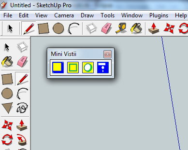
Noel here are some icons please tell me what you think and maybe Dave will approve also
-
The colours came as a bit of a shock but after a few seconds I warmed to them. I love the retro feel, ESPECIALLY the 5 1/4 inch floppy. What a pleasant surprise! First time I've seen Sketchup used for 2D too
-
Looking good AND retro!

Hello! It looks like you're interested in this conversation, but you don't have an account yet.
Getting fed up of having to scroll through the same posts each visit? When you register for an account, you'll always come back to exactly where you were before, and choose to be notified of new replies (either via email, or push notification). You'll also be able to save bookmarks and upvote posts to show your appreciation to other community members.
With your input, this post could be even better 💗
Register LoginAdvertisement


