House - to be build (rendering for a client)
-
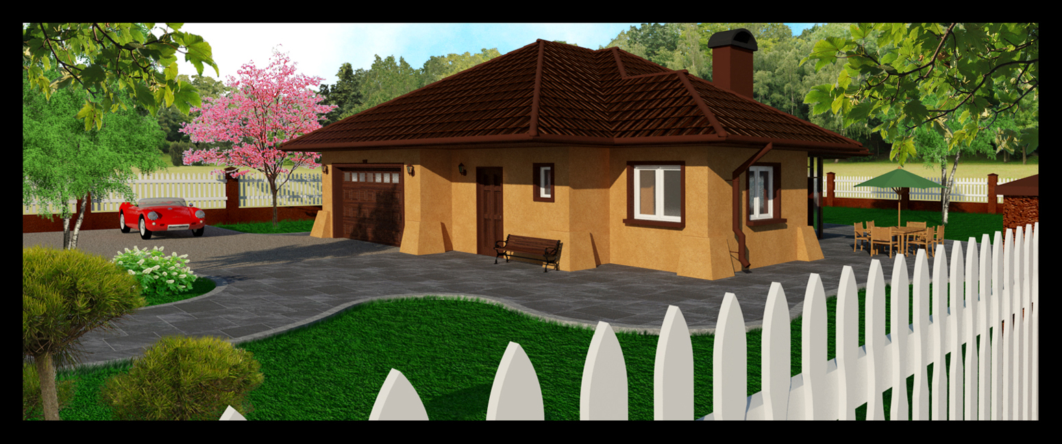
House is about 150m2-master bedroom with ensuite+office+WC+living room+kitchen+boiler room+2 car garage on the ground floor, upstaris-3 bedrooms+bathroom, stucco finish with brown ceramic roof tiles.
Would like to get some feedback on this before handing in.
Thanks.
-
Hello Pawel, Peter's advice is good and his image looks a lot better, saturation was a problem. The fence in the foreground is over powering your image, maybe you could PS an image of a fence or apply a material to it instead of the flat white. Just suggestions!
thnks John
-
Peter, John
I used vray+photoshop. I work off my laptop, so the colours are not all there (I miss my rig and viewsonics).
I have to thank to Oli and Earthmover for theirs trees, plants and flowers.
The fence has a white shinny paint material but no texture (could it be too white and shinny?)
You guys are right, I like the soft look of Peter's render.
Thank you for your advise.
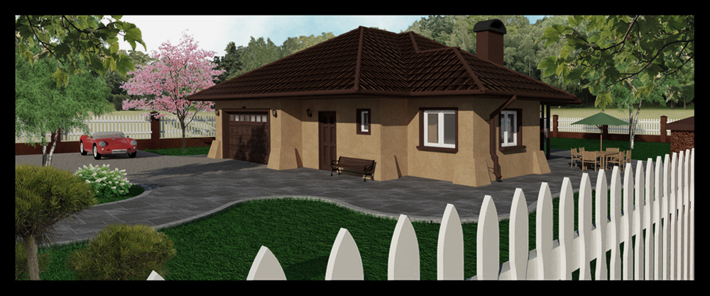
cheersattaching a new render with some changes as per P&J
-
Cool house and picture! Good job with all the trees and plants
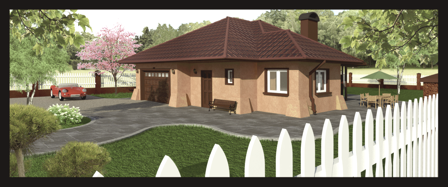
What renderer did you use? I would want the image to be much lighter. Here is an example of what I mean. I adjusted lightness, contrast, sharpness and hue. I selected the roof and and lightened it more and added a gradient for a little variation. I wouldn't think the roof would look so dark in the end, and you don't see all the detail. Just MHO.
...Maybe I've gotten away from your true stucco color, but I hope you see what I mean.
Good work, and good luck. Peter
edit: I forgot to note adjusting "saturation" too--and I was a little heavy-handed. I see I wiped out the sky too

-
Careful not to push it too far or you can really detract from the focus on the architecture you are trying to present. Good rule of thumb for photoshopping a render is to take each adjustment to where you think it should be then dial it back by half that amount. Keep each adjustment subtle and let the cumulative affect of all the changes together work to your benefit, instead of trying to do drastic things in just one or two adjustments.
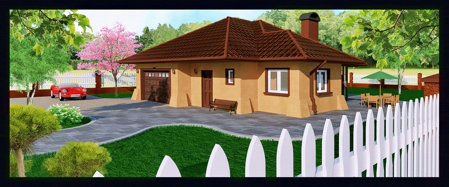
With this image you used very strong colors to begin with which removes the photorealism. Try desaturating the roof and grass a little (slightly) in Sketchup and before you render. I personally think your image is better suited to be taken into a NPR, illustrative look, perhaps watercolor. Strong colors work to your advantage in that regard. Perhaps something along these lines, which could be taken into Fotosketcher, ala Tomsdesk and others -
-
Nice job on that render EarthMover. With my first two renders I did just like you said; drastic change in one or two adjustments (point taken).
EarthMover: how do you make your trees, plants and flowers for use in SU? I dl your zip file and that's what I've used, but I would like to make my own vegetation in near future. What's the process? If you have time to spare, it would be nice to see a tutorial from a pro like you.
Thanks for all your advise. -
Making the plant components is easy once the transparent .png is made. Just look up how to make "faceme" components. Making the .png image is a little trickier but it is still pretty easy if you start with the right photo. Luckily I do 3D work for a company which has a full scale plant nursery and tree farm. The main difficulty is just removing the background from the plant photograph. To make this easier I use a painters dropcloth behind the plant when I photograph and then use photoshop to remove the white pixels. If I have time, I'll try to make a quick tutorial in the near future.
Glad you found my plant pack useful. I'll see if I can't put another pack together with a few of my newer plants as well.
-
No intention to criticise but, how are you going to fit three bedrooms and a bathroom on a second floor in what looks like a single level apartment/bungalow?
-
@earthmover said:
Making the plant components is easy once the transparent .png is made. Just look up how to make "faceme" components. Making the .png image is a little trickier but it is still pretty easy if you start with the right photo. Luckily I do 3D work for a company which has a full scale plant nursery and tree farm. The main difficulty is just removing the background from the plant photograph. To make this easier I use a painters dropcloth behind the plant when I photograph and then use photoshop to remove the white pixels. If I have time, I'll try to make a quick tutorial in the near future.
Glad you found my plant pack useful. I'll see if I can't put another pack together with a few of my newer plants as well.
Thanks for the tips. I looked at the "faceme" components and it does not look all that difficult. I will not have a problem with photoshop and removing the white pixels, the problem will be getting the flowers, hedges and trees photographed. If you would like I can help you out with removing some of those white pixels for your second plant pack.
-
@mike amos said:
No intention to criticise but, how are you going to fit three bedrooms and a bathroom on a second floor in what looks like a single level apartment/bungalow?
No worries, you are not the first person to say that. I know it looks small, but looks might be deceiving sometimes. Attaching an image of the second floor for comparison.
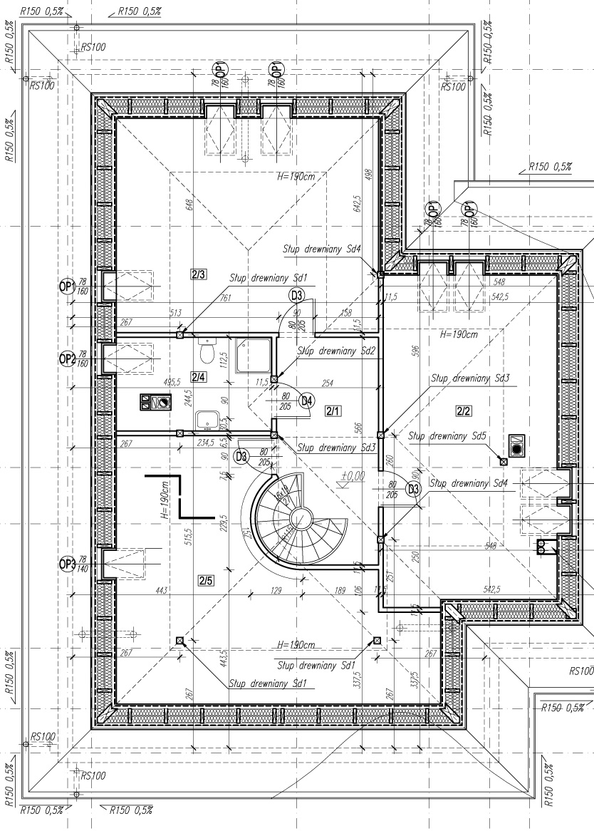
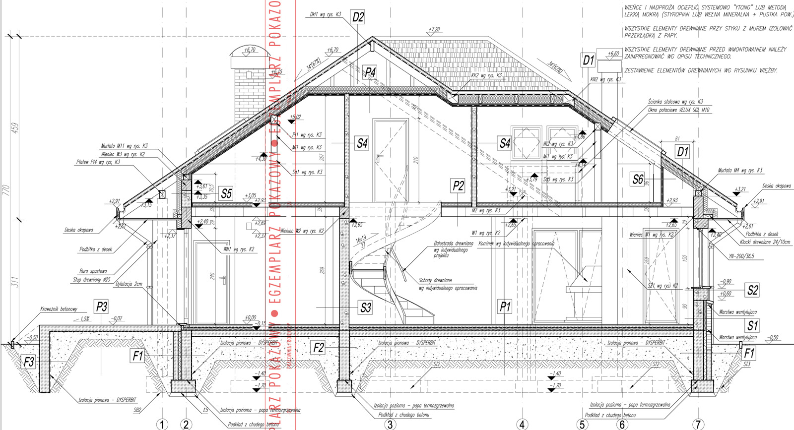
-
Thanks mate, I get it now. Must be my old eyes.
That and the apartments I have been producing are 15' wide by 15' or 30' or about 4.5m X 4.5m or 9m.
Hello! It looks like you're interested in this conversation, but you don't have an account yet.
Getting fed up of having to scroll through the same posts each visit? When you register for an account, you'll always come back to exactly where you were before, and choose to be notified of new replies (either via email, or push notification). You'll also be able to save bookmarks and upvote posts to show your appreciation to other community members.
With your input, this post could be even better 💗
Register LoginAdvertisement


