My MA Renders
-
hi toby,
forgive me if i am a bit blunt here... but dont u think that desk is a bit too.. ummm.. old fashioned for an office of 2050???? why dont u try looking for inspirations online... like here? -
@jenujacob said:
hi toby,
forgive me if i am a bit blunt here... but dont u think that desk is a bit too.. ummm.. old fashioned for an office of 2050???? why dont u try looking for inspirations online... like here?Ah yes, I don't think you are being blunt. The concept is that there is no more oil and recycled oil based products will be at a premium. Thus the use of plastics or chemicals derived from oil is going to be limited.
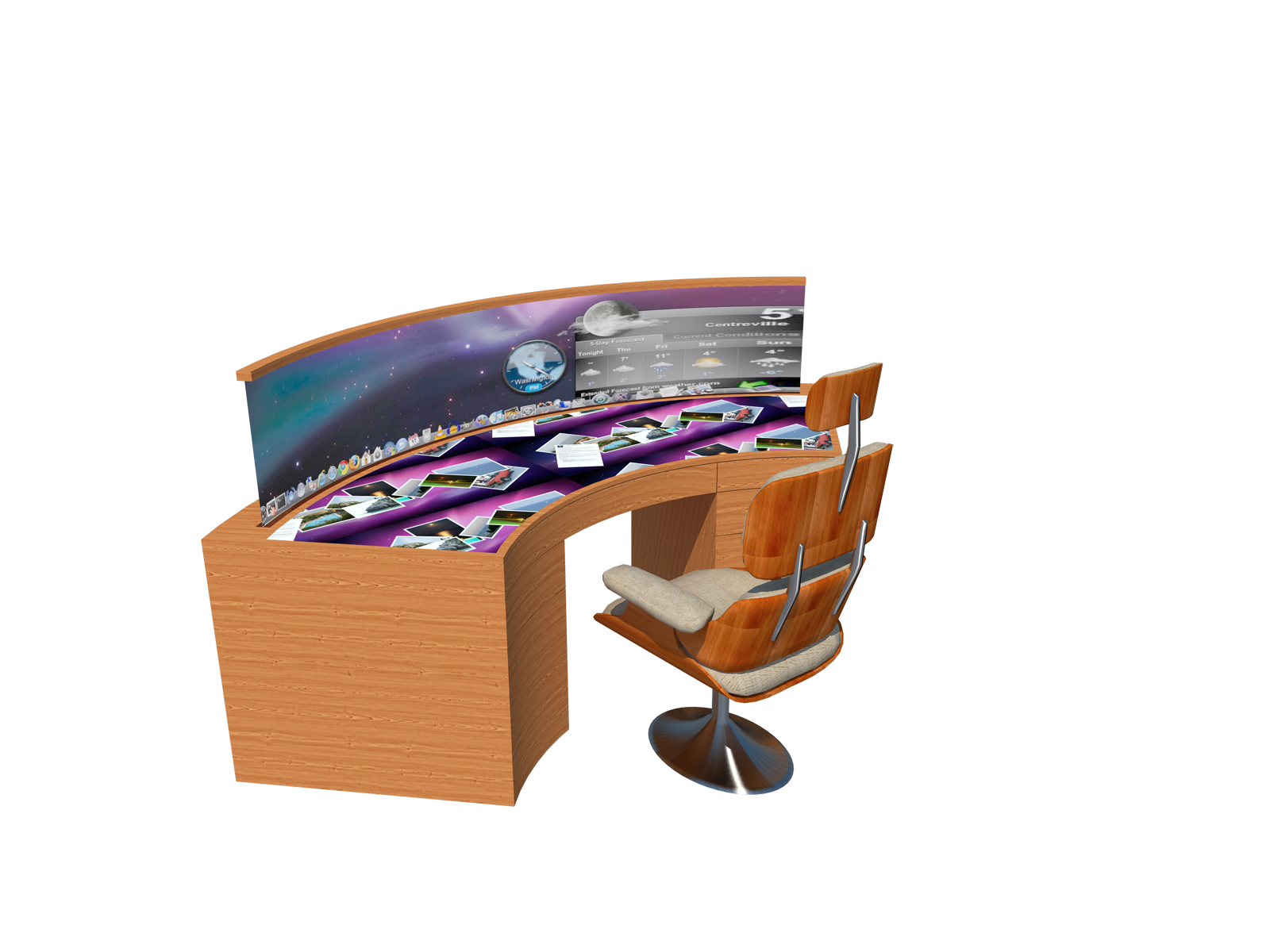
So I took the view that managed woodland would produce the most abundant materials; timber would therefore be the most cost effective material. Also taking the Steam punk movement as a cue, I decided to take an antique desk and put a contemporary spin on it.
I did look at that site as part of my initial concept research.
-
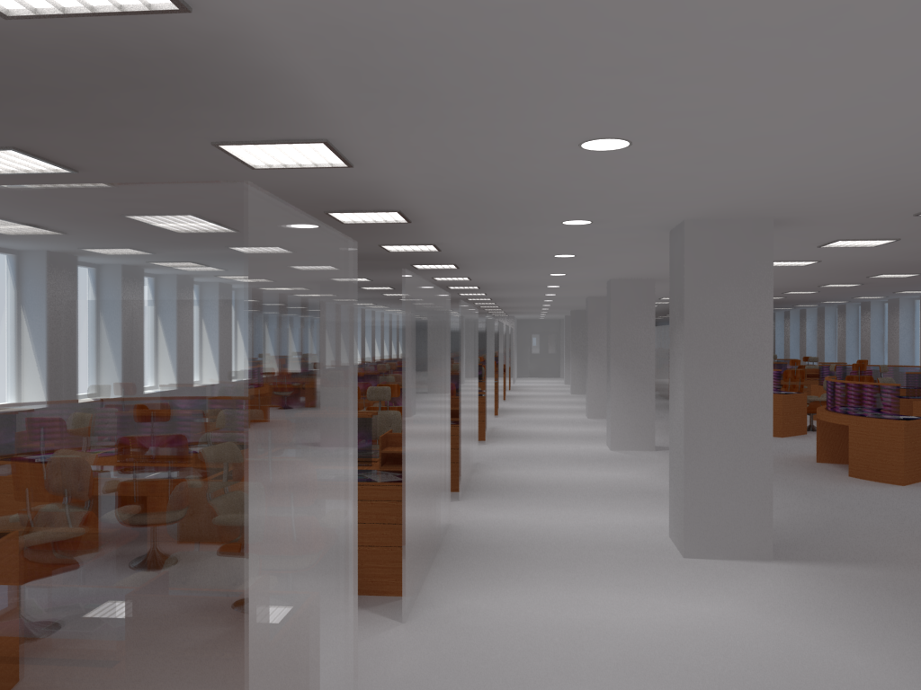
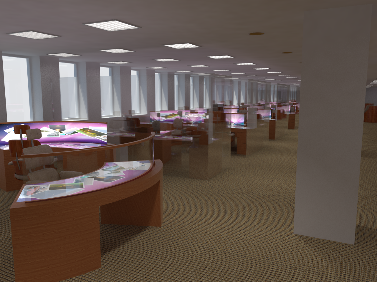
Here is some new images of the 'technical desk' and first renders of the proposals.
-
@tobobo said:
So I took the view that managed woodland would produce the most abundant materials; timber would therefore be the most cost effective material. Also taking the Steam punk movement as a cue, I decided to take an antique desk and put a contemporary spin on it
Quite right, to my mind that shows real 'forward thinking'. What better time to plan for future scarcity of resources than right now? And history contains many examples of returns to 'archaic' forms of aesthetics - even the siting of the 'future' office in the existing building is no different from the many 'hi-tech' companies housed in former Industrial Revolution mills and warehouses.
When the future arrives it is very rarely as 'different' as the 'seers' would have us think.
("Where's the jet-pack I was promised as a kid?"; I always want to ask them). -
@trogluddite said:
("Where's the jet-pack I was promised as a kid?"; I always want to ask them).
I'm still waiting for my hover board, and rehydrated large pizzas.
-
Toby, I'd make the computer screen taller (can they ever be large enough?) and raise it to eye level.
-
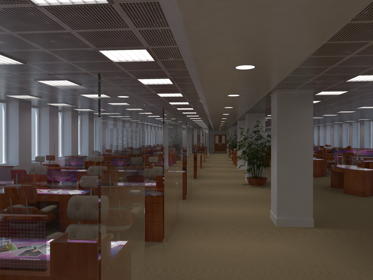
Thats a good thought, they are pretty large at the moment. I will look into it. Here is the latest render.
-
Nice render, I really like the ceiling with the lights
-
You might have to consider issues of reflections with all that glass (not knowing what the critique will include). I see you faced stations towards the windows which will reduce back glare but will create a forward glare issue in contrast to the screen, unless these are high-tech adjustable windows. Also you may have access to some new technology that controls glare on computer screens?
Working on a pre-design for an office now. To fully utilize natural light versus computer use is difficult imho.
We would like some of those stations for our GIS lab! I want one, myself!

and really, that's great rendering.

-
@rspierenburg said:
Nice render, I really like the ceiling with the lights
Thanks, the celling was simple to make but has had the biggest impact.
Here is the image file i used.
@pbacot said:
You might have to consider issues of reflections with all that glass (not knowing what the critique will include). I see you faced stations towards the windows which will reduce back glare but will create a forward glare issue in contrast to the screen, unless these are high-tech adjustable windows. Also you may have access to some new technology that controls glare on computer screens?
Working on a pre-design for an office now. To fully utilize natural light versus computer use is difficult imho.
We would like some of those stations for our GIS lab! I want one, myself!

and really, that's great rendering.

Thanks a lot, the rendering is still quite new to me.
The current windows come with blinds so that will translate onto the final write up. Its just blinds make for a boring render.
I'm just rendering another image with more light and a few additions.
-
Toby, some constructive criticism:
-
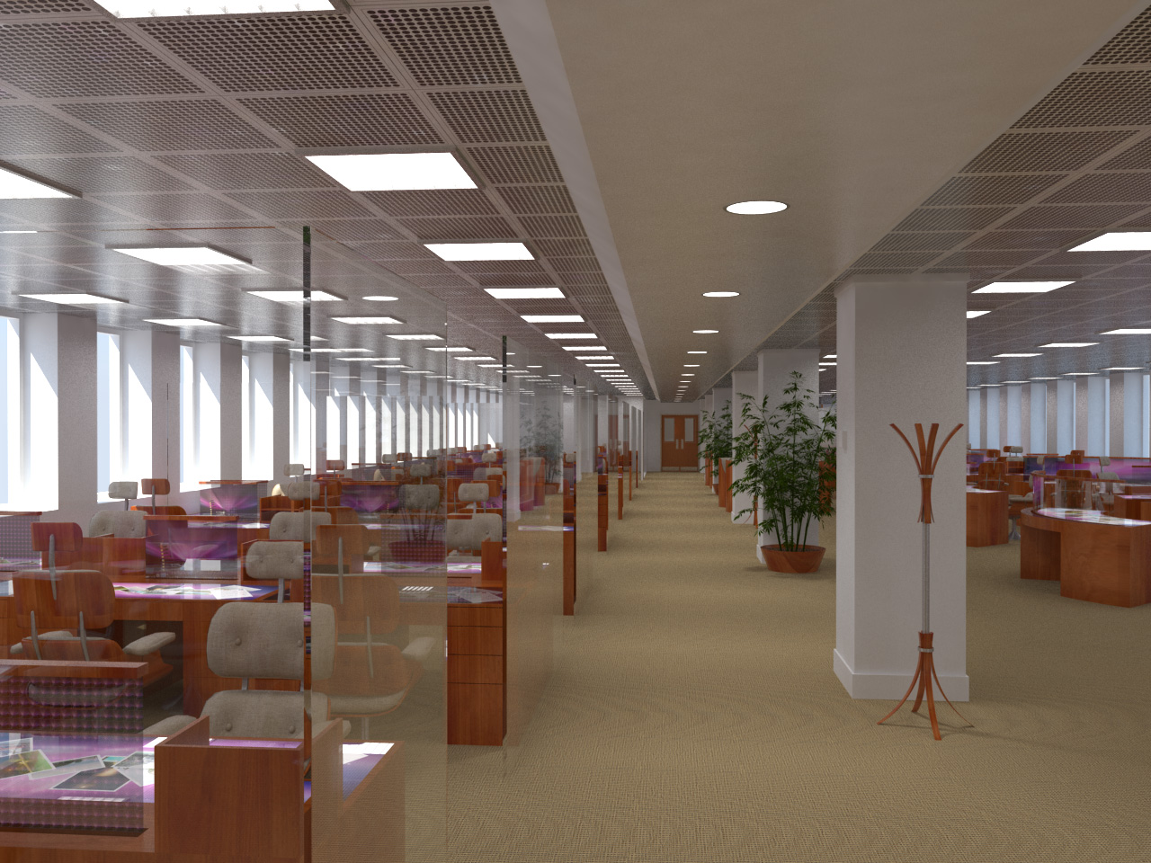
The composition of the rendering empahasizes the aisleway leading to the doors in the background. One really doesn't get a good look at the workstations.
-
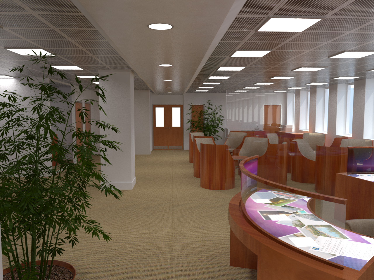
It appears to be just one work station lined up after another. Why not break that up with something in the middle, such as a seating area, meeting space, etc.
The glas partitions look nice
-
-
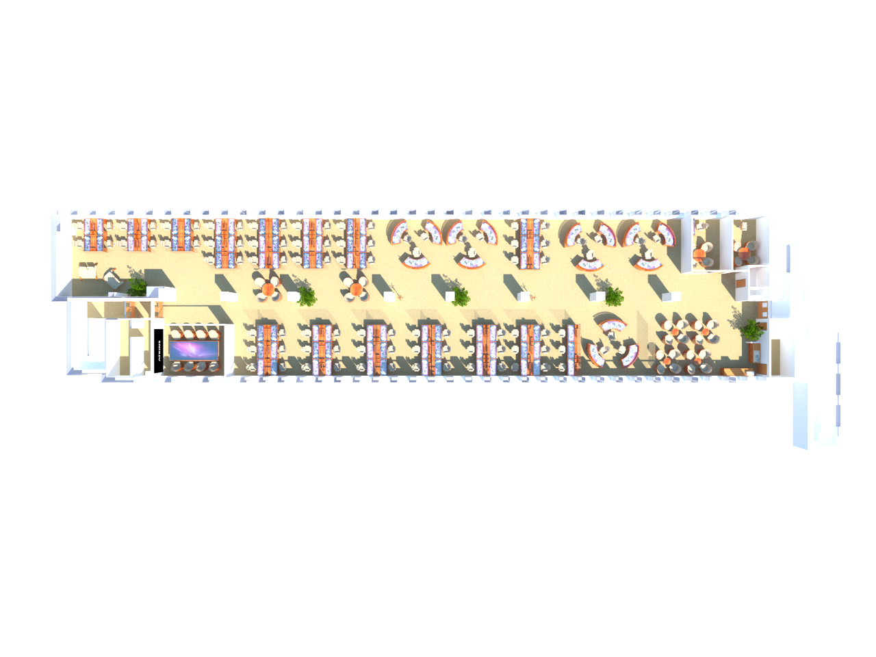
Ah Dan, thanks for the comments and you are right. I have done a layout that incorporates a few things like that.
The view is historic from the existing office, which has a lot of restrictions. I'll put up a view that shows the layout.
-
As promised the layout and another couple of renders.
-
Here are the finished images
Hello! It looks like you're interested in this conversation, but you don't have an account yet.
Getting fed up of having to scroll through the same posts each visit? When you register for an account, you'll always come back to exactly where you were before, and choose to be notified of new replies (either via email, or push notification). You'll also be able to save bookmarks and upvote posts to show your appreciation to other community members.
With your input, this post could be even better 💗
Register LoginAdvertisement


