Improving Wood Texture
-
Hi guys,
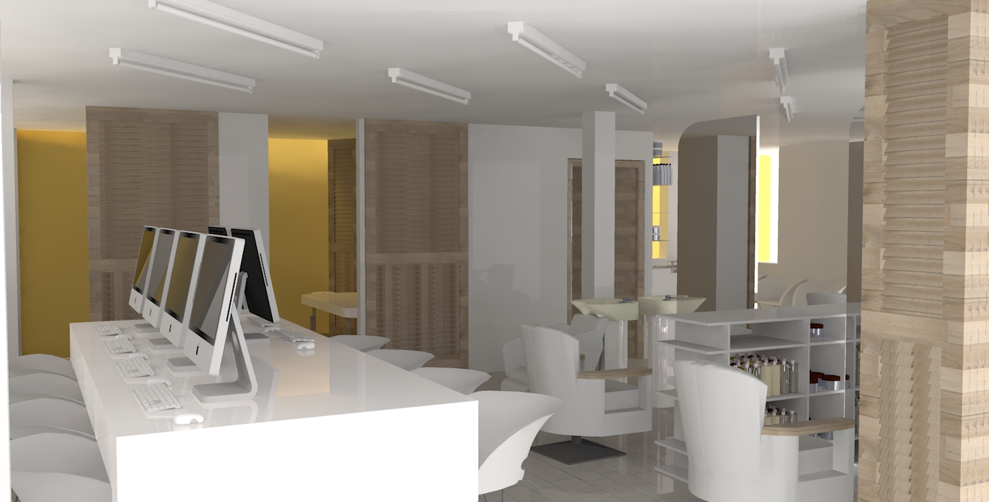
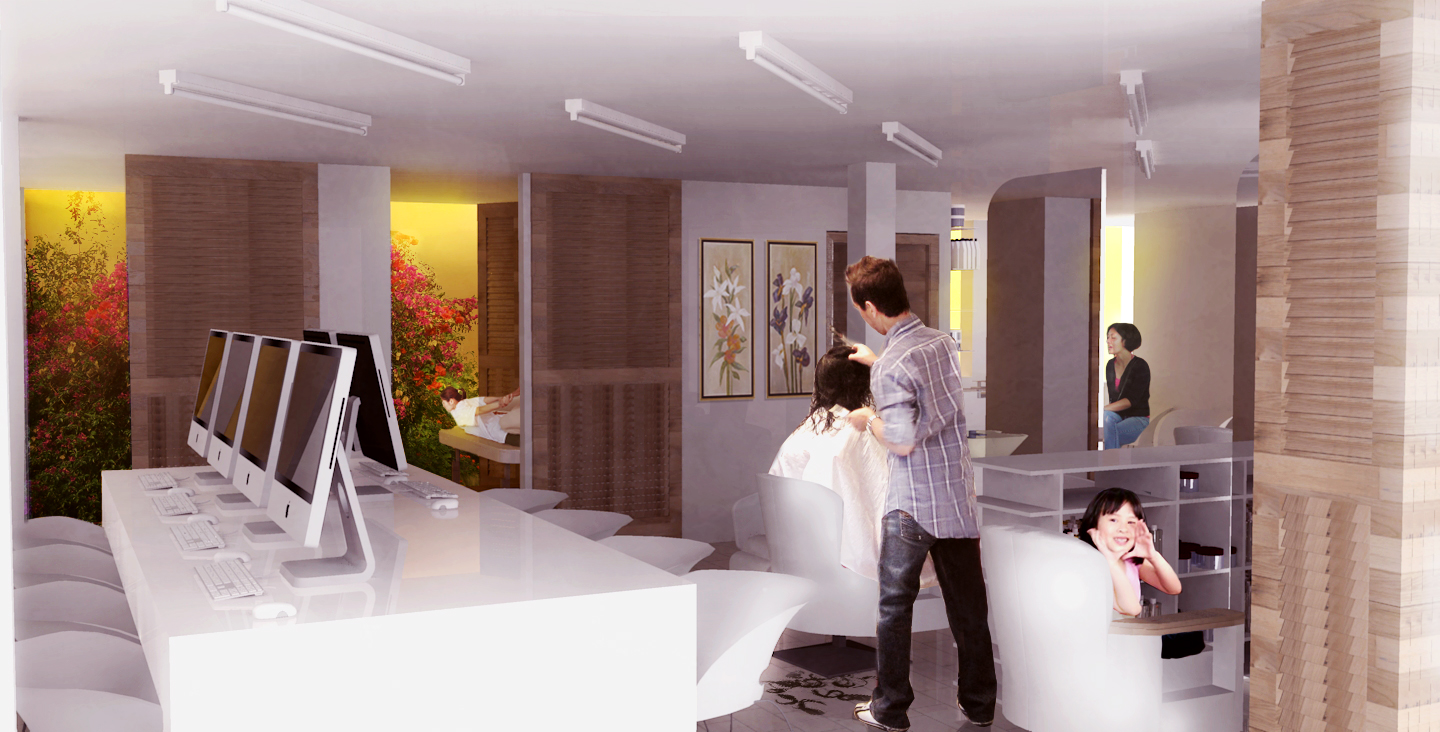
So I started playing around with Kerkythea for the first time properly this morning to try and light an interior view of a project I'm working on. I was hoping the more advanced users could give me some pointers in how to improve the realism of the scene, particularly with the wood which I'm currently unhappy with. Are there any global settings I should be aware of?

I'm fine with post processing in Photoshop, but anything at all to make the walls and atmosphere more realistic would be most helpful. I'll be posting up a night version as well now I've figured out how to create light sources.
Cheers!
- J
-
Post processing in Photoshop. Still unhappy with the wood.

-
Do you use any bump and specular maps with your wood? Do you give any shininess to it at all?
-
@gaieus said:
Do you use any bump and specular maps with your wood? Do you give any shininess to it at all?
Not at all. I think I added a slight shine to it, but that's all. What do you recommend for bump and specular maps?
Cheers!
-
Well, making these maps is not necessarily easy. Best is always to start from the original image and if you are lucky, there are no serious differences of shading between the different parts of the wood but (say) the grain is either lighter or darker. Now to begin with, you can make a black and white version of such an image and that would do it. Sometimes even the image itself is okay. But this is very basic this way (creating these shaders is either an art itself - that I do not have the talent of - or there are specific programs for them).
Can you share the wood material you are using?
-
When we are at it, Arroway is a good place to start at. Their textures are not cheap but superb quality. They have lower resolution samples, too, and you can easily understand what these different maps "do". Read their support and faq pages:
http://www.arroway-textures.com/en/faq/13
and here are some wood materials to see how it works:
http://www.arroway-textures.com/en/products/wood-1/contents(this is just one volume - they have three altogether)
-
@gaieus said:
Can you share the wood material you are using?
I downloaded http://www.kerkythea.net/joomla/index.php?option=com_remository&Itemid=42&func=fileinfo&id=54
The particular texture used was 'Oak Planks'. I made sure that all the faces were reversed correctly, but I don't really know how to make the setting for the materials look more realistic. Also, other woods give off a speckly effect, which I thought was resolved by reversing the faces correctly, unless it just comes out speckled in the test render.
Cheers!
-

Cool image.
One question, what is it? Looks like a hairdresser and internet cafe combined.
-
Those are good materials. Have you installed and are you applying them in Kerkythea?
Pete: don't tease him!

-
@gaieus said:
Those are good materials. Have you installed and are you applying them in Kerkythea?
Pete: don't tease him!

Yeah, I installed the .map.zip and installed the library, then applied the texture. I guess it's just the settings from more experienced modellers I'd like to know.
And Pete: Funnily enough, you are actually dead on! The project is a very small corner lot in Manila, where the client wanted to have two floors of economic programme, then two floors of residential occupation. The total floor area available is very small, compromised further by Filipino building regulations that stipulate a 2 metre setback on the ground floor, and a 1 metre setbak on the first floor. Due to the compromised size, rather than trying to figure out how to separate the two programmes (a gym is now located on the ground floor) - it was much more interesting to literally put the hair dressing/massage/beauty programme alongside the 'internet cafe' as a result of the design process.
The building is geared towards economic and social intensity. The facade is wrapped in a chainlink fence, which acts as a safety barrier, allows maximum views and sunlight, and fulfils the client's request for prominent advertising on the corner lot. Fabric adverts are simply wrapped around the facade and cable tied back (I'm a sucker for simple details!). The fence allows plants to grow up it, turning the corner into a sort of green fuzzy screen, punched out by advertising. The barrier also acts as a crucial safety feature, putting a barrier between flying debris in typhoons and residents, an annual occurance.
Cheers!
Hello! It looks like you're interested in this conversation, but you don't have an account yet.
Getting fed up of having to scroll through the same posts each visit? When you register for an account, you'll always come back to exactly where you were before, and choose to be notified of new replies (either via email, or push notification). You'll also be able to save bookmarks and upvote posts to show your appreciation to other community members.
With your input, this post could be even better 💗
Register LoginAdvertisement


