Meaningless Menu Separators
-
After the first separator, they lose meaning and end up grouping plugins more or less at random.
What do you think about using
add_separator_to_menu(menu_name)from sketchup.rb? -
You mean so that separators only adds a separator between the native tools and the plugin tools? I'd be good with that.
I find separators in the root menus to be a waste of space. As you say, they end up making random groups and eat up valuable space.
I've of the opinion that if a plugin has more than one menu item it should generally add them to a sub menu instead of trying to group things off with separators. (which end up to appear randomly or add double separators)
Within your own submenu one can add separators as one see fit.(though I only wish users where able to arrange this...
 )
) -
I've never liked them as they take up space.
-
They should be used, but only with PURPOSE.
The purpose is to separate... that which is different in function or intent.
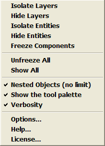
My personal belief, is that the functional tools / commands are together in one group, then separated from the toggles/settings, and perahps another group for links (that open other windows or dialogs (ie: they have "..." after their title,) or ">" and open a submenu.
Here's an example of the FreezeTools menu (after I got done with it):

-
@thomthom said:
You mean so that separators only adds a separator between the native tools and the plugin tools?
And.. I agree with the above for Main menus (incl. "Plugins",) and the right-click Context menu.
Hello! It looks like you're interested in this conversation, but you don't have an account yet.
Getting fed up of having to scroll through the same posts each visit? When you register for an account, you'll always come back to exactly where you were before, and choose to be notified of new replies (either via email, or push notification). You'll also be able to save bookmarks and upvote posts to show your appreciation to other community members.
With your input, this post could be even better 💗
Register LoginAdvertisement


