The Youngest Architect in Sketchucation
-
I want more critics guys come oooooooonn
-
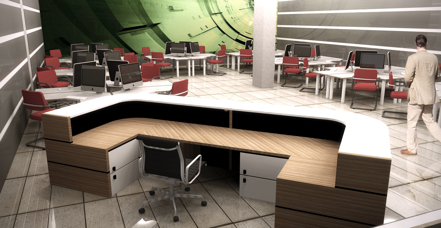
OK. Why is the woodgrain on a diagonal in the computer room image? Why are trees missing in your night shot? Is that enough of a critque?

Very nice renderings and model, and, congratulations.
-
@ben ritter said:
OK. Why is the woodgrain on a diagonal in the computer room image? Why are trees missing in your night shot? Is that enough of a critque?
Very nice renderings and model, and, congratulations.
I dont like the post-render stuffs, it was very hard to render the trees

Thanks sir
-
Yes, very much look into certification or licensing. Whatever is required in your country, so you don't go through the turmoils of THIS FELLOW.
-
I don't mean to be rude, but the title 'architect' is protected, only a licensed architect can call himself/herself 'architect'.
If you have a license, congrates!!
If you don't...you can only call youself architectural designer.
-
I think these images have a great deal of potential but currently just look a bit "flat". Unrefined maybe is a better word, but they don't really have a good "punch" to the image. Like it has been said before, it needs some life. Maybe people and maybe turn on the computer screens! Have an image on the monitors.
I hope you don't mind, but I did a quick Photoshop job of one of the images. Very quick but just gives an idea of what I mean. Adding some life and depth into the image.
-
I recall the advise/criticism of a professor once....your client does not want to shell out lots of money to build a building, only to see it sitting there empty (especially retail), so you shouldn't present it that way. Put some life into your images.
-
@stevebo said:
I think these images have a great deal of potential but currently just look a bit "flat". Unrefined maybe is a better word, but they don't really have a good "punch" to the image. Like it has been said before, it needs some life. Maybe people and maybe turn on the computer screens! Have an image on the monitors.
I hope you don't mind, but I did a quick Photoshop job of one of the images. Very quick but just gives an idea of what I mean. Adding some life and depth into the image.

Attention to details mate...
All good presentations need to be scrutinised by a trained eye before releasing to the untrained eye.
- texture UV's
- Material wrong
- Black material or shadow? looks wrong
- Light hotspot/burn
- Diffuse mat? or forgotten material?
- Too shiny, no bump or spec.
-
Love the renders, what render pack did you use in the end?
-
@brokenstaral said:
If you don't...you can only call youself architectural designer.
Not necessarily a dirty word in my experience
Hello! It looks like you're interested in this conversation, but you don't have an account yet.
Getting fed up of having to scroll through the same posts each visit? When you register for an account, you'll always come back to exactly where you were before, and choose to be notified of new replies (either via email, or push notification). You'll also be able to save bookmarks and upvote posts to show your appreciation to other community members.
With your input, this post could be even better 💗
Register Login


Advertisement