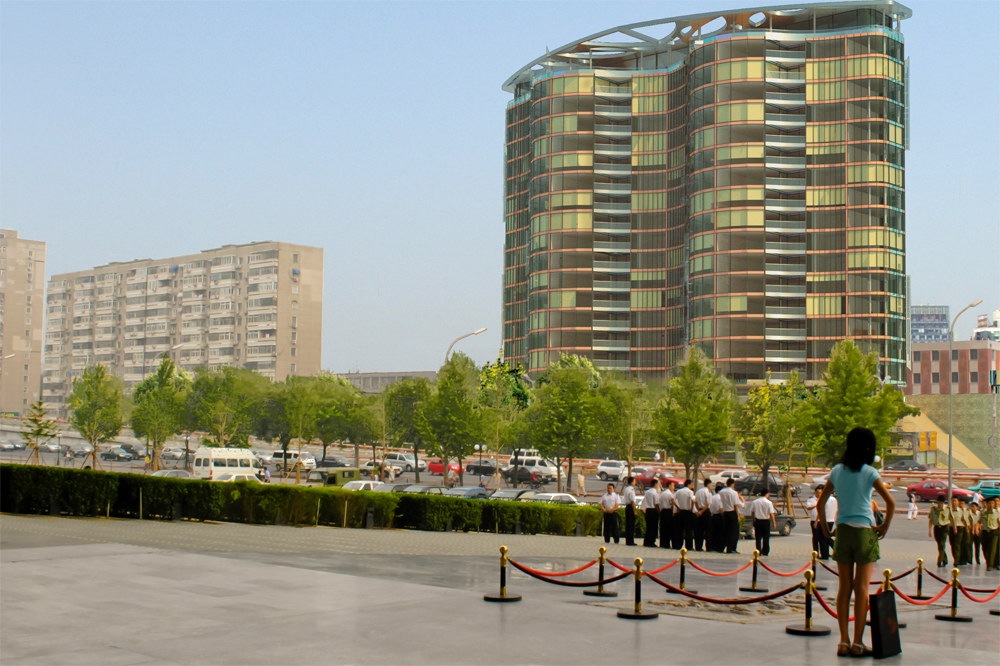
Matched Photo
-
Hi,
I could do with some help and criticism please. I have rendered a matched photo in Maxwell Render and put it together in Photoshop. Does anyone have a good method of citting around trees? Have tried to use the background layer and use the airbrush behind to limited effect. I have only a little experince in Maxwell though have enjoyed using it so far.
Any help will be greatly appreciated.

-
That looks good to me.
-
On trees I like to use Photoshops splotched eraser at 50% and randomly hit the edges. It gives it a really nice dappled look.
-
Guy, I find the lady in the foreground out of scale. Is the object of the render the biggest building on the right? If so I would opp. for a more symmetrical view, may be a tall image with more sky above. I also find the empty left lower portion of the image to be a distraction. The empty sky on the upper left could also use a foreground tree.
Nice building, will do much to upgrade the neighborhood.
-
@honoluludesktop said:
Guy, I find the lady in the foreground out of scale. Is the object of the render the biggest building on the right? If so I would opp. for a more symmetrical view, may be a tall image with more sky above. I also find the empty left lower portion of the image to be a distraction. The empty sky on the upper left could also use a foreground tree.
Nice building, will do much to upgrade the neighborhood.
quote="honoluludesktop"]Guy, I find the lady in the foreground out of scale. Is the object of the render the biggest building on the right? If so I would opp. for a more symmetrical view, may be a tall image with more sky above. I also find the empty left lower portion of the image to be a distraction. The empty sky on the upper left could also use a foreground tree.Nice building, will do much to upgrade the neighborhood.
@honoluludesktop said:Guy, I find the lady in the foreground out of scale. Is the object of the render the biggest building on the right? If so I would opp. for a more symmetrical view, may be a tall image with more sky above. I also find the empty left lower portion of the image to be a distraction. The empty sky on the upper left could also use a foreground tree.
Nice building, will do much to upgrade the neighborhood.
/quoteThanks for the help and the comments. The lady is part of the original photo, but she can come out,with a fight! I was going to do add more sky though. Alas dont have a good photo from a flatter angle.
Regards
-
Problem solved!

-
While I don't have any real criticism (It looks good!), I do have a better method of cutting around trees...use the ones I have instead. I can create a dropbox link if you want. I have a couple hundred photoshop alpha channel trees for use with renderings that friend of mine made a while ago, as well as people and brush presets (for black/white people silhouettes) They're absolutely awesome for PS renderings.
Let me know.
Matt
-
@matt.gordon320 said:
While I don't have any real criticism (It looks good!), I do have a better method of cutting around trees...use the ones I have instead. I can create a dropbox link if you want. I have a couple hundred photoshop alpha channel trees for use with renderings that friend of mine made a while ago, as well as people and brush presets (for black/white people silhouettes) They're absolutely awesome for PS renderings.
Let me know.
Matt
Yes please. You will have to point me towards a good tutorial on how to use them as I have no idea.
-
I'll do you one better. I'll see if I can snag the time to make one myself. I'll see if I can get that dropbox ready tomorrow, and hopefully the tutorial some time next week.
Matt
-
Guess it can't be helped. Upon close examination, because the ground plane is sloped down, her head is above the middle ground people. You could change this with photoshop prior to placing your building into the photo, but then that would be a distortion of the real view. Is it worth the effort to get another photo without any foreground people? If not, I wouldn't worry about it.
Hello! It looks like you're interested in this conversation, but you don't have an account yet.
Getting fed up of having to scroll through the same posts each visit? When you register for an account, you'll always come back to exactly where you were before, and choose to be notified of new replies (either via email, or push notification). You'll also be able to save bookmarks and upvote posts to show your appreciation to other community members.
With your input, this post could be even better 💗
Register LoginAdvertisement


