Working back to front!
-
Here is an exercise I've set myself - working back to front really.
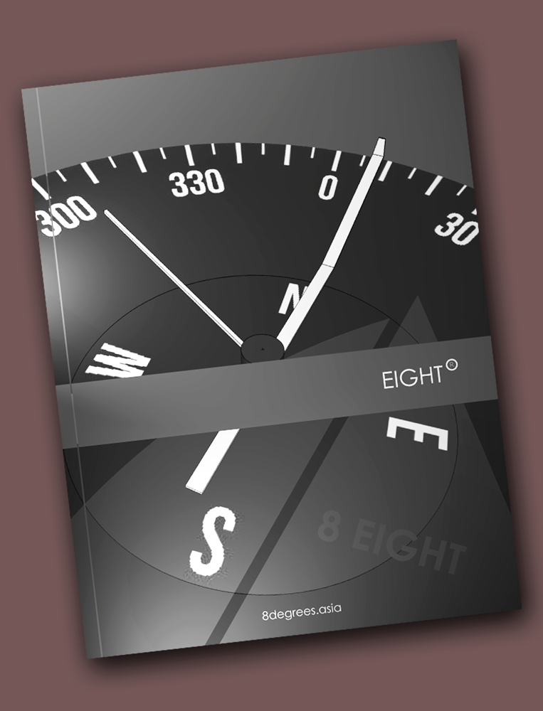
This is for a new brand development and rather than starting with an image and then developing the artwork around that I'm starting with the roughed up artwork and then developing the supporting image.
So far I have created the compass face in Layout and then imported to SU for modeling and exported the desired shot as native. Bought back then to Layout for composition and further development. Still need to play a little with the camera angle I think, maybe to bring the tummy band a little higher.
I'll then finalise the modeling and render with maxwell. Here is the biggy that will probably "DO MY HEAD IN!", trying to capture the sail and sail text in the reflections on the compass glass to add texture to the lower section of the image as roughly shown.
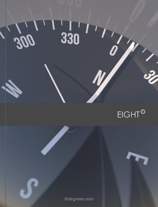
I'm initially considering modeling the sails and placing behind the camera with a emitter material as the sail texture OR if that is not successful possibly mapping the actual image within the glass. Any thoughts there would be appreciated!
Cover rough up:
-
That looks pretty cool. I need to read your post a couple of times to figure out what you wrote, though.

-
Yeah, I could not quite make out what you are up to either Richard

-
Hmmm? Yeah I read back and I can't understand it either - I'll try briefly again!
Instead of the usual - working an artwork from an image, I'm working an image to the artwork!
I have so far created a projected image for the branding and will now create the full model and render the output for use in the final branding artwork!
Meaning I'm going to try a few ideas to get the reflections of sails in the foreground to fill the lower image as shown on the draft. This bit I don't think will be easy - or at least not until the point I'm happy with it!
Thanks guys - should preview before posting!
-
With a quick test render! Positioning the sails for the reflections was rather easy!
-
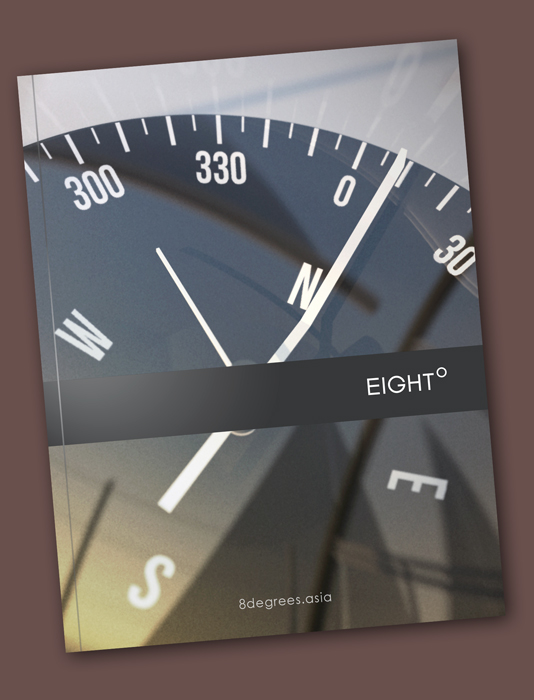
Bit of an update - still not completely happy!
I ended up creating the "EIGHT" font in Layout as although fairly happy with Century Gothic could see an improvement for just a few of the letters!
-
That's looking really nice. Can you teach me to do that?
-
Thanks Dave! Mate I need someone to teach me! Turned out nightmare in the end getting the sky and reflections right, you move an object a bit and because your trying to pick them up on a hemisphere they bounce out of scene. The sky similarly - I used a mix of physical sky and skydome with custom applied zennith and horizon colours, getting the mix of sun and dome colours right (still not happy) was nightmare!
Here is a comparison of the Layout created font (top) v's century gothic (bot)

-
I like the way you did the G and the H. the G as you've got it fits the design very well. You should do the entire font in a font application.
I understand the problem with the reflections. You did a nice job on them, though.
-
@dave r said:
I like the way you did the G and the H. the G as you've got it fits the design very well.
Thanks Dave!
Yeah I wanted to get the G to sit well with the DEG symbol! Hmmm? Not sure I'd want to go through a whole font design exercise though would be fun! I'd probably start with Century Gothic as I use it a lot for brochures - though for the first time recently used a "?" mark and WOE that didn't work! It has a question mark way out of whack with the rest!
-
I had to have a look. you're right. where in the world did that '?' come from?
-
Have you tried futura family font? Is very similar and I like it a lot.
The G is more rounded, just like yours.
Free Fonts - 6500 Free TTF Fonts (F)
Over 6000 Free Fonts are on this page. You can download as many free fonts as you choose. These Free Fonts are True Type Fonts that are made to work with the Microsoft Windows Operating system
(www.webpagepublicity.com)
Hello! It looks like you're interested in this conversation, but you don't have an account yet.
Getting fed up of having to scroll through the same posts each visit? When you register for an account, you'll always come back to exactly where you were before, and choose to be notified of new replies (either via email, or push notification). You'll also be able to save bookmarks and upvote posts to show your appreciation to other community members.
With your input, this post could be even better 💗
Register Login


Advertisement